112th Annual Membership Exhibition
Welcome to the 112th Annual CSP Membership Exhibition.123 printmakers submitted work for this call. It is possibly our biggest collection ever, showing that CSP is certainly evolving. We have new members, new recruits to the Board of Directors, and ongoing thoughtful projects aimed at member involvement.
Possibly the drive to make artwork, and print, involves making sense of, and reordering the events, and environments we are living through. The skills and vision displayed below reflect the humanity, and vibrancy surrounding us. Work in this collection represents in many forms; both traditional and experimental methods are pursued with unique recipes, and quality materials. Themes explore visions of belonging, as well as depictions of fighting back against injustices. Images of place, people, spirit, and nature are collected with an ocean of forms, marks, atmospheres, and intuitive layers.
Many of these pieces are for sale. Contacts are attached below with statements and bios; organized by the artist’s first name. Please contact the artist and organizers at exhibitions@caprintmakers.org with enquiries for purchase or any other concerns.
Join us for a discussion on inspiration and concept, being an artist in the age of ai, and how the future is physical. Though we cannot host a physical reception, our panel discussion will be held on November 14, 2026 at 1pm PST. RSVP at this link.
Thank you,
Kevin Harris, Exhibitions Co-chair
Susanna Harris, Exhibitions Co-chair
Israel Campos, Website and Gallery Layout



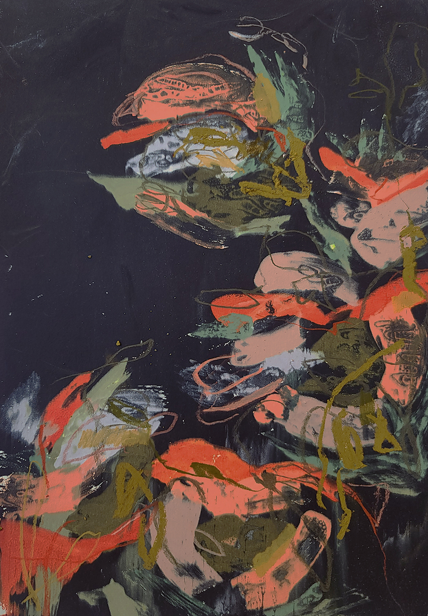
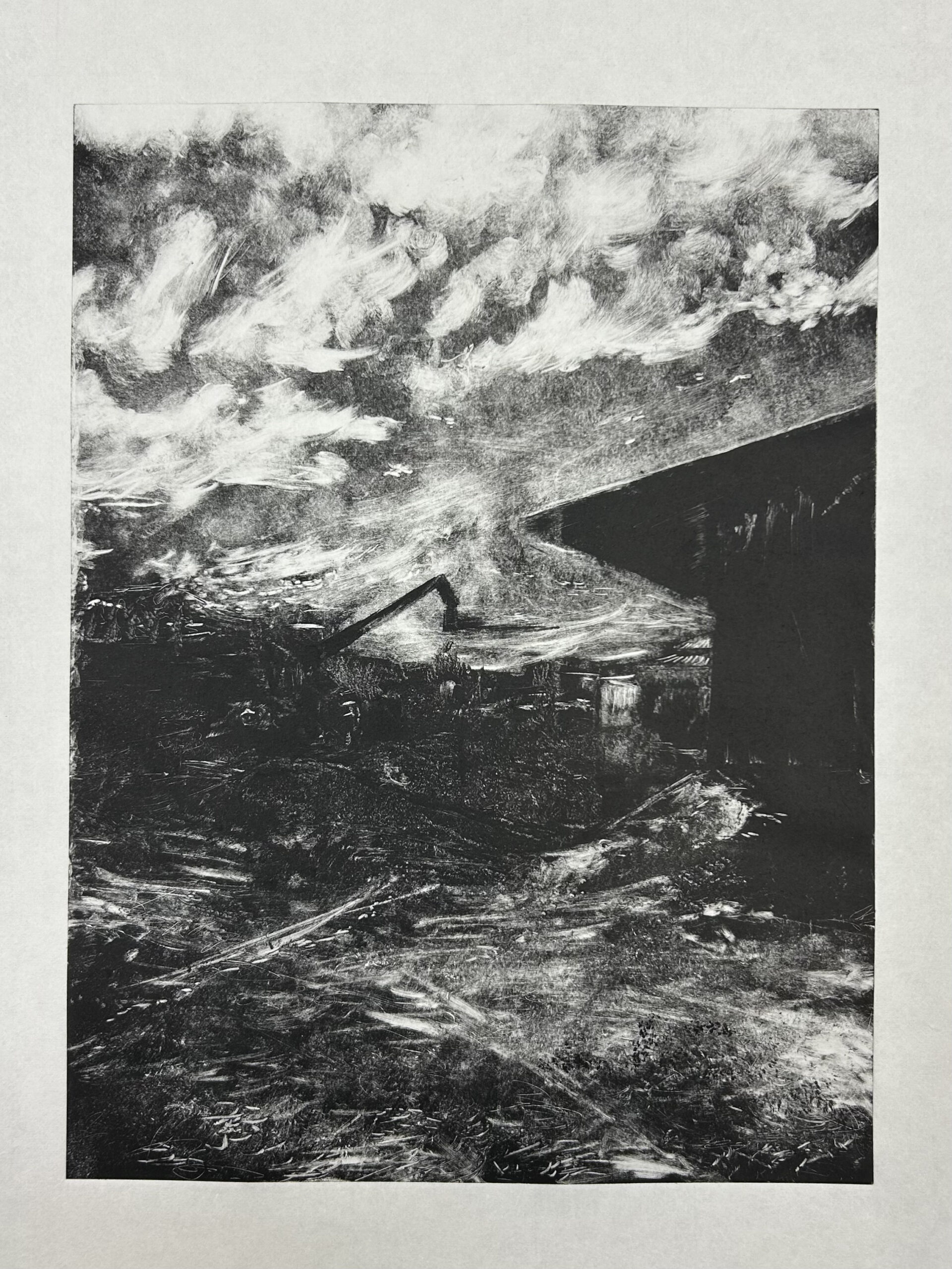


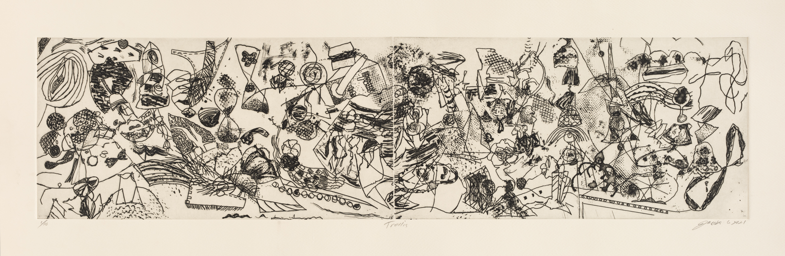
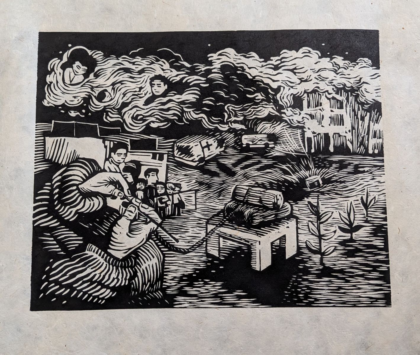
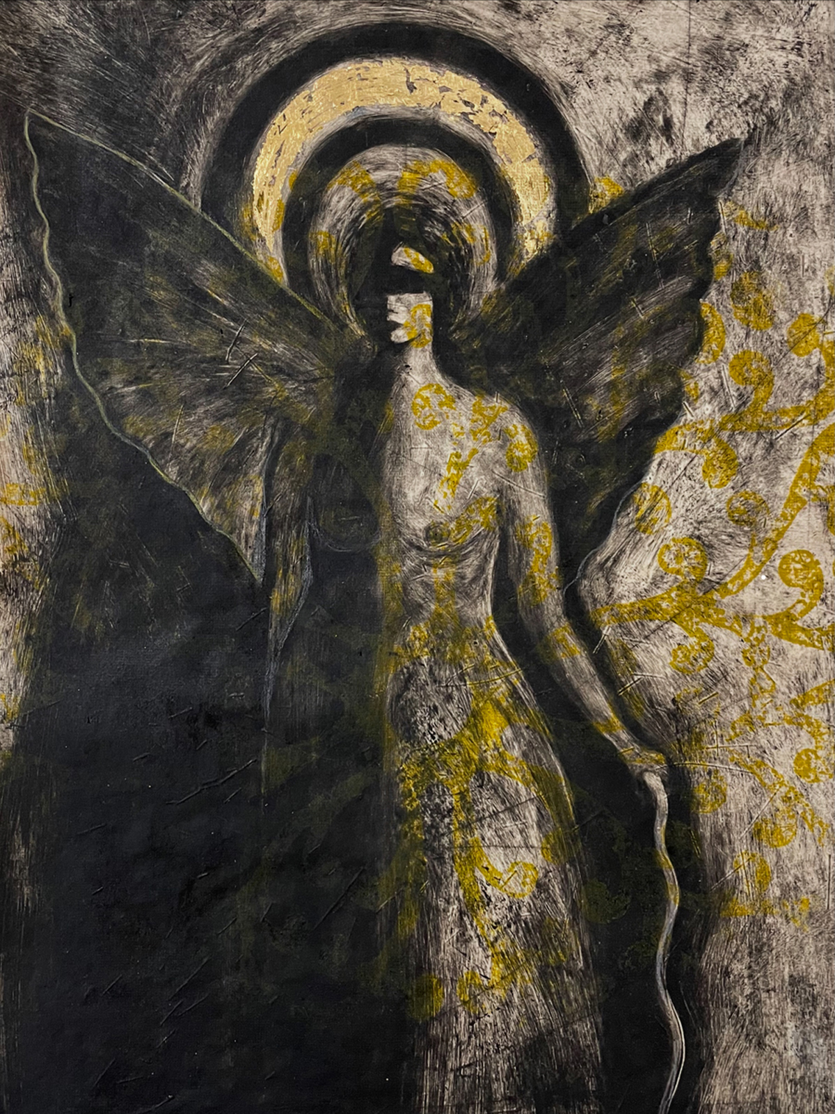
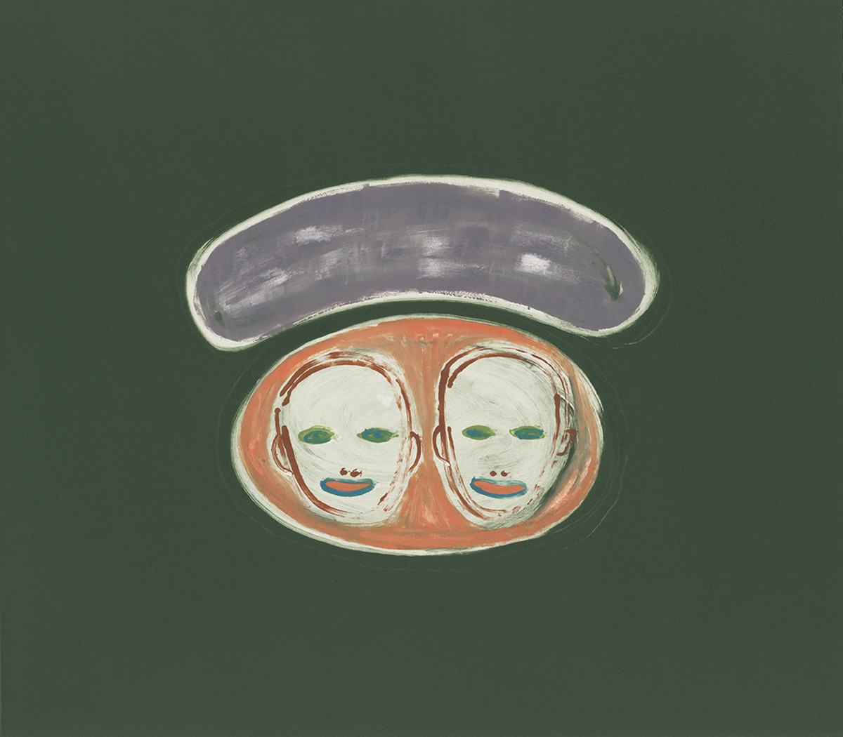
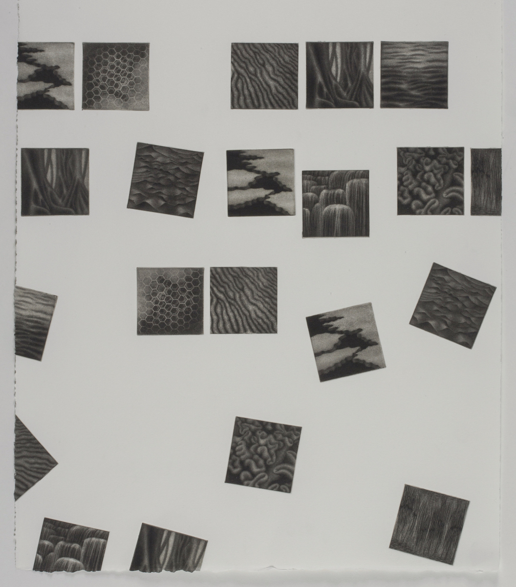
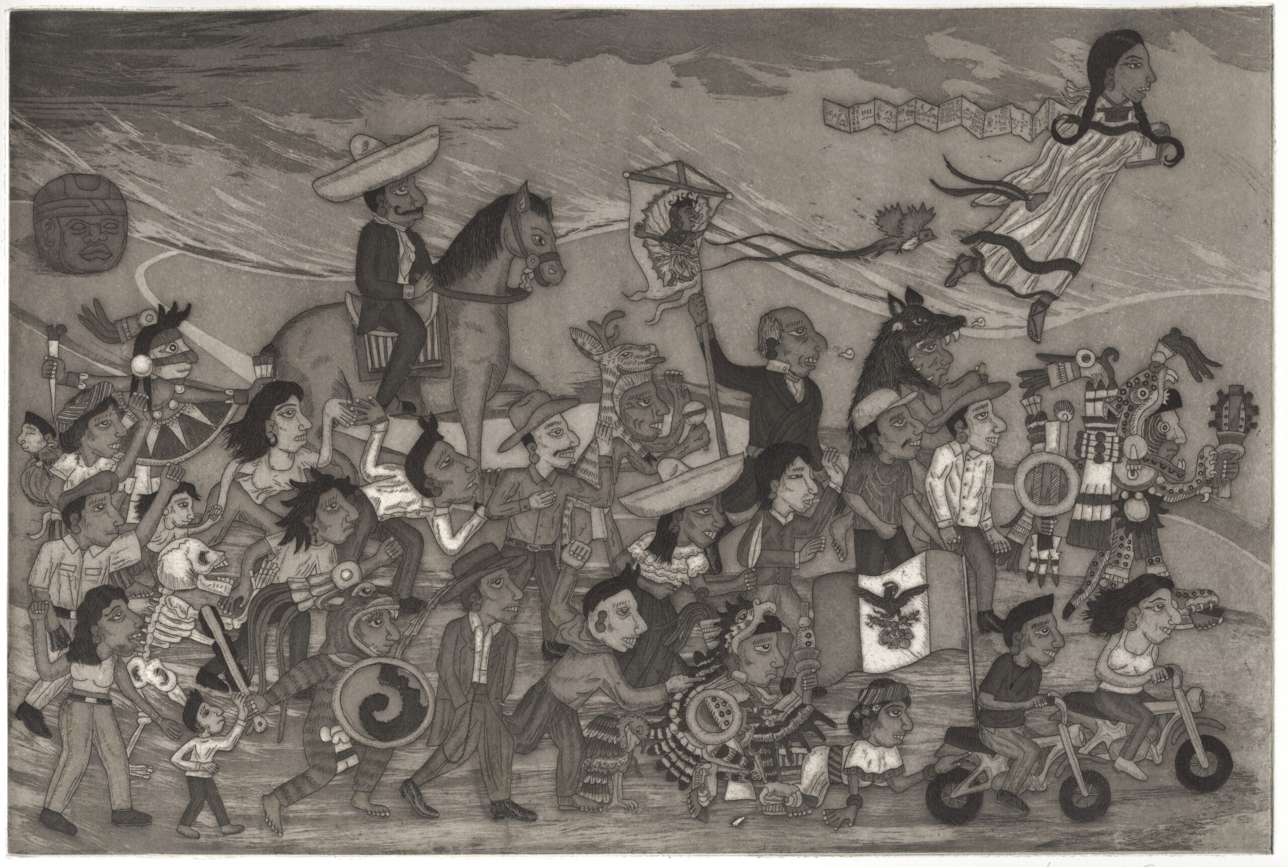
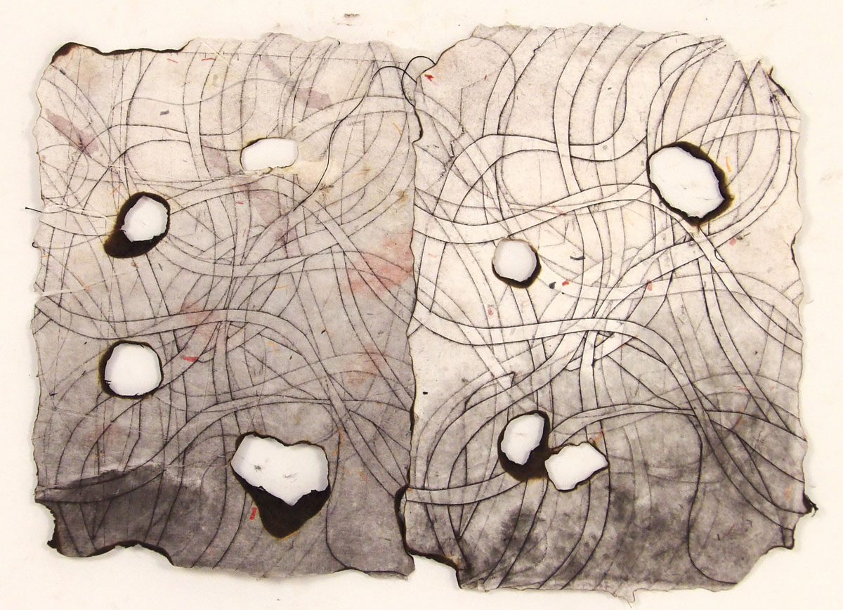
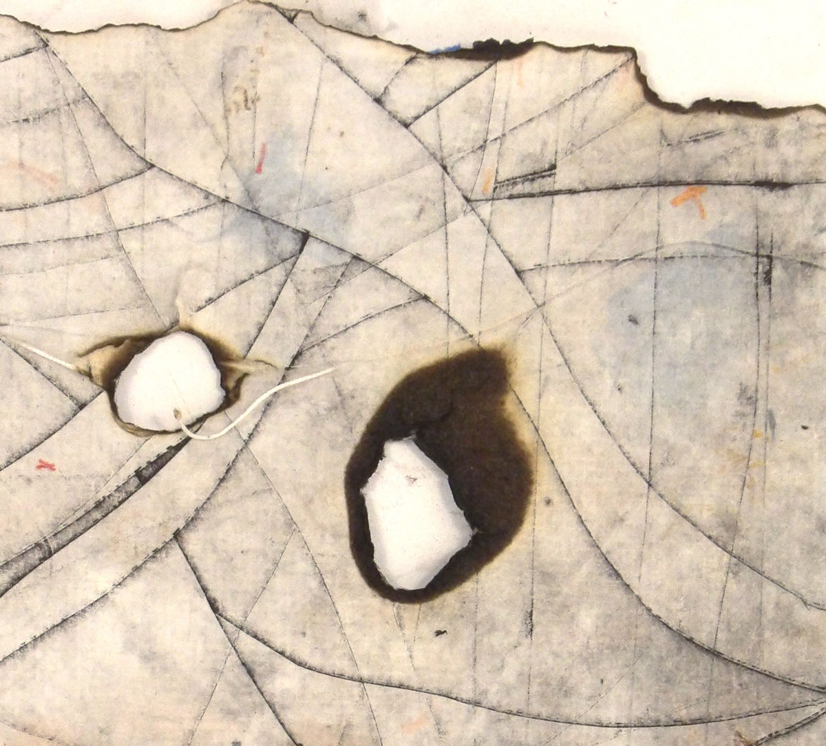

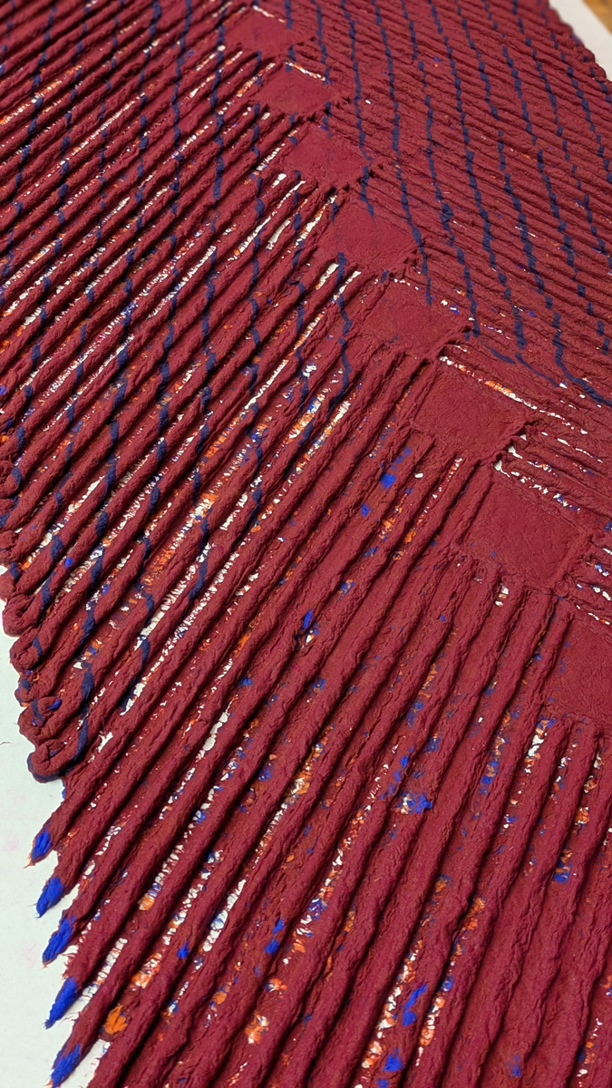
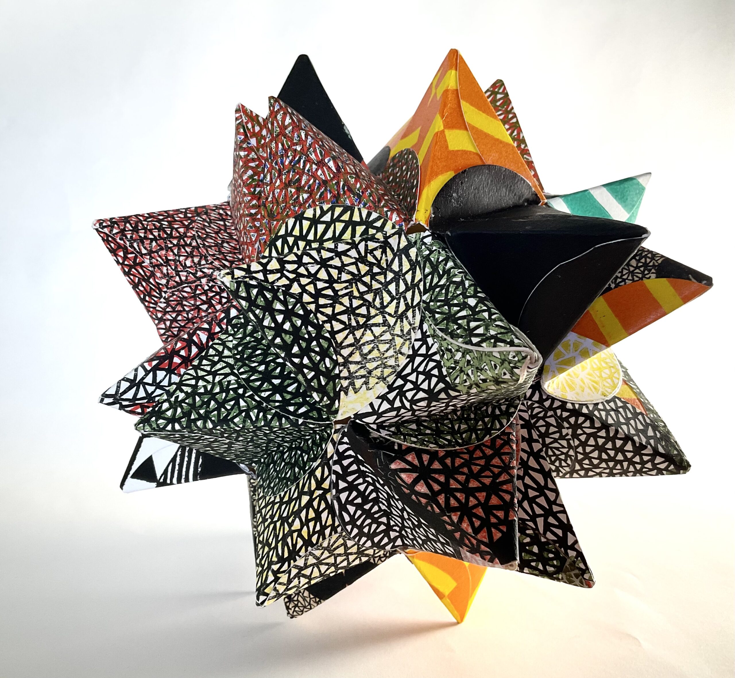
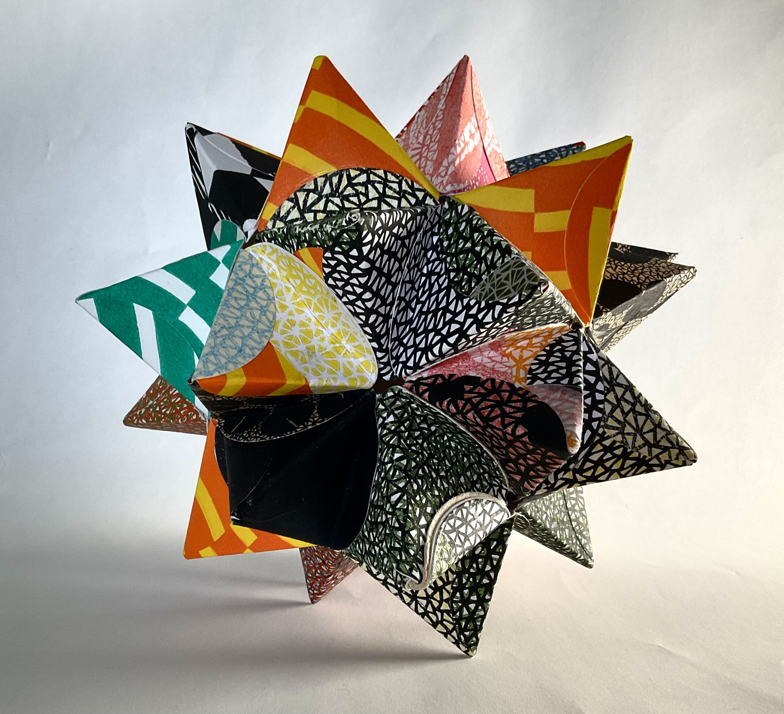
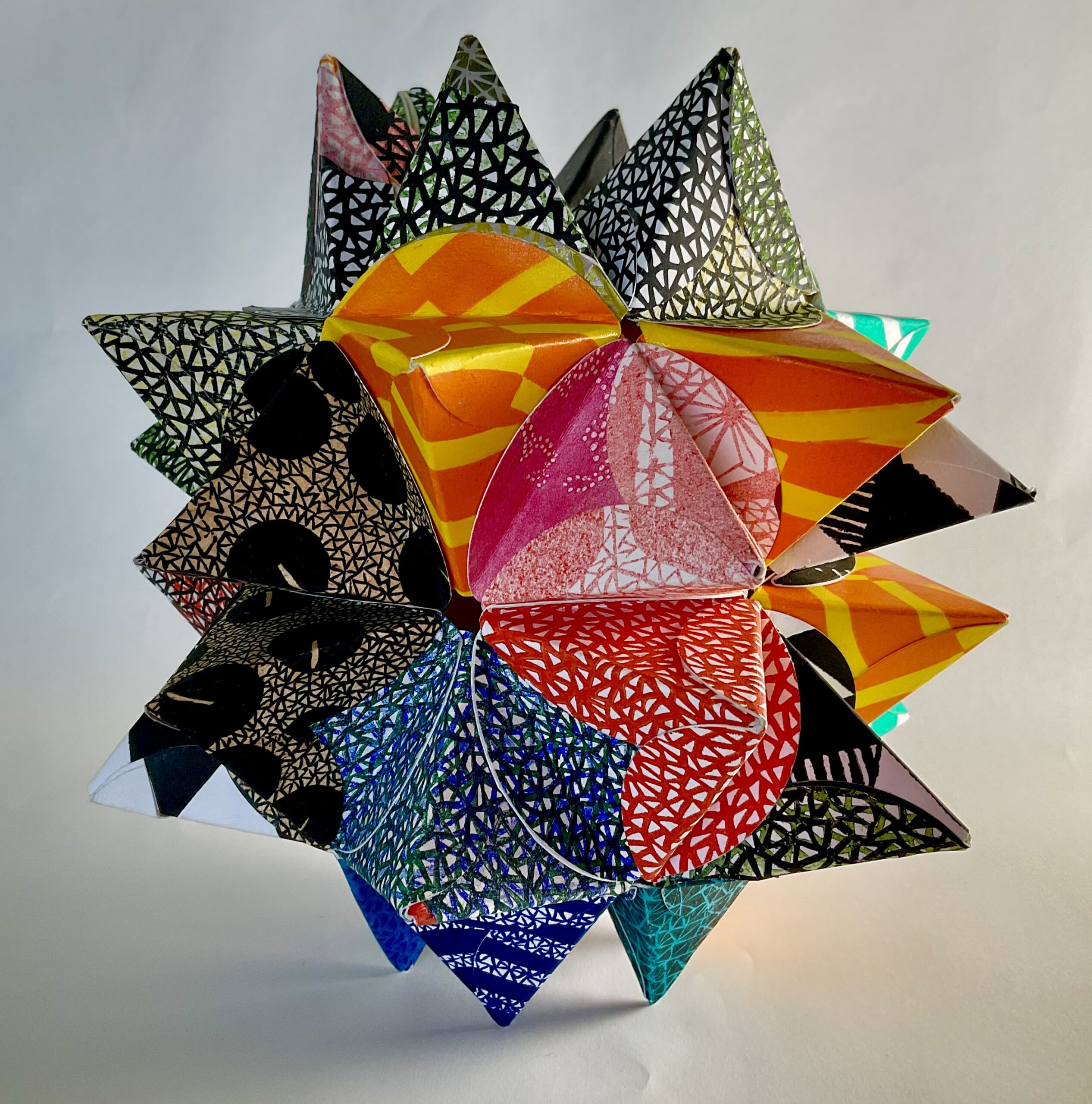



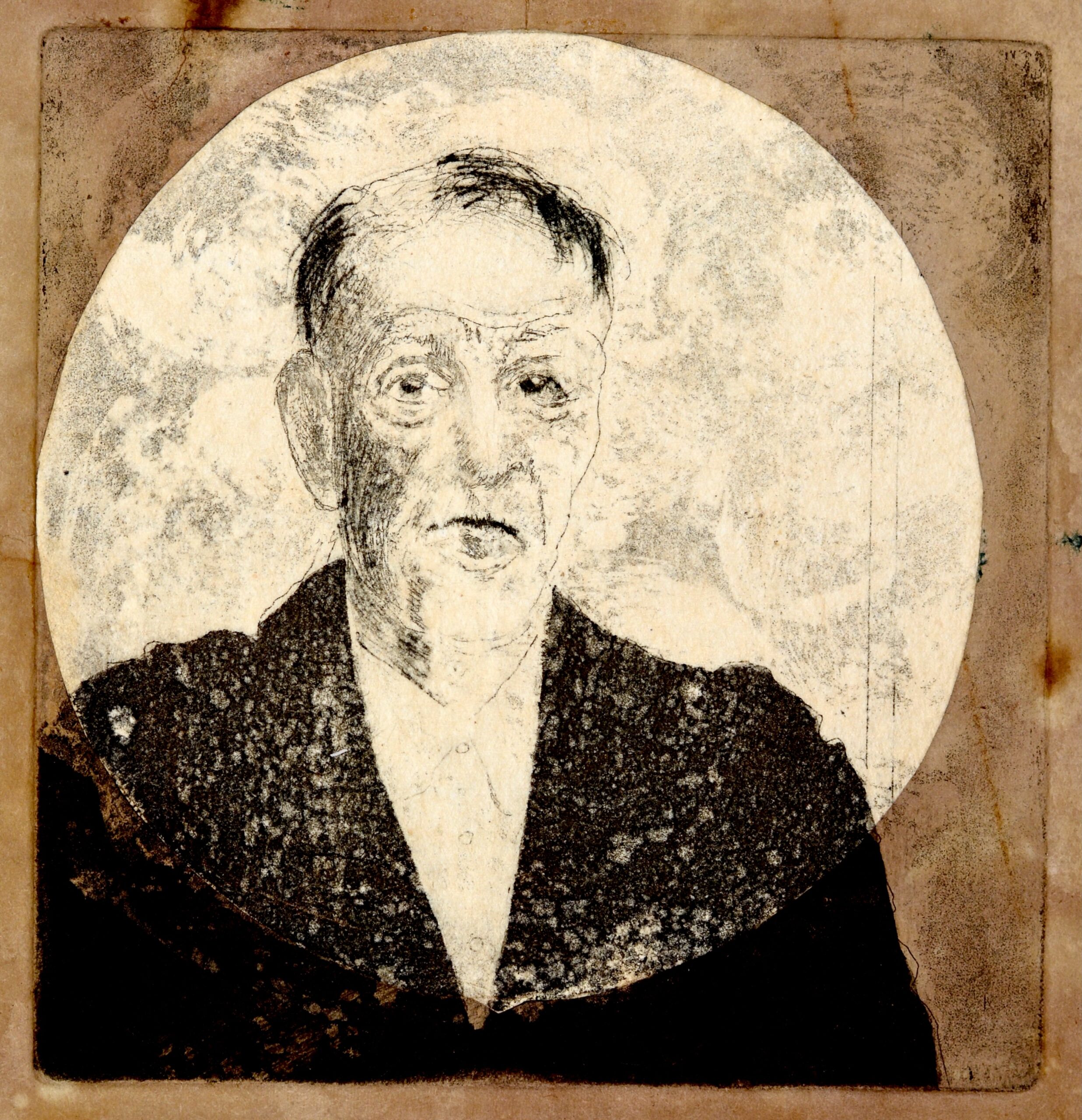


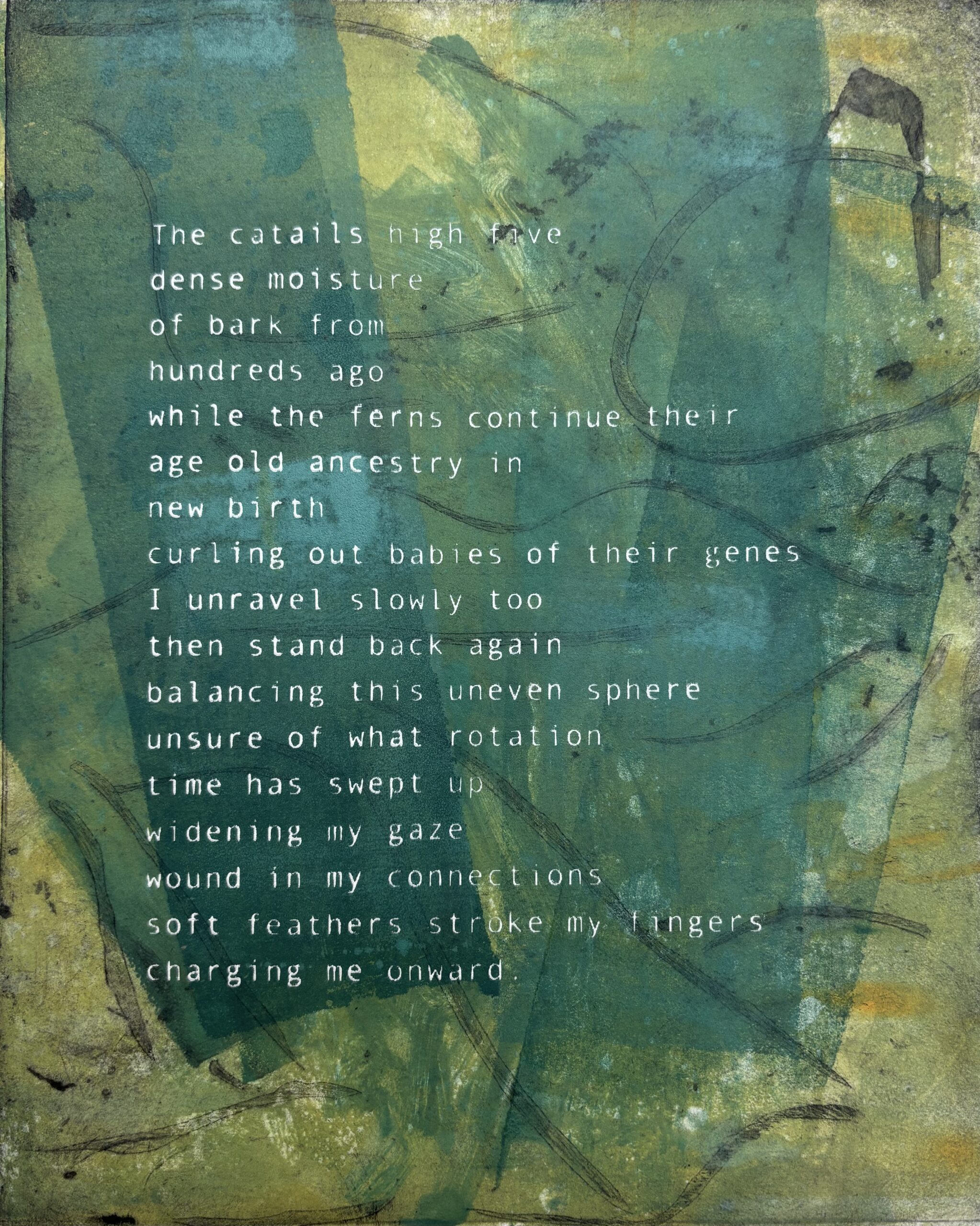

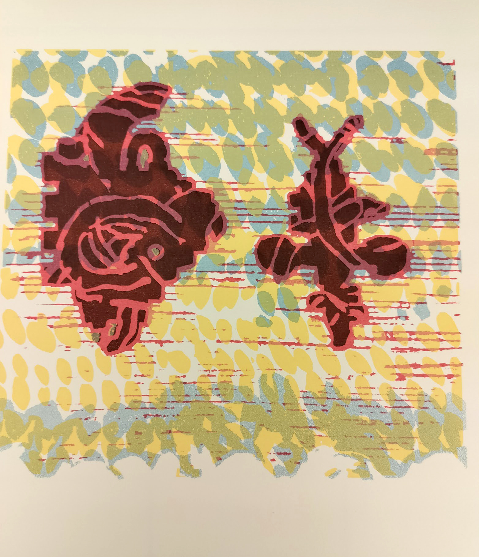
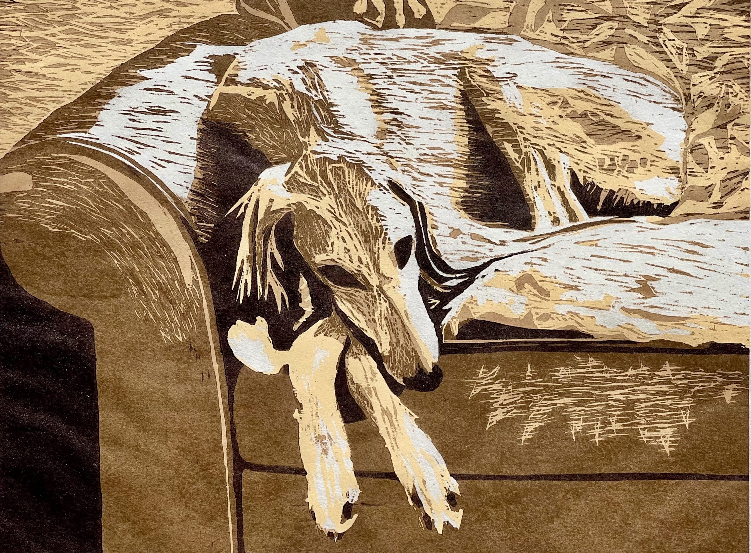
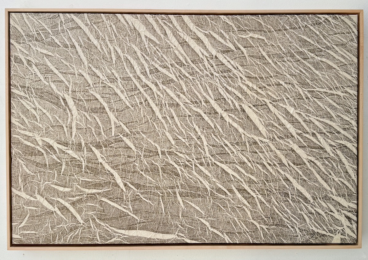
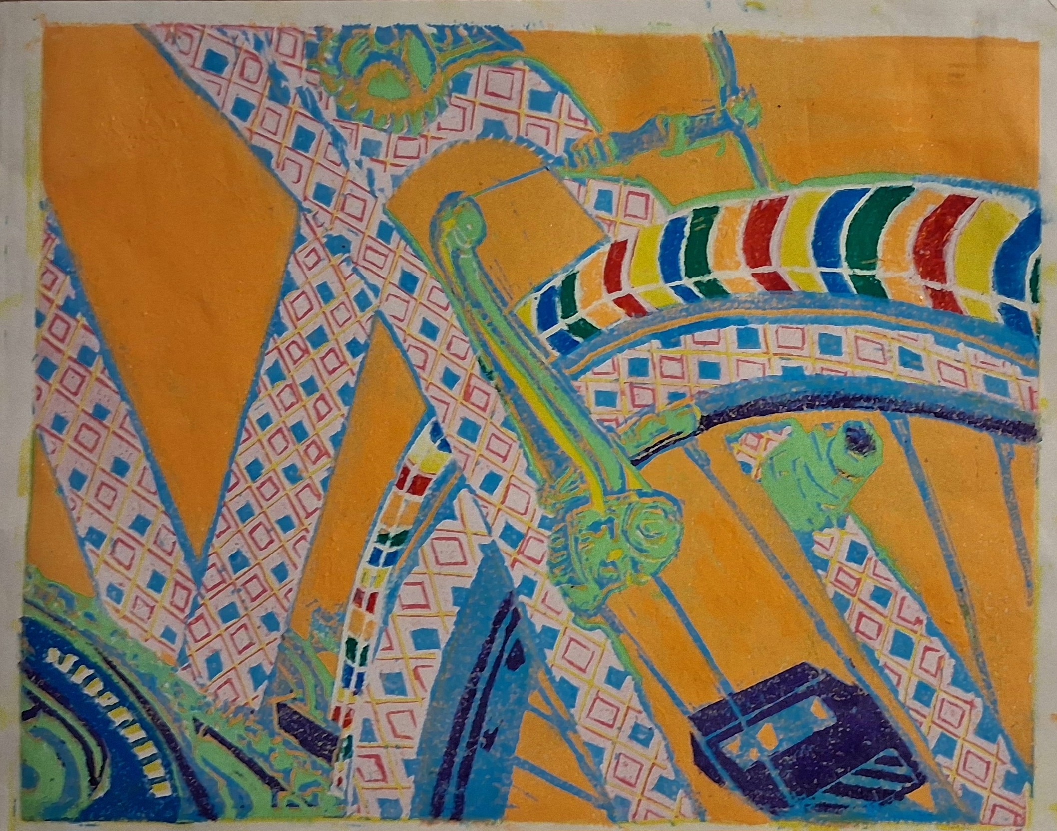
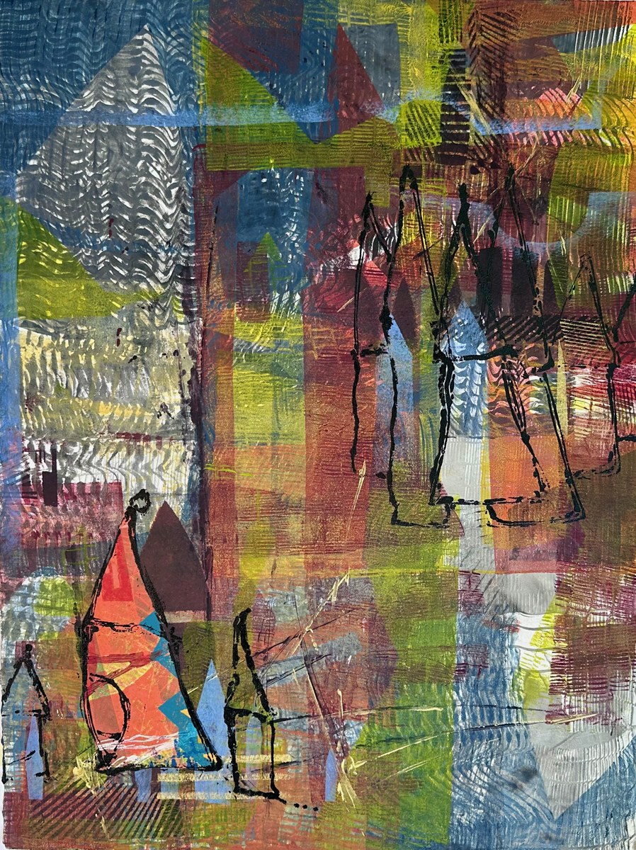
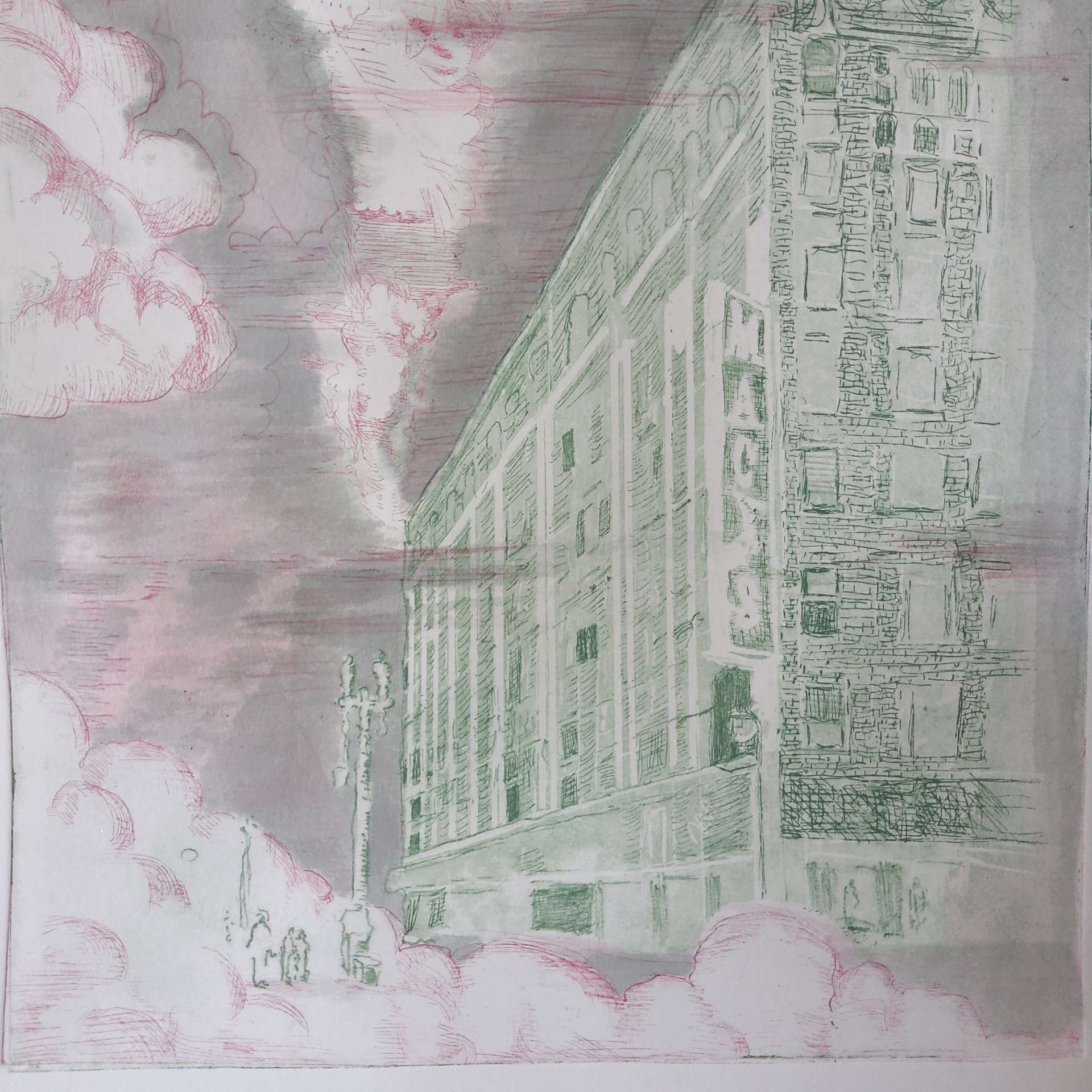
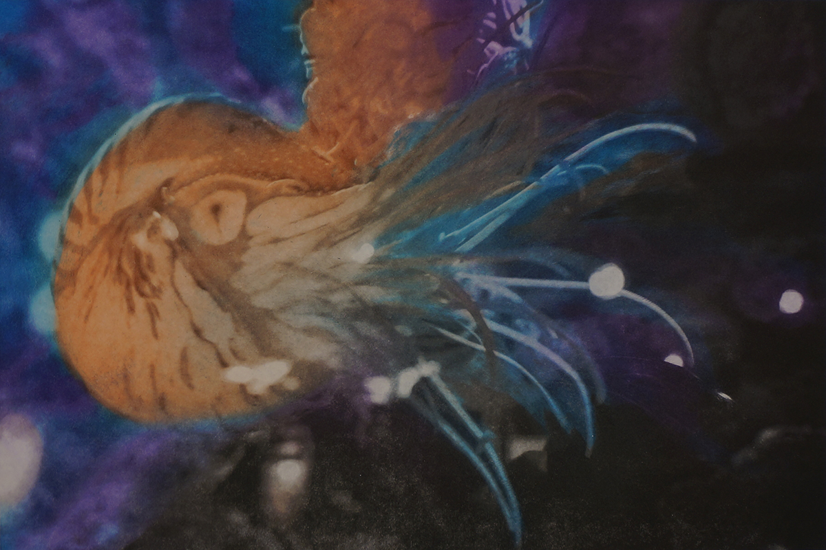
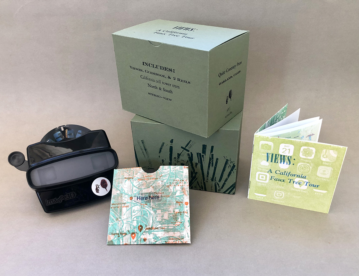
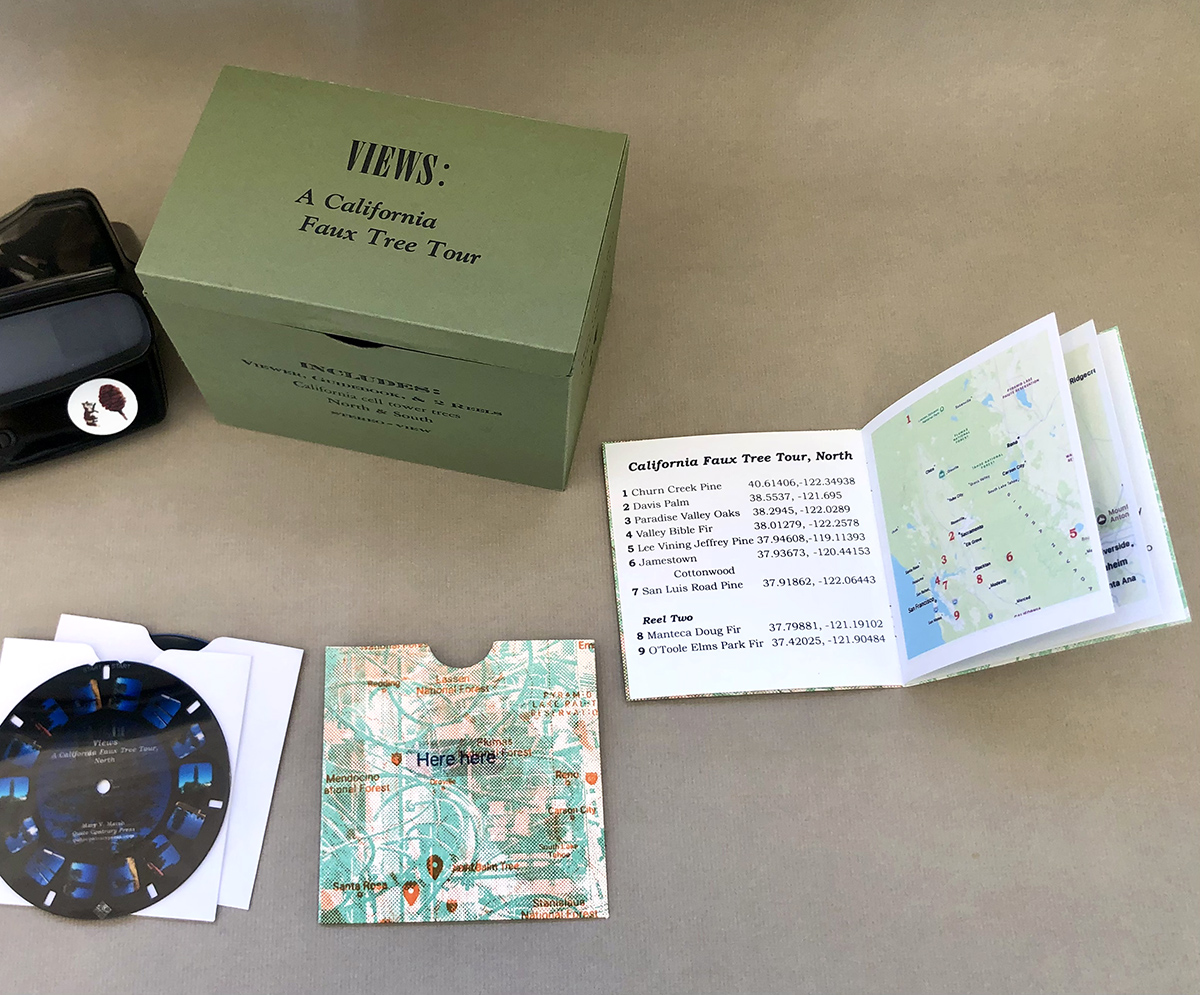
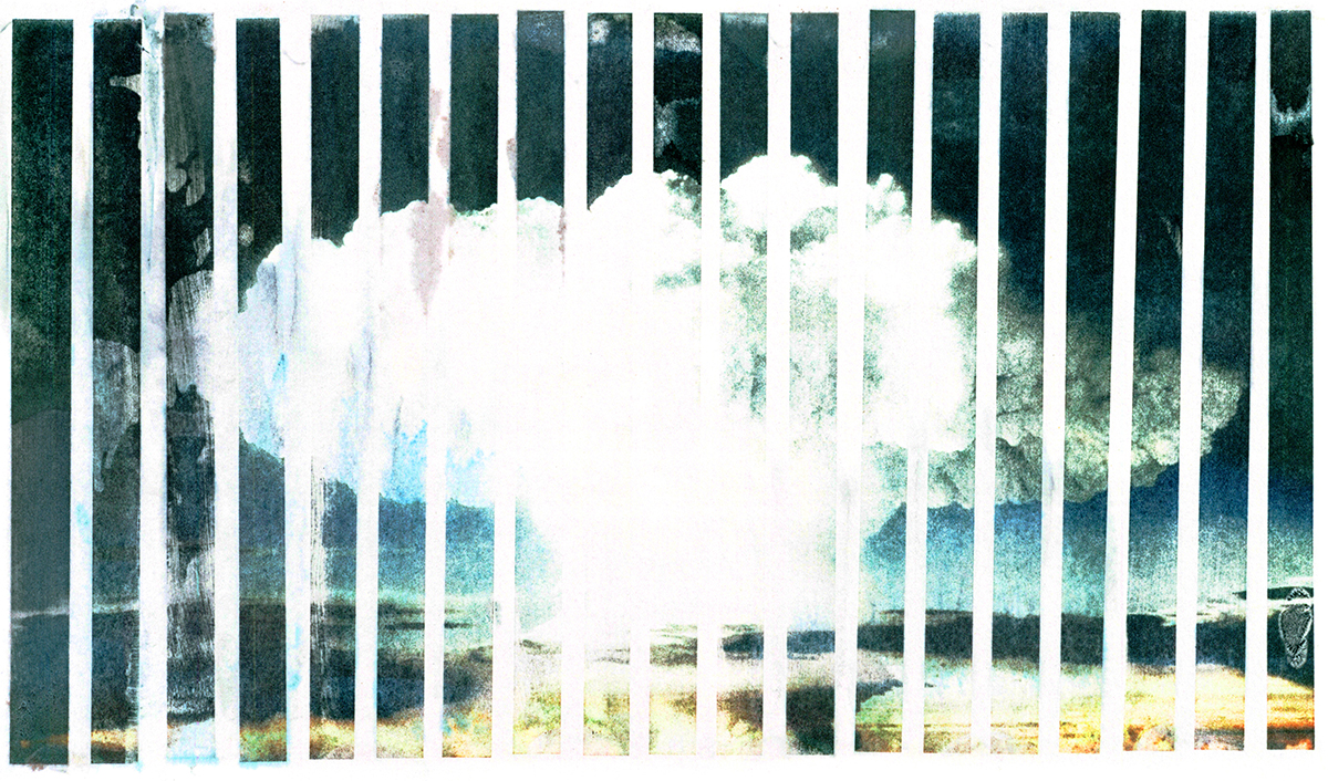


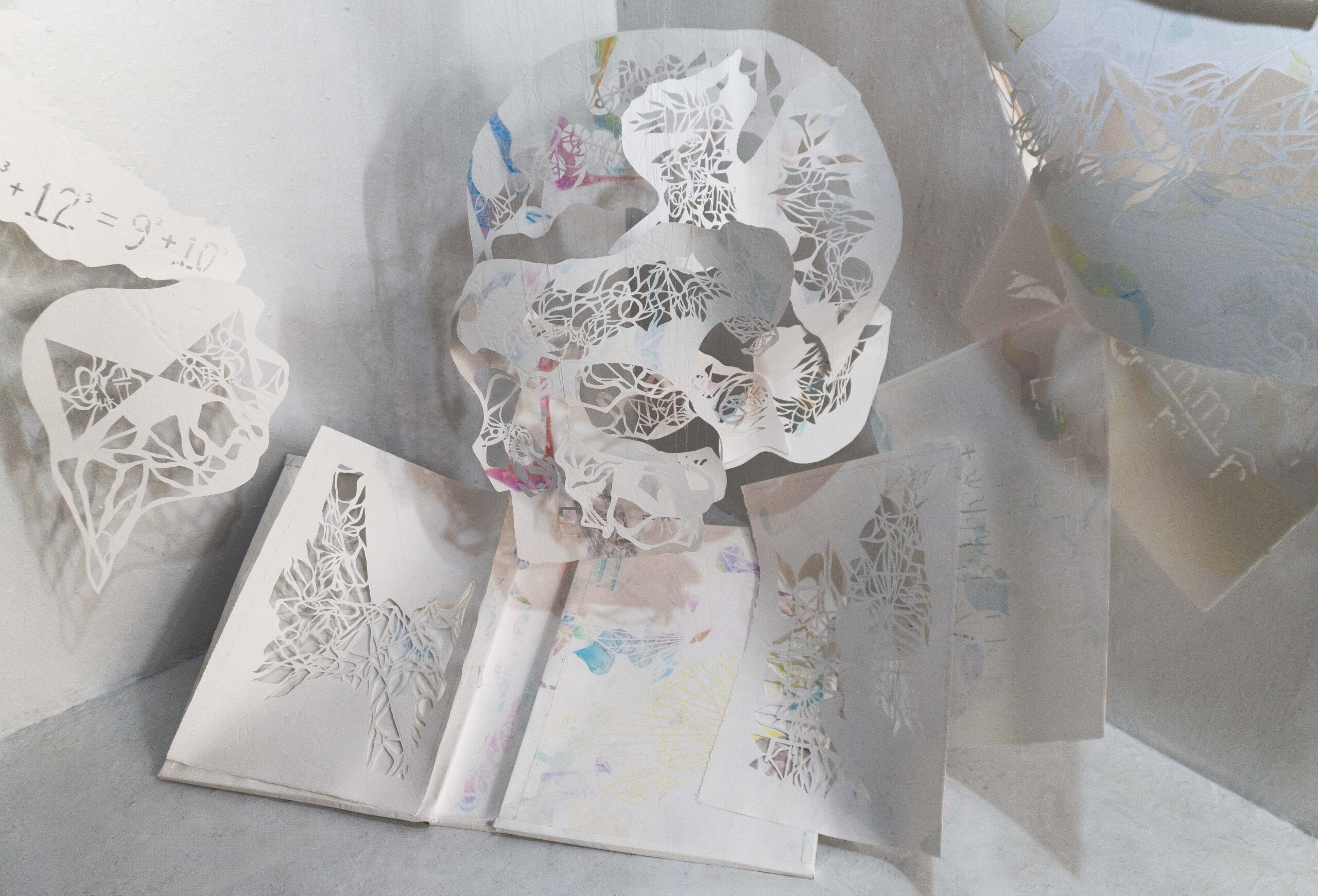
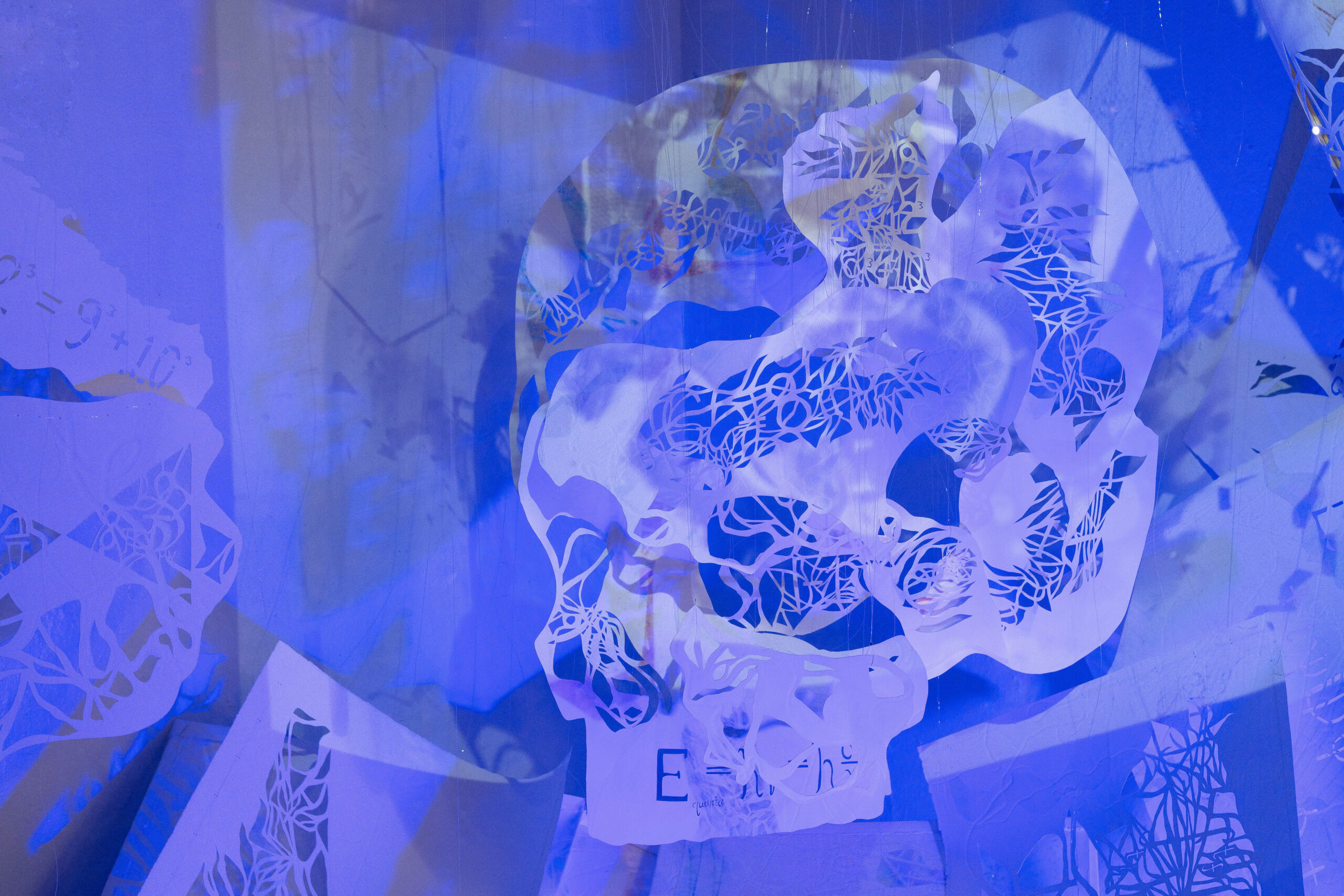
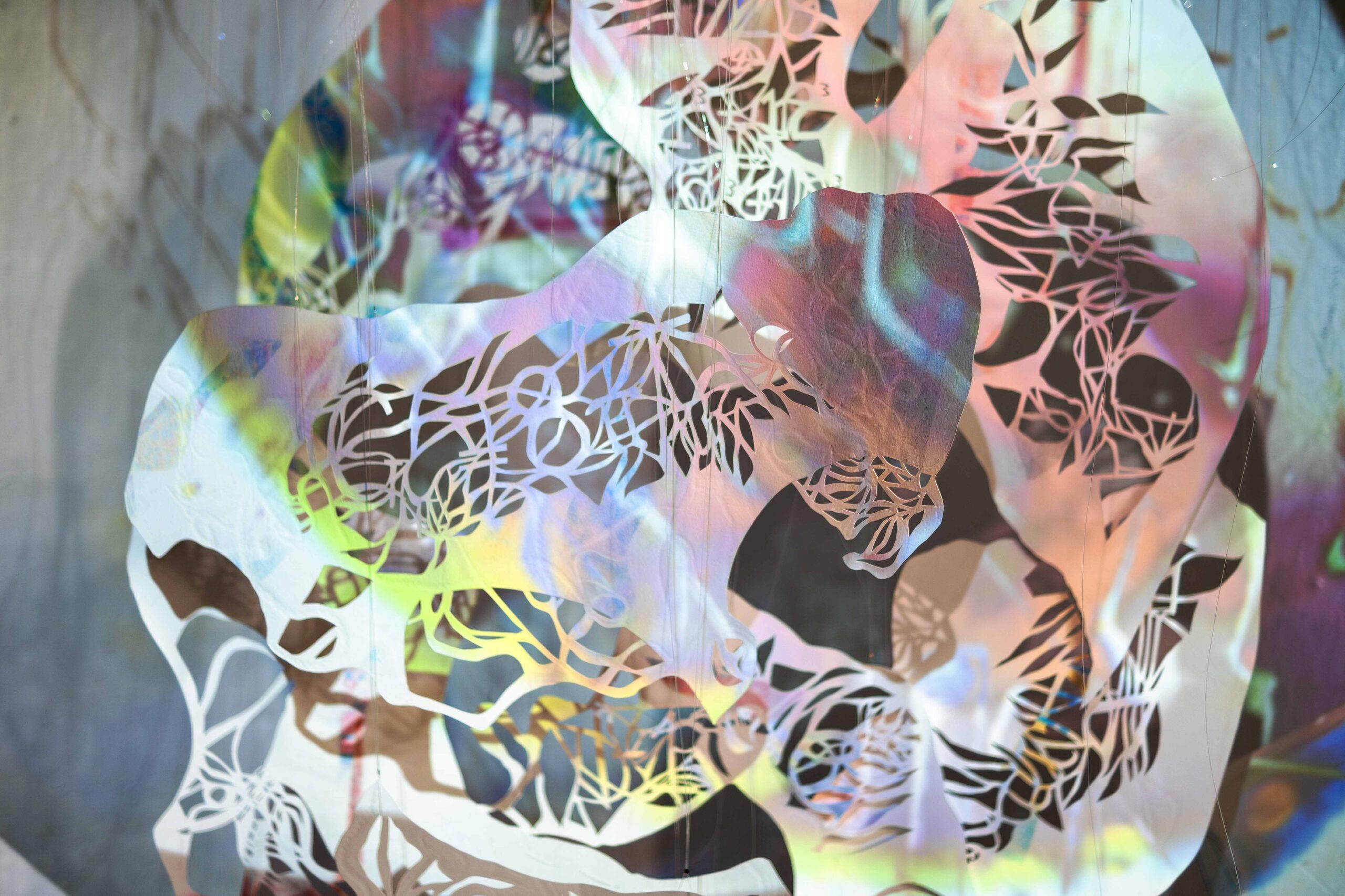


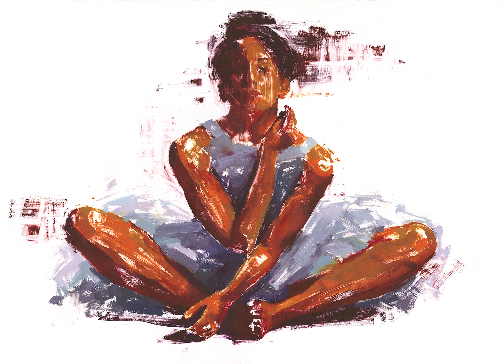

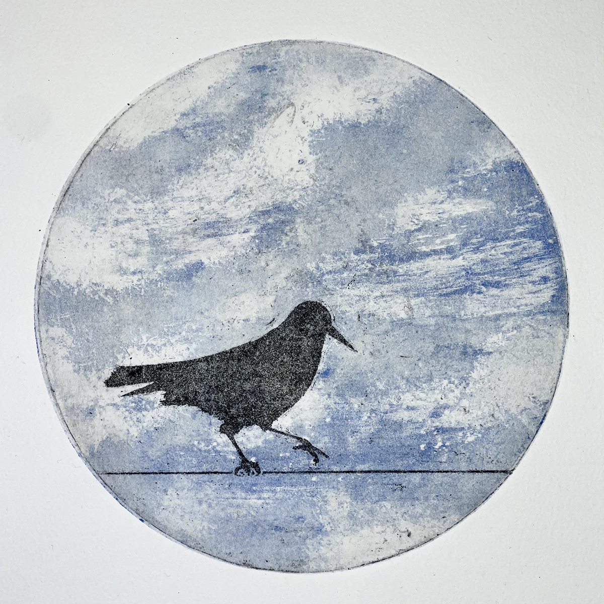
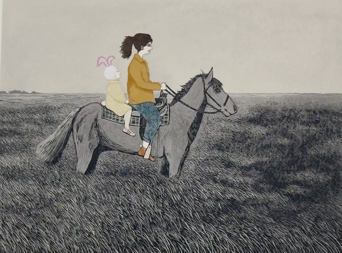
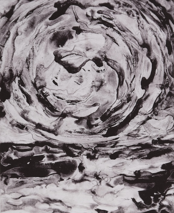




Artist Statements & Biographies
Alicia Persaud
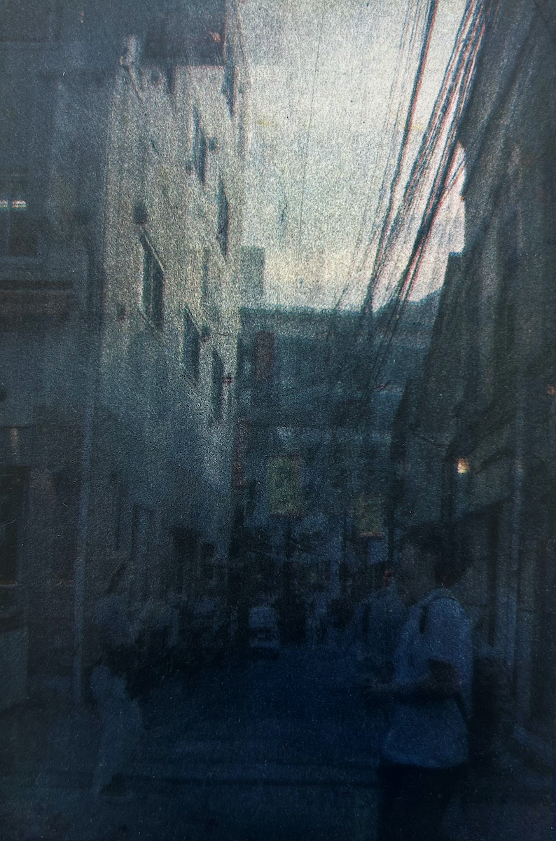
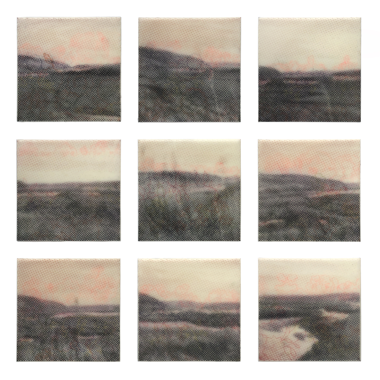
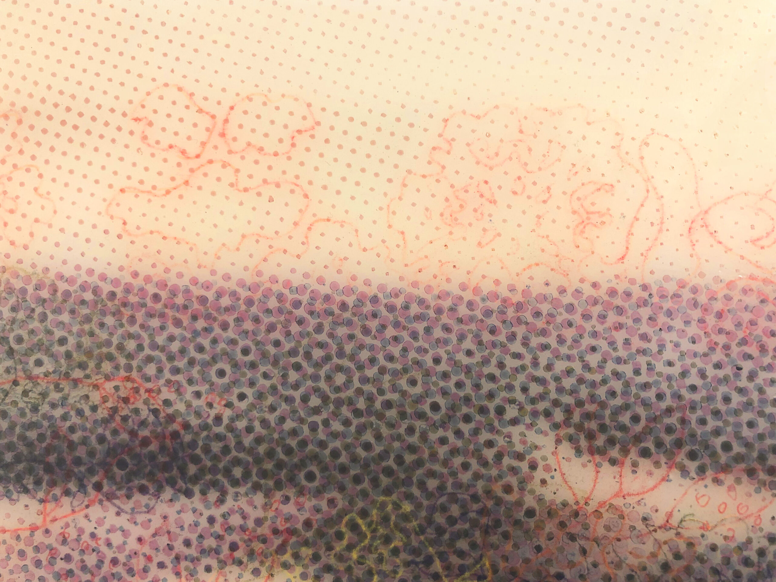
ARTIST STATEMENT Growing up in the suburbs of South San Diego, California as a first-generation woman of color, I often took public transit and explored my surroundings out of curiosity, questioning the idea of land, cities, and home. Traveling outside of my hometown, I grew a deeper appreciation for natural landscapes. My work has developed into an embodiment of exploring my feelings and reflections on globalization through some of the environments I’ve found myself in: Japan, Oakland, San Francisco, South Carolina, Arizona, and Los Angeles, both pre-pandemic and post-pandemic. My working process is largely intuitive and meditative for reflection, highlighting my personal recollections and interactions with my surroundings as an observer taking on a journalistic approach. Capturing what I find most fundamental, I begin with photographs and paintings, combining my imagery with printmaking to preserve these memories while showing parts of them, pushing the boundaries between abstraction and realism. While developing my pieces, I consider the relationship between landscape, land, water, and people to one another, juxtaposing natural and urban landscapes in a technologically changing society. I aim to highlight how some memories will blend together or be remembered differently, motivating different resonances, senses of reflection, and nostalgia for the viewer. I form new connections with my imagery after coming to a resolution, bridging the past and present while also highlighting the emptiness and vastness in the cities I’ve experienced. I contemplate: How can we protect these expansive landscapes and grow as a global society with the impact of climate change? BIO Alicia Persaud is a first-generation graduate from UC Santa Cruz. Fascinated with the concept of memory, her work has developed into an embodiment of exploring her feelings and reflections on globalization through different environments using painting, printmaking, photography, and combining these mediums. She is currently pursuing an MA in Printmaking at Royal College of Art in London, England. aliciaxpersaud@gmail.com @aliciaxpersaud |
Alisa Golden
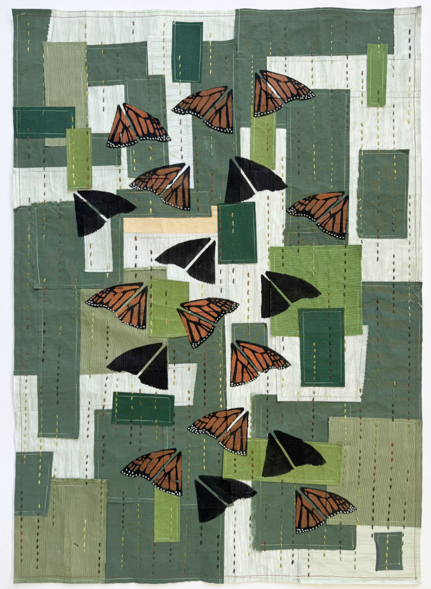
ARTIST STATEMENT My subjects tend to be a response to something I’ve read or written; natural science and natural history speak to me: how an animal lives, the impact of human activity on oceans and forests, and how we can take care of the natural world and one another are my concerns. As a printmaker, I am also interested in marks and traces and how they become symbols for and signs of the people and beings who were there before. After having made books for over thirty years and retired from teaching bookbinding and book art, I find myself with a bin of book cloth scraps. My practice has shifted to art quilts, and only recently it seemed natural to create quilts with the paper-backed cloth. I layer and machine stitch one color on interfacing as a background collage, then comb through the bin of stencils I’ve made previously or create anew for one that fits: in this case I made a new two-color image for the Monarchs; I apply the paint with a brush by hand. Backing the piece with linen fabric and stitching with complementary or contrasting thread finishes the quilt. The green book cloth suggested trees to me. Although Monarch butterflies are known to have a migration pattern, they seem to thrive in our neighborhood year round on these warming days. But when I travel south and catch a glimpse of hundreds of them clustered and overwintering on a tree, I feel there may be hope. I like the space between images and words, the colors and titles, where the viewer must interpret or fill in the gap, a mysterious leap of inference. https://neverbook.com BIO Alisa Golden writes, makes art, and edits an online and print, art and literary magazine, Star 82 Review. She holds a BFA in Printmaking from California College of Arts and Crafts (CCA) and an MFA in Creative Writing from San Francisco State University. For many years Golden taught book art, letterpress printing, and writing as an adjunct professor and through workshops around the San Francisco Bay Area. Her book art may be found in the special collections departments of universities and libraries nationwide; her writing and images of her quilts have been published in many literary magazines; and her art quilts have been juried into and are touring with several Studio Art Quilt Associates regional and global shows, and her quilt, “Would He Hide Me?” was accepted into the deYoung Open, 2023-24. She is the author of Making Handmade Books and Painted Paper, and other instructional books. art@neverbook.com |
Andrea Leland
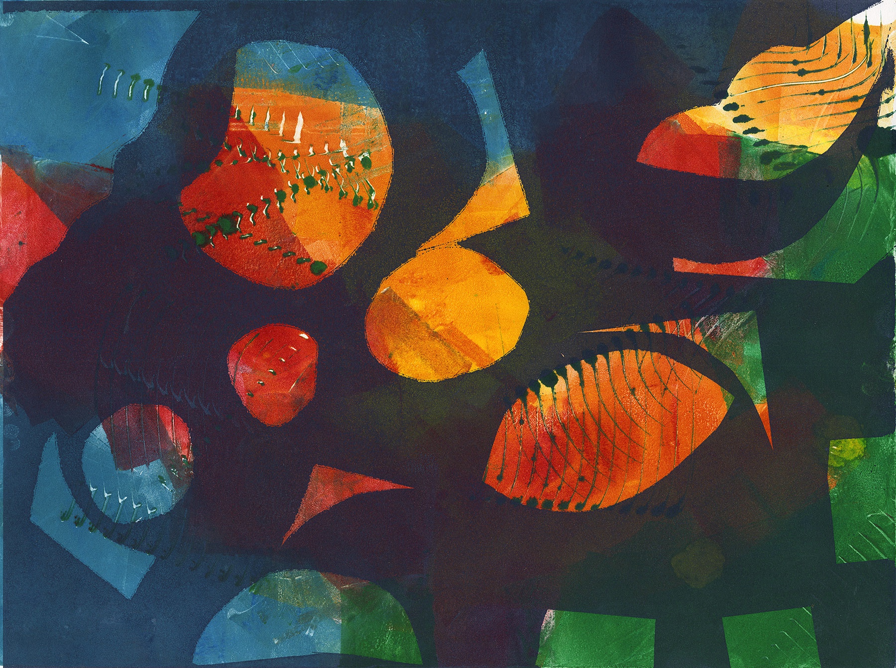
ARTIST STATEMENT My work began in painting and collage, practices rooted in layering, intuition, and the gradual building of surfaces. When I turned to printmaking — specifically monotypes — I found a process that felt immediately familiar and yet fundamentally different. The hands-on engagement was the same: applying ink to a plate using stencils, marks, and pure color. When the inked plate goes through the press and the paper lifts I never know exactly how the print will emerge, there I is always the element of surprise! That tension between intention and discovery became central to how I work. Working with abstract shapes and layered color, I became less interested in defining images than in suggesting them. The abstraction is deliberate and complete — concerned more purely with color relationships and spatial tension than with representation. Forms accumulate and interact, and the result is something the eye must negotiate rather than simply read. What draws me most deeply to monotype is what happens between the layers. In painting or collage, earlier marks are often covered over, buried. In monotype, the underlayers remain present, breathing through the surface of what comes after. The result is a kind of visual archaeology — the viewer senses depth and history without being able to fully read it. That ambiguity is not a byproduct of the process. It has become the work itself. BIO I began my artistic training, at the School of the Art Institute in Chicago in the ceramics department. From there I moved into painting and an interest in self-taught outsider and indigenous art. During my MFA years, I took some time to travel to an island in the Caribbean to study the influences and resources the artists on the island drew from to make their art. A publication ensued and a lifelong interest in outsider art and indigenous cultures of the Caribbean. I began by writing about art and artists, then turned to filmmaking as a more direct way to record the cultures I was observing. What I saw in my travels shaped my paintings. For more than 30 years I alternated between making films and painting in my studio. Each film took years to produce, direct and distribute, and depended on many collaborators. Painting was the opposite: solitary, meditative and immediate. In the studio I could respond directly to what I had seen and felt. After my final film won an Emmy, I left filmmaking to focus on my own work rather than documenting other people’s lives, and I returned full-time to my art studio. For years I worked in pastel, drawing landscapes and the plants around me. That work gradually became collage painting. More recently I have concentrated on printmaking, specifically monotypes. For many years I divided my life between Chicago and the Virgin Islands. About 12 years ago I moved to Petaluma, California, where I live now. My studio is in the Art Hatchery building in Petaluma. aeleland@gmail.com https://www.instagram.com/andrealelandart |
Anita Heckman
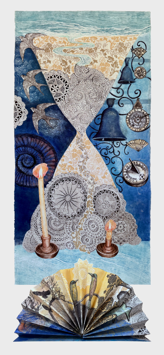
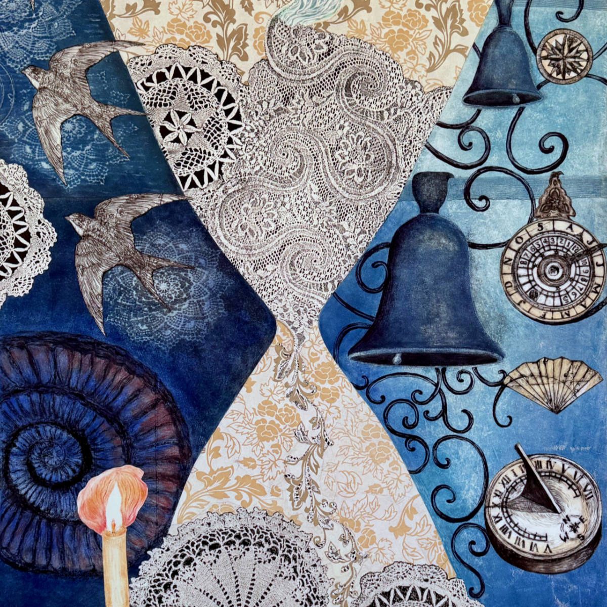
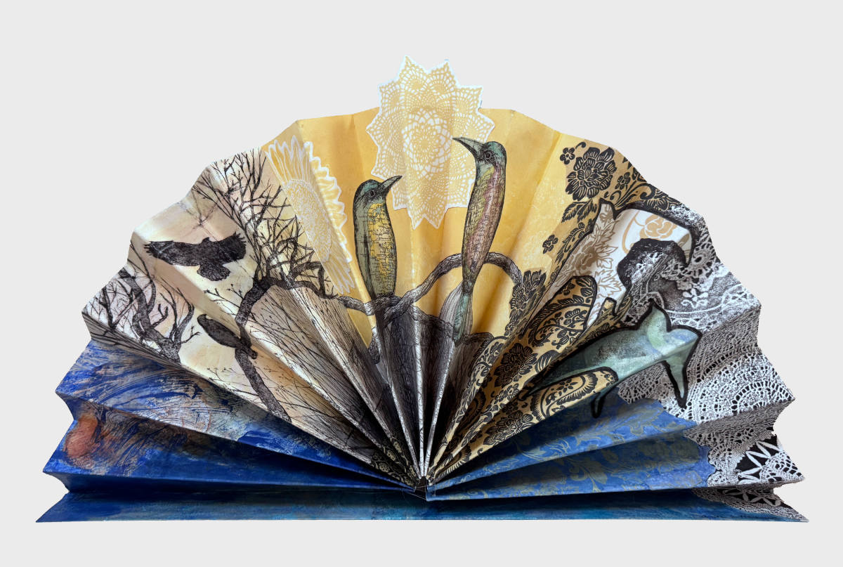
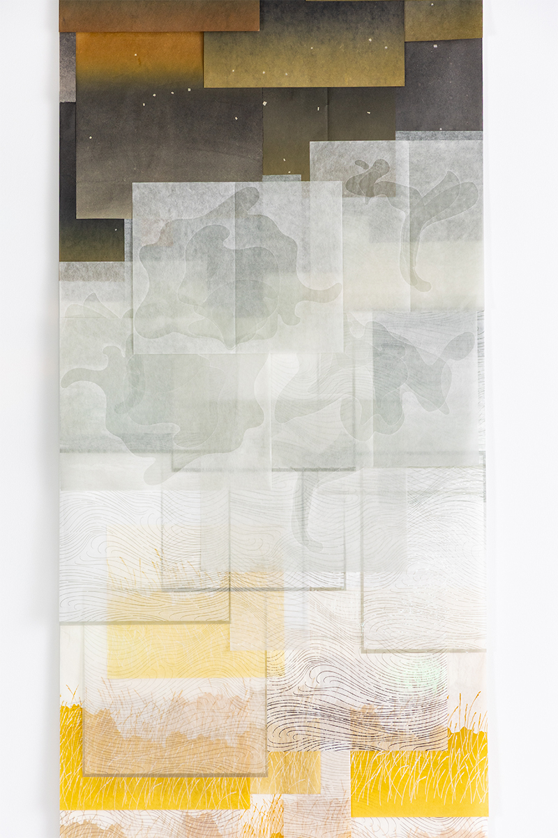
ARTIST STATEMENT Time flies, the sands of time, time to go, night-time, once upon a time, lost time, I don’t have time… There are so many ways to think about the passage of time! Before clocks were common, in much slower-paced eras, we measured time by darkness and light, the tides, the stars and the seasons. Bells chiming, hourglasses, sundials, candles, nocturnals, astrolabes, and the migration of birds helped inform people. This piece celebrates times past and hopefully flowing into a more positive future. I created this piece for the “Over the Edge— Printmaking Without Limits” exhibit at Pajaro Valley Arts. Our challenge was to think outside the usual parameters of what it means to make a print. I chose to make my largest and most complicated print ever. The vertical wall piece is a monotype printed in multiple layers on two sheets of paper, since it was larger than my press. I glued them together and added nine tetrapak drypoint pieces (printed from plates made of recycled almond milk containers), embossed prints of lace and many collage elements. The 3-D fan began as one very long horizontal piece. I scored it and attached drypoint images, some chine collé and collage elements, gelli prints and a bit of acrylic paint. Then I folded it, secured it with some clear thread, and mounted the fan onto its free-standing base. More information and process photos: https://www.anitaheckman.com/blog-1 or @anitaheckmanfineart on Instagram. BIO ANITA HECKMAN is a printmaker in Santa Cruz, CA. She luxuriates in the sheer beauty of the natural world and is moved by life’s small wonders. Her work merges color, light and patterns to form rich visual tapestries that sometimes tell a story. Anita creates monotypes (one-of-a-kind prints) with non-toxic ink, printed onto fine art paper with her Takach press. Multiple layers of ink are often combined with collage or chine collé. She also incorporates drypoint using recycled tetrapak containers, alcohol transfers and stencils. Themes include the passage of time, constellations, botanicals and birds. Anita has served on the steering committee for ARRT- Artists Respond and Resist Together since 2016. She curated exhibits featuring local, regional and international artists at the Resource Center for Nonviolence from 2012-2020. Her work is featured in numerous private collections and Kaiser Permanente Santa Cruz and Scotts Valley. Learn more at anitaheckman.com anitaheckmanfineart@gmail.com @anitaheckmanfineart |
Anna Rochester
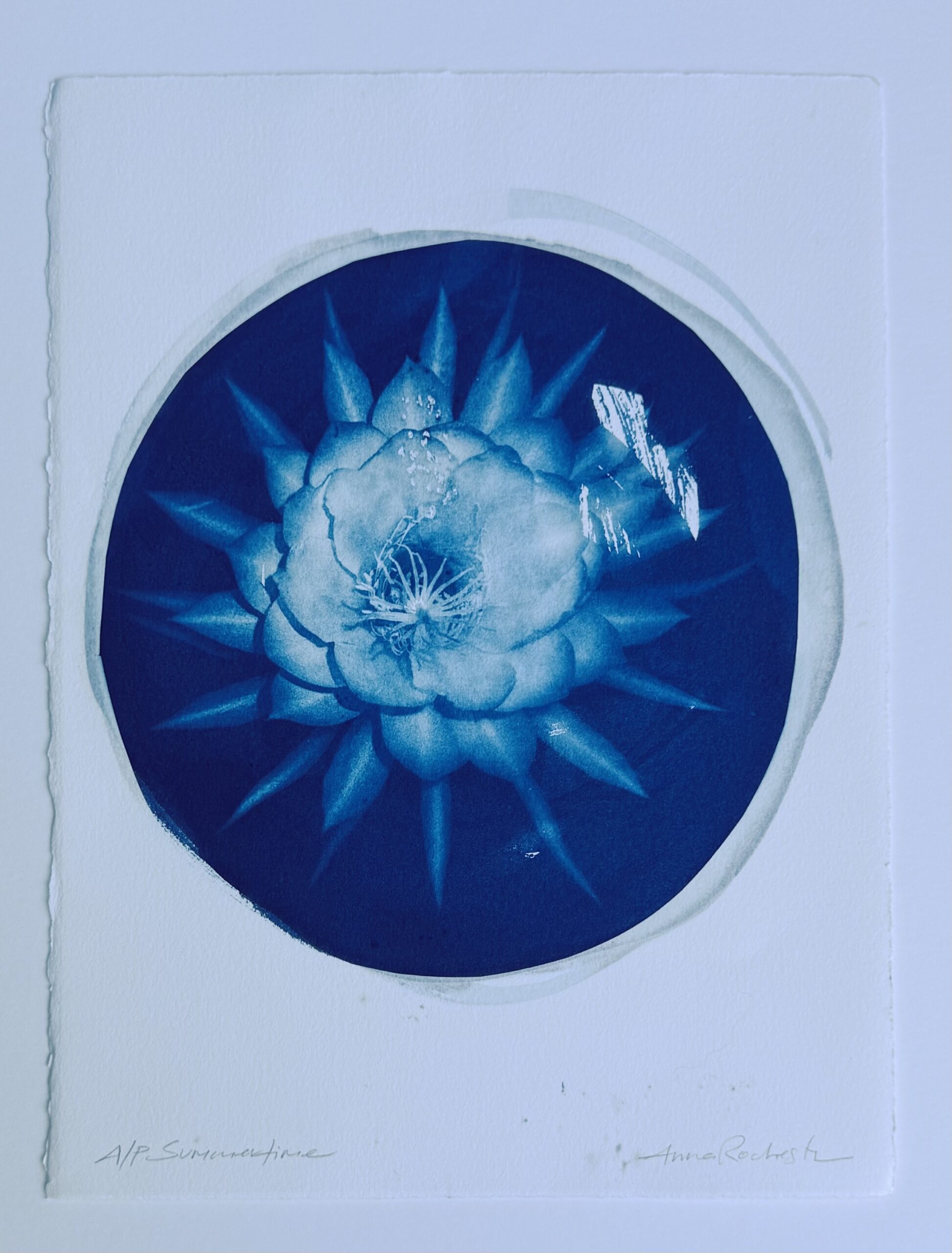
ARTIST STATEMENT The image, “Summertime – Janis Joplin” was created for a print art exchange called, Muse/Ic Art Exchange 2026. Now in it’s 4th year, with a new theme each year, the art exchange includes works by artists living coast to coast and across the Atlantic. The members are an inclusive group of artists, many of them printmakers. An expectation of the members is to support each other’s art making and daily creative rituals in a non-judgmental way. An epiphyte cactus native to Mexico and Central America, gets its name, Queen of the Night, because it blossoms only at night, for one night, and by dawn is wilted. It took four years for the first bloom to emerge in Anna’s garden. Immediately she snapped a photo of it and knew it would used as inspiration for a print project. Entitled “Summertime” followed by the lyrics, “and the living is easy”, has been covered by hundreds of artists. A few of Anna’s favorites are by Ella Fitzgerald, Louis Armstrong, Janis Joplin, Nina Simone and Lana Del Ray. Anna hopes this moment of inspiration, from the simple beauty found in this print or the song “Summertime”, by the artist of your choice, brings some ease into your daily routine. The print is a cyanotype and is printed on Rives BFK paper. BIO Anna Rochester (she/her) received her B.A. in Art Education from the University of Oregon and her M.A. from the Art Institute of Chicago, both with an emphasis on printmaking. From 1996 to 2010 she worked in Museum Education departments at world class institutes from the Institute for the Study of Ancient Cultures at the University of Chicago to the Shedd Aquarium and, then at the Exploratorium in San Francisco. Her work focused on leveraging museum collections and hands-on practices to enrich K-12 curricula, exploring the interface between artistic and scientific ways of inquiry. Since 2014, She has lived in Kentfield with her son, husband and dog. For Anna, art making remains both a way to represent the world and its abstractions, and a vehicle with which to engage with artists and students motivated by similar aspirations. Anna is the co-director of the arts-based nonprofit called Connect the Dots Art Studio. They like to focus on collaborations and inviting the community to join in the art making experience. She is thrilled to be the co-curator of the Marelli Window Display in San Rafael, which has been a shoe repair business for over 100 years! arochester@gmail.com https://www.instagram.com/anna.112studio/ |
Anna Homchick
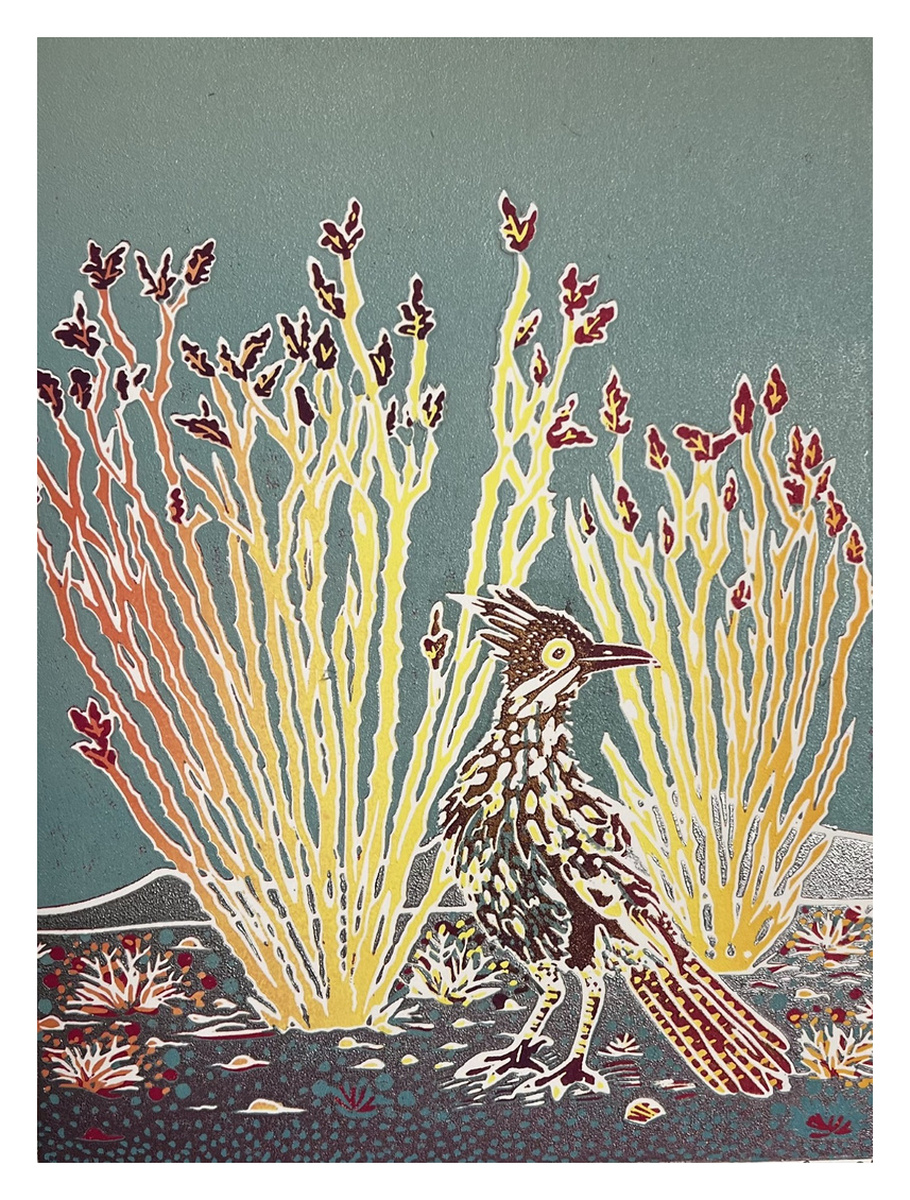
ARTIST STATEMENT Anna lives in Sonoma County. Her formal art education included classes at UCLA where she worked in pencil and later studied oil painting. Her artistically-accomplished Aunt suggested she explore printmaking as she could see themes and a style that would transfer well to the medium. Anna has had minimal formal training in Linocut, preferring to develop on her own, while studying accomplished linocut artists. She is drawn to the reduction method, which begins and ends with a single linoleum plate, with the artist adding layers of detail and color changes with each removal of detail from the single plate. Errors are not tolerated, and one must be fully committed so as not to damage the plate. Anna likes to do landscapes, with California and Sonoma County often featured. She enjoys the work of artists who can show space and atmosphere in their prints, she tries to achieve this effect with her prints. Exhibited at: 2023 de Young Museum Open, San Francisco BIO I’m a Linocut artist that lives in Sonoma County. I sell my artwork at Healdsburg Center for the Arts. ahomchick@gmail.com INSTAGRAM https://www.instagram.com/annavhomchick/ |
April Vollmer
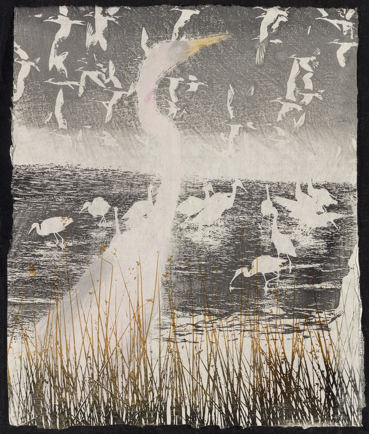
ARTIST STATEMENT My prints are autobiographical stories woven from the patterns and contradictions of nature and science. The methodical steps of printmaking, its technical and scientific character, its repetitions, offer me a way to generate layered, thoughtful images. This hand cut great egret block is printed with three machine cut blocks: terns, snowy egrets, tule grass, all based on my photographs of the Pacific coast. With its refined cutting and printing tools and resilient handmade paper, Japanese woodcut has given me a way to make images that are tactile and immediate. Its physical touch gives substance to fleeting visions. The reality of extinction and climate change underlies all my recent prints, printing gives me a way to share insights and remain positive in the face of loss. BIO April Vollmer is a New York artist and author who makes prints, books, and photographs, and specializes in Japanese woodcut, mokuhanga. With an M.F.A. from Hunter College, she first visited Japan with the Nagasawa Art Park Program in 2004. Vollmer carves freely and prints blocks in different orientations and combinations, generating images through the processes of printmaking. She promotes cultural exchange through mokuhanga and is on the advisory boards of the triennial International Mokuhanga Conference, Japan; Kentler International Drawing Space, New York; and the Mokuhanga Project Space, Washington. In addition to exhibiting prints, Vollmer has published in journals including Science, Printmaking Today, and Contemporary Impressions. Her book, Japanese Woodblock Print Workshop, was released by Watson-Guptill in 2015. april@aprilvollmer.com https://www.instagram.com/aprilvollmer_artist/ |
Barbara Poole
ARTIST STATEMENT I have always either painted, made etchings or built little sculptures. At first my work was based on what I saw and often was a documentation of the passage of time. More recently I make images from my imagination with a narrative that is meaningful to me. Usually the images are based on interactions with others or events that have affected me during the year. BIO My work is developed from my imagination, and I think of images that have been important to me in the past year and develop those into etchings. Each year my work varies, as I decide my focus and see what comes from that. bp.poole2@gmail.com barbarapoolefineart.com |
Barbara Morris
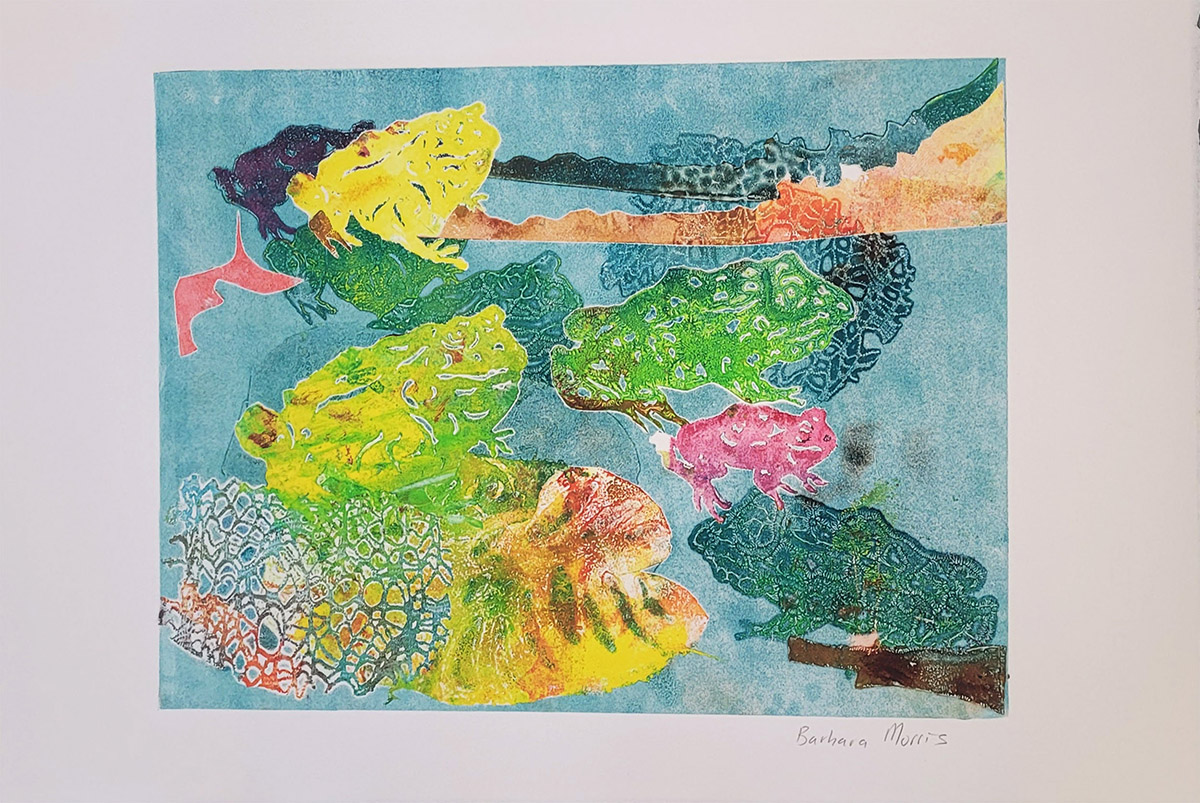
ARTIST STATEMENT My recent monotype series are often inspired by nature, the flora and fauna which surround us, as well as my love of color. I have employed a variety of techniques to obtain my desired results, often using stencils of animals, flowers, or birds that I draw, then cut with an X-Acto knife or nail scissors, to use as a template. These produce a fascinating effect to be achieved as the ink below the stencil is revealed, and the stencils themselves build up interesting layers of color. I enjoy combining these with other, found materials. Sometimes I use leaves as a type of stencil, intrigued by the minute level of detail of veining that is revealed in the process. Departing somewhat from the natural world, more abstract compositions are formal explorations of the evocative potential of found objects. Printmaking is such an engrossing medium because of the element of surprise, every time I pull a print revealing the image is such an exciting moment, much like opening a present. BIO Barbara Morris is an artist and writer currently living in the San Francisco Bay Area. She received her MFA degree in painting from the University of California, Berkeley. Her work is colorful and expressionistic, with an exploration of both figurative and non-representational subject matter utilizing abstract paint handling techniques. Most recently, Morris has been working with imagery derived from or inspired by nature, with an emphasis on gesture and process. In addition to drawing and painting, printmaking has become an increasingly significant component of her studio practice. bjmorrisart@gmail.com @bjmorrisart |
Barbara Jacobs
ARTIST STATEMENT I am fascinated with exploring color and texture through non-representational subject matter expressed in a variety of media. Among them are: pastel, strictly monoprint, or monotype with oil stick or soy-based ink + additional materials; digital art combined with physical media in layered processes; drawings, painting, and other items sometimes included in ‘mixed media.’ Regardless of the material, my focus is on color–even when limited to black-and-white–and our response to color, texture, and a non-representational approach that invites viewers to explore their own interpretations and responses–whether elusive or literal. For the most part, my work is on the smaller side physically, but in the process I always see it large-scale in my own mind, as if one could walk into the spaces and among the shapes. I’m not tied to any one medium, concept, or subject but enjoy myriad explorations, even including line drawings of both semi-representational and highly imaginative subjects. Starting a new piece is typically moved by being inspired by the medium…imagery emerges or develops as the work proceeds, and I tend to work in short sessions rather than longer phases…but time flies, so to speak, and this is a good example of how that works! Regardless of the materials I work with, layering elements is important to me for my own process and experience and also for inviting the viewer to share in that experience. I’ve been able to also incorporate my past work of over 25 years of creating commissioned wall finishes including glazing, murals and Venetian plaster. Themes of landscape and land-forms, architecture, history/culture, natural and human phenomena, and interpretations of being in and observing time and space in myriad dimensions are among the many subjects I find intriguing. The concept of “windows” is a recurring one that I continue to explore, whether in physical media, digital media, or a combination of the two, considering it in a way as a lens through which color/texture and other elements are expressed. I enjoy working in series, so you will see among the gallery images some connection between either a few or many images that include, or encompass, particular styles or media. Working in a personally non-representational approach through a variety of media and formats allows me to explore the exciting nature of this cross-dimensional viewpoint and expression. As the subject matter of any piece evolves—whether intentional at the outset or more intuitively, as the result of the process—I tend to work in series’ of pieces that may even move from one medium to another as the inspiration and processes develop. Some of my work is visible on my instagram page (@bjacobscolor). BIO Originally from Minnesota, I moved to California in 2015 from Massachusetts, where I’d lived and raised my family since 1968. My formal artistic education includes work done at the Academia di Belle Arti in Florence, Italy; the University of California, Berkeley, where I had the good fortune to study with the abstract expressionist painter, Adja Yunkers, and with David Hockney! Both were memorable and very inspiring experiences. At the University of Minnesota I received my Bachelor of Arts in studio art with a concentration in painting and printmaking. Aside from my personal art work, since 1986 I have been very active in helping clients create supportive, comfortable environments for home or work through my continuing practice as an architectural color consultant. Growing up in Minnesota amidst the paintings, stained glass and sculpture of my father, William Saltzman, I’ve lived in art-and-color-centered environments for my entire life. I took it for granted, and did not realize at the time what an impact that had—and would have in the future—but the more my personal art work evolves, the more obvious it becomes. It’s been a fascinating journey. While my five children were young (now they are adults with their own families), my own art work was really on the back burner. But I am enjoying re-exploring that evolution. Over the years, I’ve enjoyed being published in and interviewed for a variety of national professional and shelter media, both in print and online, on the subject of supportive color design and color selecting for interiors and architecture. Most recently are two articles on the intersection of fine art and design. I’ve also enjoyed the creative process of authoring a unique coloring book – “Windows to Imagination, a coloring book + color journal” (available at Amazon.com). It’s quite different from others, incluiding space for journaling, ideas for reflection, and a number of unique styles of images for coloring. In addition, readers and artists can make use of the art-making information that I have included in the book. Music has crucial role in my personal world. As a classically trained violinist, since 2016 I’ve enjoyed the transition to playing bluegrass and old-time fiddle and banjo. The. musical and social gratification is tremendous and it’s a key part of my life and even artwork. barbara@integralcolor.com @bjacobscolor |
Barbara Nilsson
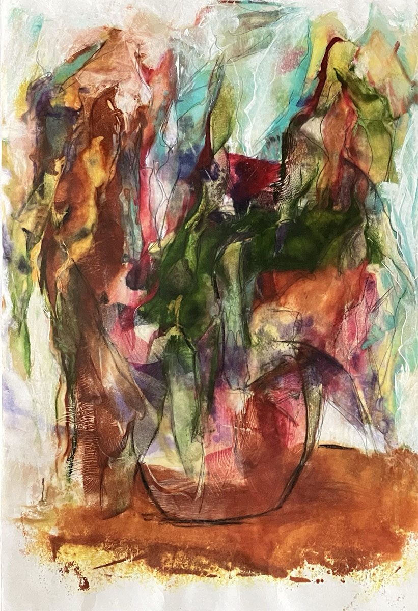
ARTIST STATEMENT My work is primarily monotypes with bees wax and pigment, i.e. encaustic. The wax has a translucent quality making printmaking a friendly medium for my abstraction. Using many thin layers of encaustic gives the monotype a multi-dimensional and translucent effect. It is nature and my surroundings that speak to me, that bring me peace, that inspire me and that can also upset me. The earth is of extreme importance to me, not only because of what is going on with it in regards to our environment but for it’s beauty, it’s gifts to us, it’s bounty. My image “The Bouquet” is ambiguous in its interpretation. Is it autumn? Is it withering? Is it just beautiful as it is? It is up to the viewer to determine. BIO Barbara Nilsson started her artistic career as a contemporary printmaker. Her favorite printmaking medium is the monotype. Barbara is also a painter of encaustic, cold wax and oils and acrylics. Spanning 50 years her work has been published and included in hundreds of national and international exhibitions receiving numerous awards. She has spent many years teaching children and adults drawing and oil painting. She also gives workshops in various mediums. Nilsson is the recipient of grants from the Philanthropic Ventures Foundation, Oakland, CA and the Peninsula Community Foundation, San Mateo, CA. and her art has been featured in publications including: California Society of Printmakers, One Hundred Years 1913 – 2013, Art of Northern California, American Art to name a few. Ms. Nilsson’s work is included in the permanent collections of: The Library of Congress, Washington DC; The National Museum of Women in the Arts, Washington DC; and U.C. Davis Medical Center, Sacramento, CA. and other private collections. barrichvin@gmail.com |
Bob Pennycook
ARTIST STATEMENT I create small, mixed media monotypes using imagination and abandon tied to natural themes. The images invoke landscapes without documenting place; somewhere vaguely recognizable yet filled with soft edges and shapes and textures that provide a temporary spot for relaxation and solitude. BIO Bob Pennycook is a contemporary mixed media landscape artists based in Tweed, Ontario, Canada. Working primarily with printmaking (monotypes and relief prints) he also explores acrylic and oil painting as part of his artistic practice. His work is an expressive interpretation of the landscapes that surround him, capturing the interplay of shapes, colour, textures, rhythm and patterns to be found in nature. With decades of experience, Pennycook has exhibited extensively in juried shows across Canada and the United States, earning recognition for his dynamic and textured approach to interpreting the landscape. He is an elected member of The Society of Canadian Artists and his work has been featured in numerous publications and corporate collections. Beyond his own artistic practice her has contributed to the art community as a workshop instructor, editorial writer and designer sharing his expertise in printmaking and painting with artists across North America. bob@bobpennycook.com bobpennycook.com |
Brian Nicolas-Espinoza
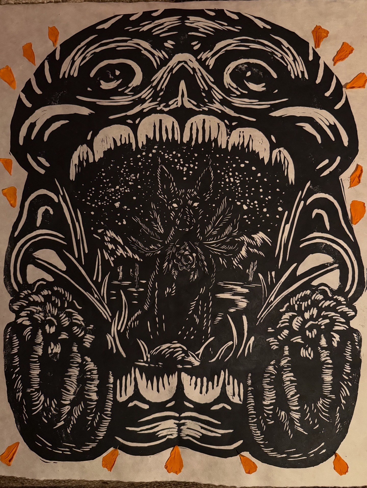
ARTIST STATEMENT Brian uses his craft working extensively in the music industry incorporating culture, history, and his passion altogether. Drawing influence from Mesoamerican cosmovision, mortality, and indigenous reclamation, he creates to inform and showcase solidarity with likeminded people and a everdetermined pursuit to document current events amidst the suppression of voices on social media. Brian has worked with musicians to support vulnerable and underrepresented communities by creating artwork for band merchandise. For example, hardcore band Xibalba releasing merchandise to support families affected by ICE in which funds were distributed to grassroots organization, Union Del Barrio. Fire In the Mountains festival allowed Blackfeet Nation high school students from the reservation to collaborate with artists bringing their vision to life. BIO Brian Nicolas-Espinoza is a printmaker and illustrator born and raised in Boyle Heights, CA. Having gone to CSU Chico there, Brian developed an interest in art history and a pursuit to reclaim his roots through art. He explores deeper into his Mixtec roots and religious trauma in Catholic schools as commentary to express his body of work. His work is an amalgamation of themes bridging music and culture to create narratives that resonate between the two spaces. macuahuitlpress@gmail.com instagram.com/macuahuitlpress |
Carol Levin
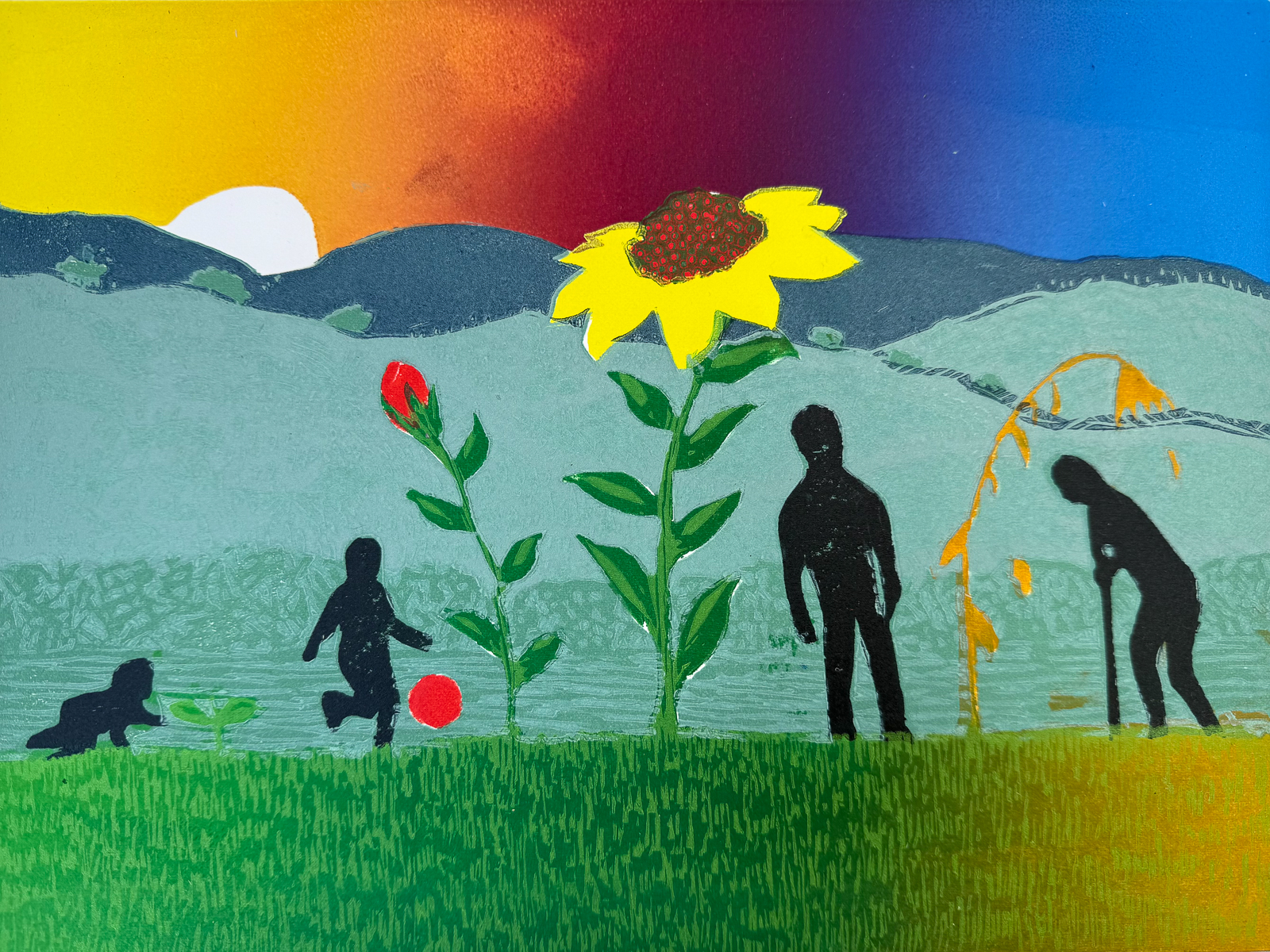
ARTIST STATEMENT This year, I have had a significant lost of loved ones, long known friends and acquaintances. I have aging parents along with the impacts of aging on my own body, now matter how well I take care of myself. I have nieces and nephews bringing new life into this world along with the joy of watching my own grandchildren and children grow. This piece hopes to describe life as we age, like a flower that grows and dies, we too grow the end is inevitable, and most likely not one of our choosing. This piece is also experiments with processes that I had not yet tried as a printmaker. First, I carved three shino blocks and originally printed this piece using watercolors on Japanese paper to create a mokuhanga print that was much more delicate and subtile then the work I am exhibiting. Second, I used the the same carved blocks with oil based inks on a sturdy Rives BFK – incorporating rainbow rolls and some reduction carving to create more textures and details. The print was passed through the press, about 9 times. BIO Growing up, Carol Brent Levin spent many summers attending camp in Northern Michigan where she fell in love with the outdoors. This love of nature continued through her adult life and is seen through her eyes in the art she creates. She spent many years exploring the natural wonders of the environment. First, as a photographer she began taking photos of tiny flowers growing along roadsides. While trying to identify the plants, she learned about invasive species and human caused changing habitats. Working with the local land trust and a member of the California Native Plant society, Carol has been involved with restoration work. Often her art explores mans relationship to nature or the beauty of nature itself. Carol has been taking art classes at the local community colleges as well as many workshops offered in Northern California. After taking an etching class, she became very interested in process of printmaking. Although she enjoys sketching, painting, and photography, printmaking and ceramics have become her main avenues for artistic expression. While she has a small etching press in her home studio, she has enjoys working shared community presses in places like Walnut Creek, Berkeley, and Benicia. carolbrentlevin@gmail.com wildflowerartist |
Cathie Crawford
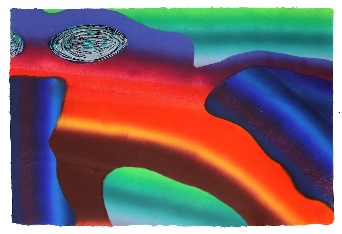
ARTIST STATEMENT The beauty of water and the ever-changing colors of the landscape have been a constant source of inspiration throughout my forty-year concentration on the color reduction woodcut print. My recent work has been a gradual transformation to a more non-objective approach to the landscape. These extremely colorful woodcuts are a convergence of color, line, shape and texture in an ambiguous space with whispers of landscape. Color is everything. I am obsessed with it. These prints are a celebration of the life of our beautiful planet, which deserves our awe and respect. I also believe we, like the planet, are always in the process of becoming or in the mist of emerging. Alarmed by Climate Change, I feel a responsibility to the life of our planet. The Covid pandemic was Mother Earth getting even for all of humanities abuses. I am very worried about the impact of fossil fuels on the environment. Several of my recent prints express my concern for our environmental crisis as it affects our oceans and waterways. The warming of our oceans will have a negative impact on all of us as well as future generations. My prints are known for their luminous color achieved by numerous runs through the press using blended rolls of transparent ink applied with brayers and mylar stencils to my printing matrix. I print reductively from one piece of ¼” plywood as a printing matrix on handmade Japanese Kozo paper with oil-based relief ink. I also use mylar stencils to work reductively within one shape at a time to extend the color possibilities, printing ‘pochoir’. You may view how I made each of these prints, run by run, on my website www.cathiecrawford.com under ‘How I Print’ or ‘Newest Print in Progress’. https://www.heartland.edu/artGallery/the-floating-world.html https://sparcinla.org/wp-content/uploads/2025/01/At-the-Threshold-Portfolio_2024.pdf https://youtu.be/ybIksMgcbGE Riverfront Museum Zoom presentation BIO Originally from New York City, Cathie Crawford lived overseas six years in Saudi Arabia and France. She returned to Illinois in 2004 from Grenoble, France. She has concentrated on the color reduction woodcut since earning an MFA degree in 1987 from Bradley University in Peoria, Illinois where she had a one-person retrospective in December of 2016. Her work has been included in over forty solo exhibitions, over a hundred juried national shows and thirty-six international juried exhibitions since completing a BFA from The Ohio State University in 1971. Crawford has received fifty-seven awards, fourteen since 2021. Her woodcuts have been exhibited in thirty-three states as well as Bulgaria, Cuba, France, Italy, Poland, Saudi Arabia, and the UK. Crawford’s prints are included in private and corporate collections in ten countries including at the Print Center New York in New York City; The American University Museum, Washington DC; The Safeya Binzagr Darat in Jeddah, Saudi Arabia; the Casa de las Americas, Havana, Cuba; the Newark Public Library in Newark, New Jersey and the Peoria Riverfront Museum in Peoria, Illinois. www.cathiecrawford.com cathienrich@gmail.com www.instagram.com/crawfordprintmaker |
Chanel Mace
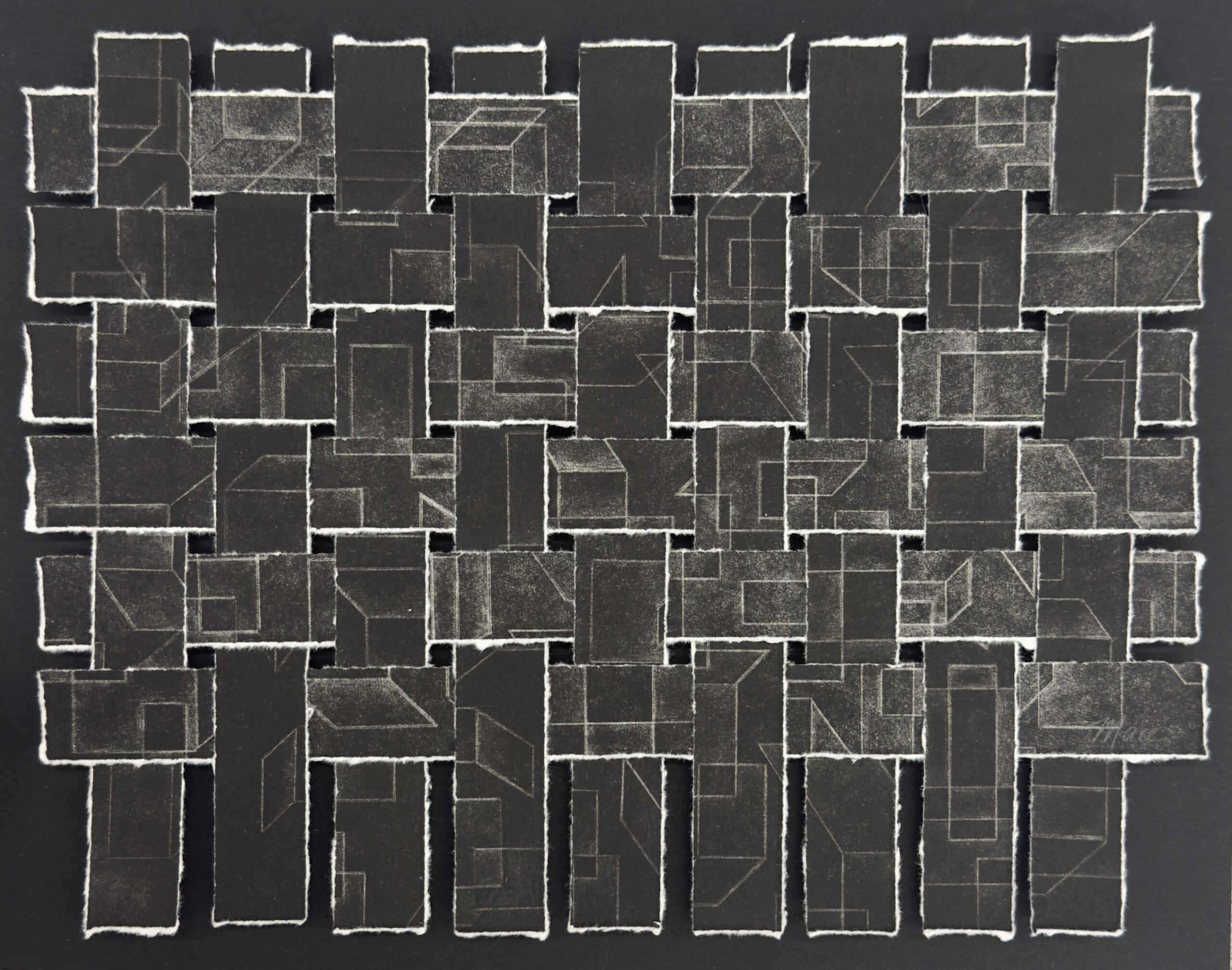
ARTIST STATEMENT My work is reactionary to the environment, both psychological and physical. Each person interacts with space in a unique way, and those interactions trigger deeply personal sensations. Through the process of printmaking, I respond to these sensations by creating meditative, structured compositions. Repetition and form offer a kind of sanctuary, one that I build layer by layer, navigating between chaos and calm. Printmaking, with its deliberate and tactile nature, allows me to reflect on the human experience of navigating space and relationships. Just as we constantly adapt to our surroundings and to one another, I adapt to the challenges of the printmaking process, transforming them into something more cohesive and whole. My choice to work primarily limited color, invites closer inspection of form, surface, and nuance. Each layer becomes a space to explore, a place to get lost. Although my work could be created more precisely using new technologies, I intentionally preserve the artist’s hand in every element, from the carving of the matrix to the inking of the plate and the pull of each print. I use a method originally intended for mass production to create singular, intimate works of art. BIO Chanel holds a BFA from the School of the Art Institute of Chicago and studied at Central Saint Martins in London. After graduation, she lived in Los Angeles, where she interned at Josephine Press. While in LA, Chanel expanded her knowledge by working for artist that included the Haas Brothers and Michael Schmidt, gaining experience in metalwork with silver and copper. After her time in Los Angeles, She completed a yearlong postgraduate residency at The Wrocław School of Printmaking in Poland. She then spent eight years living and working in Australia. While in Sydney, she was very active in the local printmaking community, working out of The Workshop Arts Centre in Willoughby and serving as acting Secretary of the North Sydney Printmakers Association called Open Bite. After a decade abroad, she returned home to Sacramento, where she now works out of Myrtle Press and is a member of the California Society of Printmakers. chanelcmace@gmail.com @chanelmaceart |
Christine Herman
ARTIST STATEMENT The patina of time and the ephemeral beauty of nature are key subjects that inform my printmaking practice. Intrigued by creating work that points to ideas obliquely, I juxtapose the presence of the natural world with the human experience within it, gently pointing to the possibility of varied perspectives and emotional associations. Taking photos is a fundamental part of my practice as a printmaker, which I use to document vistas and details. It is also a way to recall my emotional responses to the raw beauty I witness. The explorative journey outdoors is as much part of the work as the resulting prints. The ever changing elements of water, wind, and flora capture my attention. Weathered wood, tidal marshlands, coastal shorelines, and redwood groves, all intrigue me and act as inspiration. My mediums of choice are various forms of printmaking (monotype, collagraph, woodcut) and mixed media techniques including suminagashi, collage, and the creation of hand made books. My approach usually involves the deconstruction and reassembling of prints into layered compositions that create depth and richness, as I rearrange formal elements to depict fleeting, intimate, and elusive moments. BIO Christine Herman is a printmaker whose abstract works on paper are interpretations of inspiring landscapes and natural forms. A native of Canada, she currently lives in Alameda, California. Christine’s voyage to becoming an artist has been long and winding. While still practicing as an interior designer, she began working in watercolor and exhibiting her paintings in galleries and shows in the Midwest. In 1999 she moved to Taos and began studying printmaking. This pivotal event changed her creative trajectory, after which she focused on monotype. She continued with printmaking studies at the University of New Mexico, the Institute of American Indian Arts and the University of Minnesota at Duluth expanding her work to include collagraph mono prints, woodcut, and book arts. Represented in several private and corporate collections, Christine’s work is included in “Trail Guide: The Northland Experience through Poetry & Prints”, “Response” Prints & Poetry by Calyx Press and “Dust & Fire: Annual Anthology of Women’s Writings”. She is a past member of the Northern Printmakers Alliance, New Grounds Print Workshop in Albuquerque, LIBROS New Mexico Book Arts Guild, and Highpoint Center for Printmaking in Minneapolis. christinerosyherman@gmail.com christinehermanstudio |
Cindy Ostroff
ARTIST STATEMENT It is the creative tension in printmaking that draws me in and motivates me. Currently I am exploring ways to use recycled objects, a range of papers, and weaving. I am also exploring textiles. BIO My arts education includes a BA from Rutgers University. I have participated in retreats at Haystack, Rhinebeck Institute, and Zea Mays. I often exhibit at Falkirk, Marin MOCA, the Osher Marin JCC, Sebastopol Center for the Arts. I teach at the Sonoma Community Center. cindyostroff21@gmail.com cindyostroff21 |
Colleen Leahy
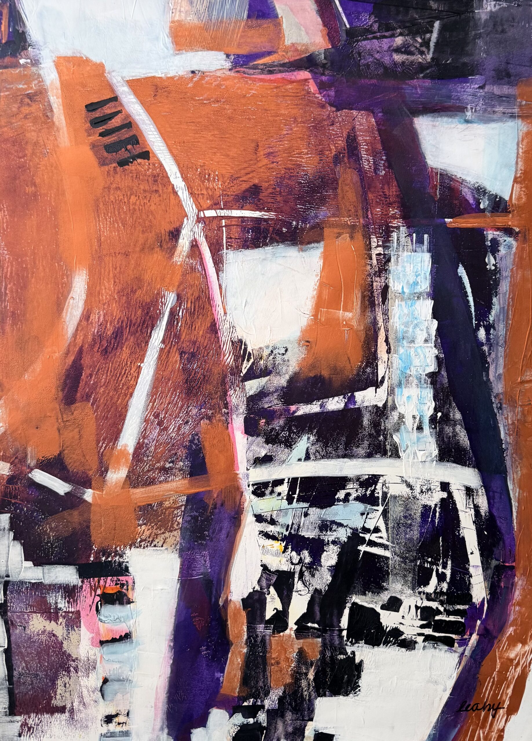
ARTIST STATEMENT Plans and expectations can route life in specific directions but inevitably you find those moments to do what contents the heart. For me those moments have always been about making art. Since 2010 I have had the time to pursue printmaking on a full time basis. Beginning with copper plate etching, working through screen printing and lithography I have developed skills that making adding ink or paint to paper an endless exploration. This works represents my current interest in monotypes with hand color. I focus on the elemental that is in front of me. In Breakup 2 I am reflecting on the speed and the drama of the thaw that ends eight months of snow blanketing Anchorage, Alaska, which was my home from 1987 through 1990. I believe in close observation of the ordinary because, in my life, that is the substance of the extraordinary. BIO Colleen Leahy is a printmaker currently living and working in Palm Desert. She is a transplant from Bainbridge Island, WA. She began her printmaking practice in 2010, at Inkgarden Studios on Bainbridge Island. Following several exhibitions on the Island, she joined Seattle Printmakers and began a multi year education in Printmaking at Pratt Institute in Seattle. Pratt provided experiences in etching, lithography, mezzotint, screen printing and traditional woodblock. In 2012 she attended Gage Academy in Seattle and completed both Drawing and Painting curriculums. She also exhibited work in Seattle, California, Colorado and Idaho. She was part of Gage Gallery, in Seattle, which emphasizes Pacific Northwest Art. Since relocating to Palm Desert, Colleen has been juried into the California Society of Printmakers, and is also a member of Desert Art Center and the Palm Desert Artists Council. leahycolleen@gmail.com Cplprint |
Dana Zed
ARTIST STATEMENT Working in several media, I am an artist in the SF bay area interested in color, pattern, metaphysics, truth and beauty. You can see my work at danazed.com BIO ZED has been based in the San Francisco Bay area for over 40 years. She started her career with 12 years of solo shows with Ruth Braunstein at Braunstein/Quay Gallery. She has been in several Museum shows, including a solo one at the Napa Valley Museum in 1991 with glass sculpture and a solo one at the De Young Museum in 2013 with digital work. Dana has done numerous architectural glass commissions, including two Julia Morgan homes and one Maybeck residence. She has been published internationally. In 2012, Dana completed a permanent glass installation for the San Francisco public library. In 2017. Dana started studying Printmaking with Charlie Chavez because her daughter was in the class. Since that time she has added etching to her list of media. As President of the California Society of Printmakers, the last two years Zed has been significantly overwhelmed and inspired with the great quality of work in the printmaking community. Dana also teaches ceramics to over 100 students a week through her small business at her Studio. Last, but not least, she writes flash fiction., reads incessantly and rides her bicycle very long distances. danazed@me.com @thedanazed |
Danguole Kuolas
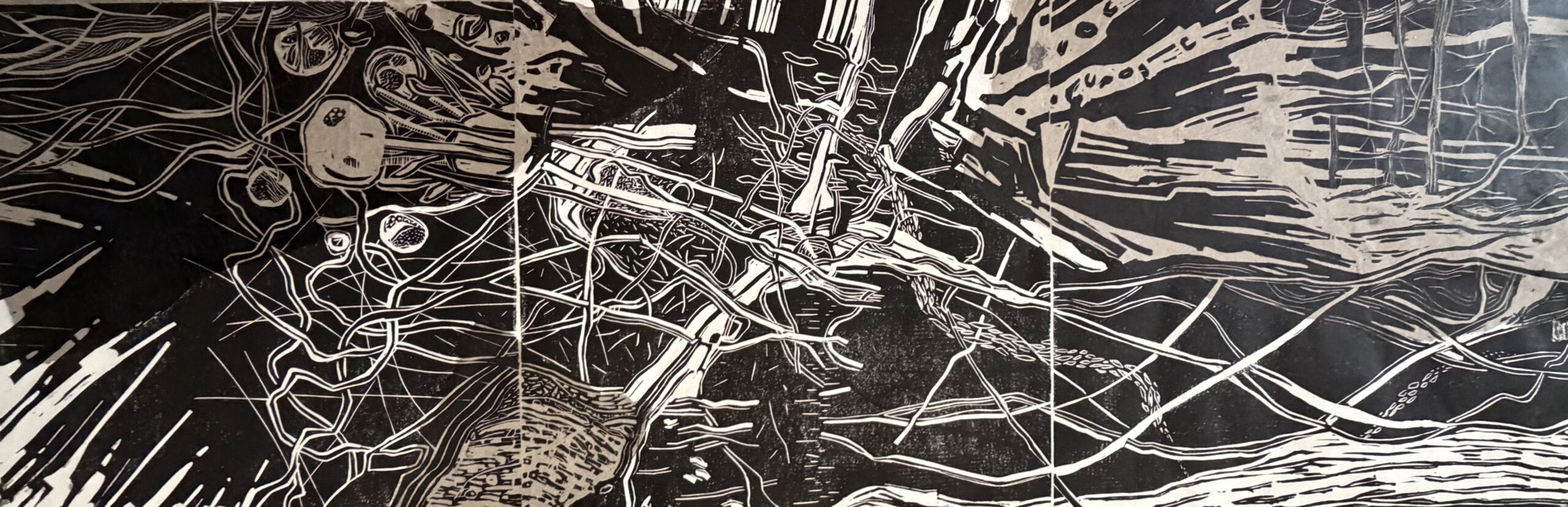
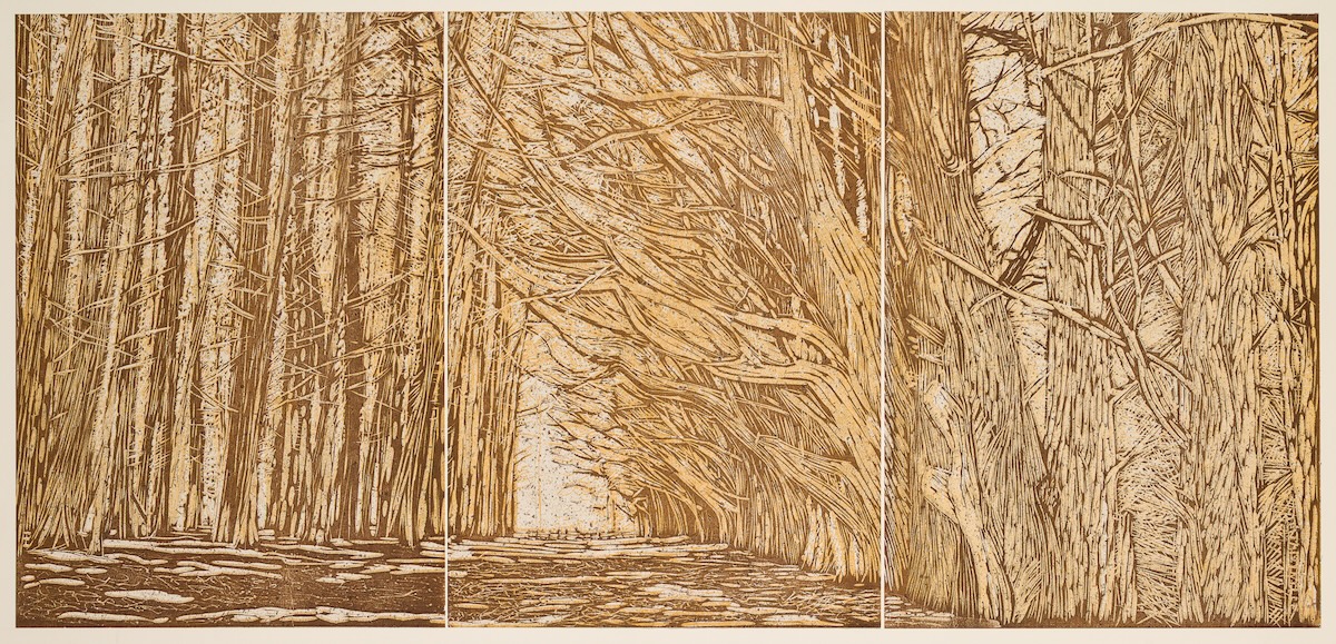
ARTIST STATEMENT I absent mindedly started sketching, letting the flow of the lines spread from a 12″ X 12″ sheet of paper onto the newsprint covering my workspace, Before I knew it, the drawing was 36 inches long. I immediately saw that I needed to transfer it to linoleum (using three 12″ X 12″ squares), adding texture as I carved. Looking to add depth after I finished carving, I chine colle’d earth-colored washi. The process of creating the print was a very liberating exercise, releasing me from the constraints of having to make a profound statement about some facet of my life or the state of the world. Someday, I may feel the need to make a deep philosophical treatise about the piece, but I am content for now. BIO Danguole Rita Kuolas is a printmaker, creating etchings and relief prints. She has a BFA degree in Printmaking. She is a member of the California Society of Printmakers, The Los Angeles Printmaking Society and The Boston Printmakers. Her work can be seen at the Valley Art Gallery in Walnut Creek CA, the Moraga Art Gallery in Moraga CA and at the AP Gallery in Vilnius Lithuania. dkuolas@comcast.net danguolekuolas |
Deena Haynes
ARTIST STATEMENT While I have worked with a variety of art mediums, what truly captivates me is integrating printmaking, painting and photography with unorthodox processes. Whether the work is abstract or representational, an iconic or grid composition, I love the dance between the layers of ink, and between the camera and brayer. I create monotypes without a traditional press, using a brayer or pinpress, and layer with paint and/or images from my digital, instant or pinhole cameras. My work may combine screenprinting with cyanotype, photography and monoprint or drypoint and paint. Sometimes it’s hard to tell where the monoprint ends and the photograph begins, where the traditional ends and contemporary begins. I am constantly amazed with the unending possibilities with these mediums and the surprises and mystery they reveal. I am deeply influenced by the natural world and my work frequently reflects my deep resonance with the unapologetic “isness” of wild places. My work is often exploring juxtapositions or seeming dichotomies—the hidden and revealed, the obvious and mystery, the rhythm and stillness, or the ancient and contemporary. Website: www.deenahaynes.com Instagram: @deenahaynesartist BIO Deena Haynes is a multidisciplinary visual artist living in the hills of Santa Cruz County, California. Across varying subjects, her work is unified by an ongoing exploration of materials and process. She combines photography, printmaking, and painting through layered and often unconventional processes, creating work that moves between representation and more impressionistic or expressive interpretations. Her deep love of nature is often reflected in her work. Frequently found hiking or cycling around Santa Cruz County, Deena draws inspiration from the landscape and her close observation of it—an influence that often emerges in her imagery, palette, and choice of materials. Deena is a longtime participant in Santa Cruz Open Studio and her work has been exhibited in New York, San Francisco Bay area, and Santa Cruz galleries. Her work is held in private collections across the United States, Canada, and Europe. deena@deenahaynes.com @deenahaynesartist |
Diana Castillo
ARTIST STATEMENT Monotypes have become an unexpected addition to my art practice. I enjoy working subtractively, revisiting places and memories through loose marks and pulling ink until I arrive at an image that feels familiar. I have found that landscapes lend themselves quite naturally to this process because of how they live in memory, feeling both impossible to forget as well as impossible to remember and capture in their entirety. Having lived in different cities and states across the country has made me reflect on my relationship to people and places and the transience that can accompany the feeling of home. BIO Diana Castillo is an El Paso, TX native based in Oakland, CA. She holds degrees in Music and Spanish from the University of North Texas and is currently studying Art at Laney College and Berkeley City College in the East Bay Area. Her works often explore the themes of identity, nostalgia, family, and the idea of home. dianacastilloelp@gmail.com |
Diane McLeod
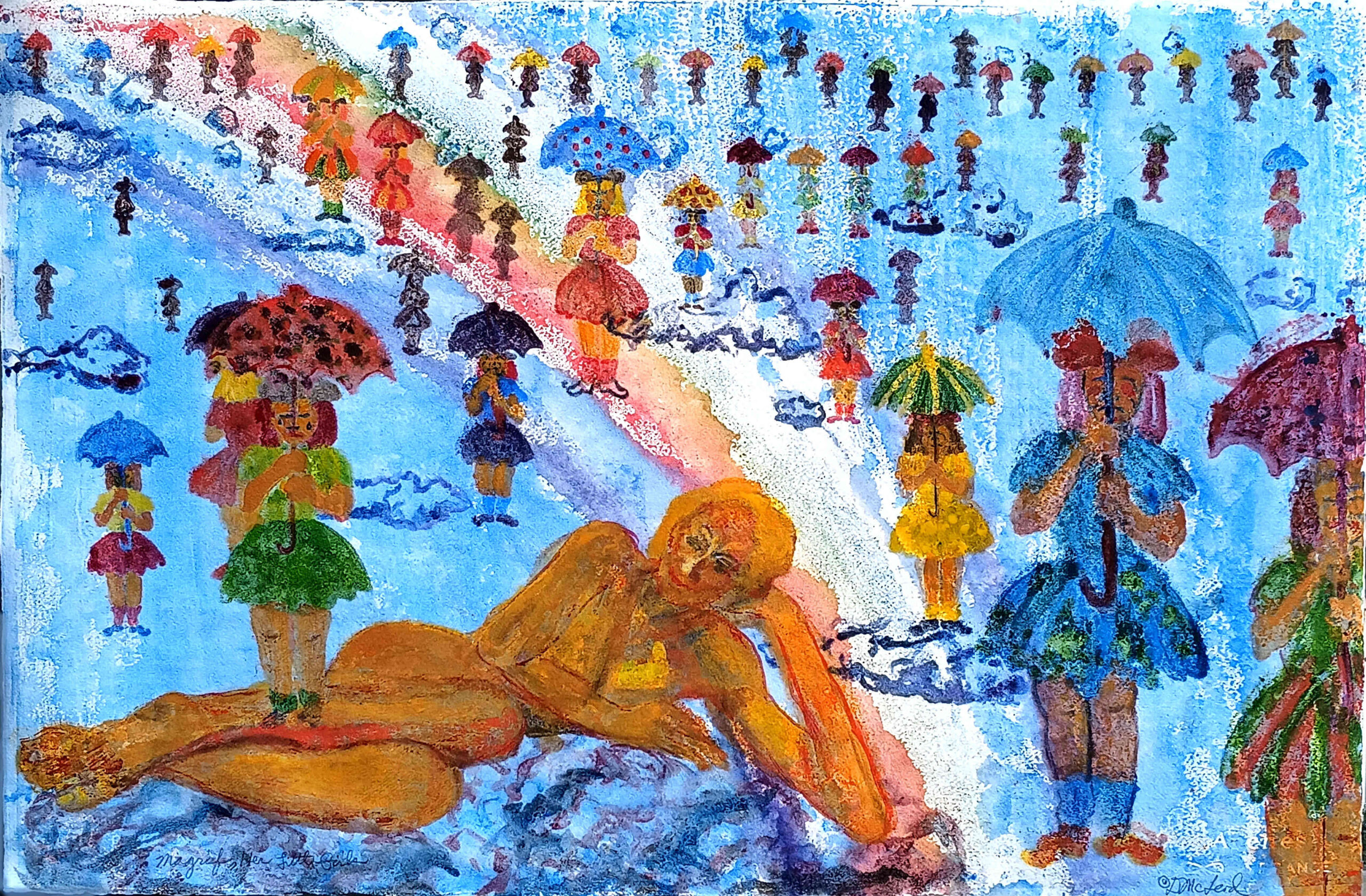
ARTIST STATEMENT Her Mah-grief is one of a series begun in 2025 that explore my personal interests, memories and subconscious life. Through this series I not only explore a new direction in the theme of my prints, but also a printmaking technique seldom used by me but now employed consistently throughout the prints, of which there are eight so far. The goal of my Watercolor Printmaking Transfer is not to accomplish images that so much look like traditional watercolors, but to capture the gritty, patterned effects that result from the lifting technique and are reminiscent of “grainy” memories and the shifting from reality that happens in recalled events. The theme and technique also lend themselves to fantasy and myth, quirkiness and humor that have emerged during the process. BIO Diane McLeod is considered a Master printer with more than 50 years of Printmaking experience in all areas of printing techniques. She pursued her love of this ancient art form after graduating from New York University with an MA in Printmaking and Painting. She has an extensive exhibition record including one person shows, group exhibitions, and invitationals. She has received a great amount of recognition; Foundation Purchase Awards, commissions, other special opportunities and many news write-ups. Her community service includes being a founding member in 1973 of an all woman, feminist art gallery, WARM, the Women’s Art Registry of Minnesota. She continues to exhibit with them in commemorative exhibitions. She was the recipient of a Fulbright Memorial Fund Scholarship and traveled to Japan, experiencing its Art, Cultural and residents. She was selected for the Long Beach Airport Mural Projects, and her Monoprint became a displayed mural. In recent years, she served as President of the non-profit art organization, the Los Angeles Printmaking Society (LAPS). McLeod has been the LAPS Foundation President for several years. In that capacity, she organizes annual monetary award competitions for excellent matriculated Printmaking students. dmcleodprints@gmail.com |
Don Dao
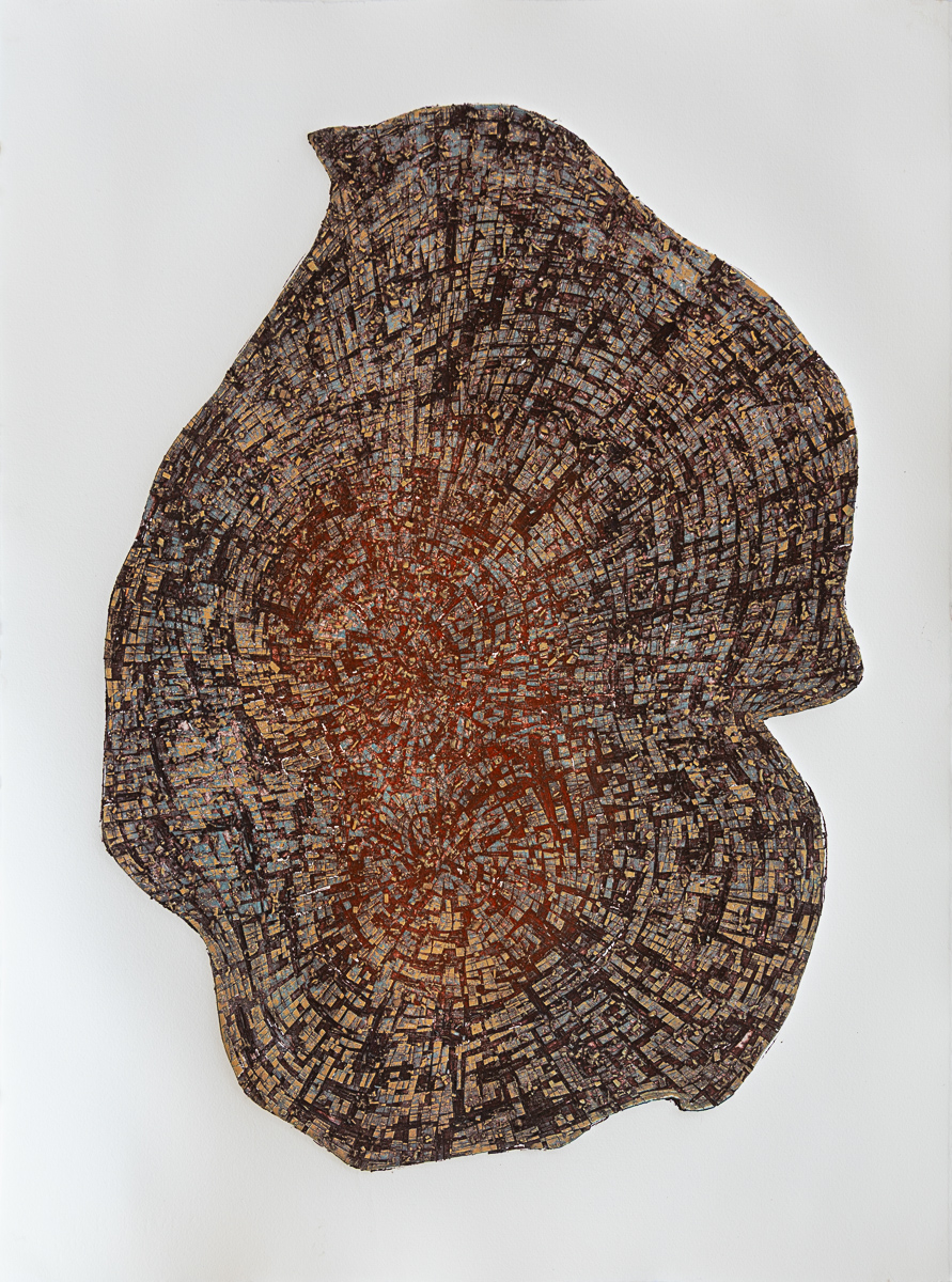
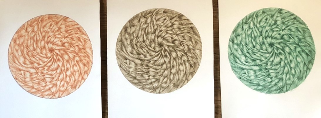
ARTIST STATEMENT I make collagraph prints shaped by tree-ring cross-sections, cellular growth, and geological fracture. I use these structures to explore how force leaves visible traces, how interruption redirects growth, and how environmental stress can remain present as form even after its original source is gone. While the imagery often begins with remnants of fallen trees or other material traces shaped by stress and time, the work is driven by what printmaking itself can generate. I build plates through carving, layering, and sealing, then print multiple inks of differing viscosities in a single pass. During printing, the inks collide, resist, and merge. Mechanical pressure and chemical resistance produce dense surfaces of radiating rings, cellular buildup, and rupture that cannot be planned or produced in advance. The resulting prints are not representations of nature. They are objects produced through extended labor, technical decision-making, and instability within the process. I am drawn to intricacy that rewards sustained looking and invites viewers to consider how the work came into being. The plate is a starting point. The print is what happens when I push the process until something unforeseen emerges from pressure, constraint, and accumulation. BIO Don Dao is a Los Angeles based Vietnamese American artist and educator. He works in experimental printmaking primarily using viscosity techniques. His work is process driven and centered on making this and the forces that shape us visible. Dao has a BA in Art from UCLA and an M Ed in Curriculum and Instruction from CSULB. dondao@gmail.com @dondaoart |
Donna Westerman
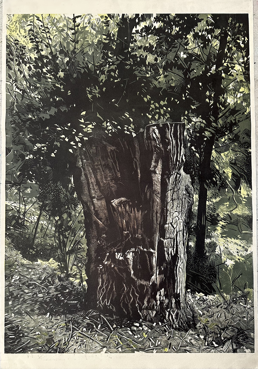
ARTIST STATEMENT The source of my work is the natural world and my place in it.. I live close to open spaces in nature where lately I”ve been intrigued by stumps and their persistence to continue to live. I am also attracted to “line” and have a love for drawing . The translation of the drawing onto wood and the difficulty of thinking backwards with registration of multiple colors appeals to my love of problem solving. BIO Donna Day Westerman, born and raised in Detroit, MI, is an artist-educator now living in Orinda, CA. She received her MFA in Printmaking/ Painting from Otis Art Institute in Los Angeles in 1965, after also having attended the University of Michigan and the Boston Museum School. Later, as a professor and chair of the Art Department at Orange Coast College in Costa Mesa, she received honors for establishing (in 1979) the first Computer Graphics program in the nation within an art department. After a long and active affiliation as a board member of the Los Angeles Printmaking Society and upon retirement from OCC, she moved to Northern California and became an ongoing artist-in-residence at Kala Art Institute in Berkeley with a focus on woodcuts. Also a member of the California Society of Printmakers and Wood Engravers Network, she has been an exhibiting artist since the age of 14. Her work has been shown both nationally and internationally and is in many prominent public and private collections. This year she was honored to have one of her prints acquired by the Smithsonian National Museum of American History. ddwestermanh@gmail.com @donnadaywesterman |
Donna Brown
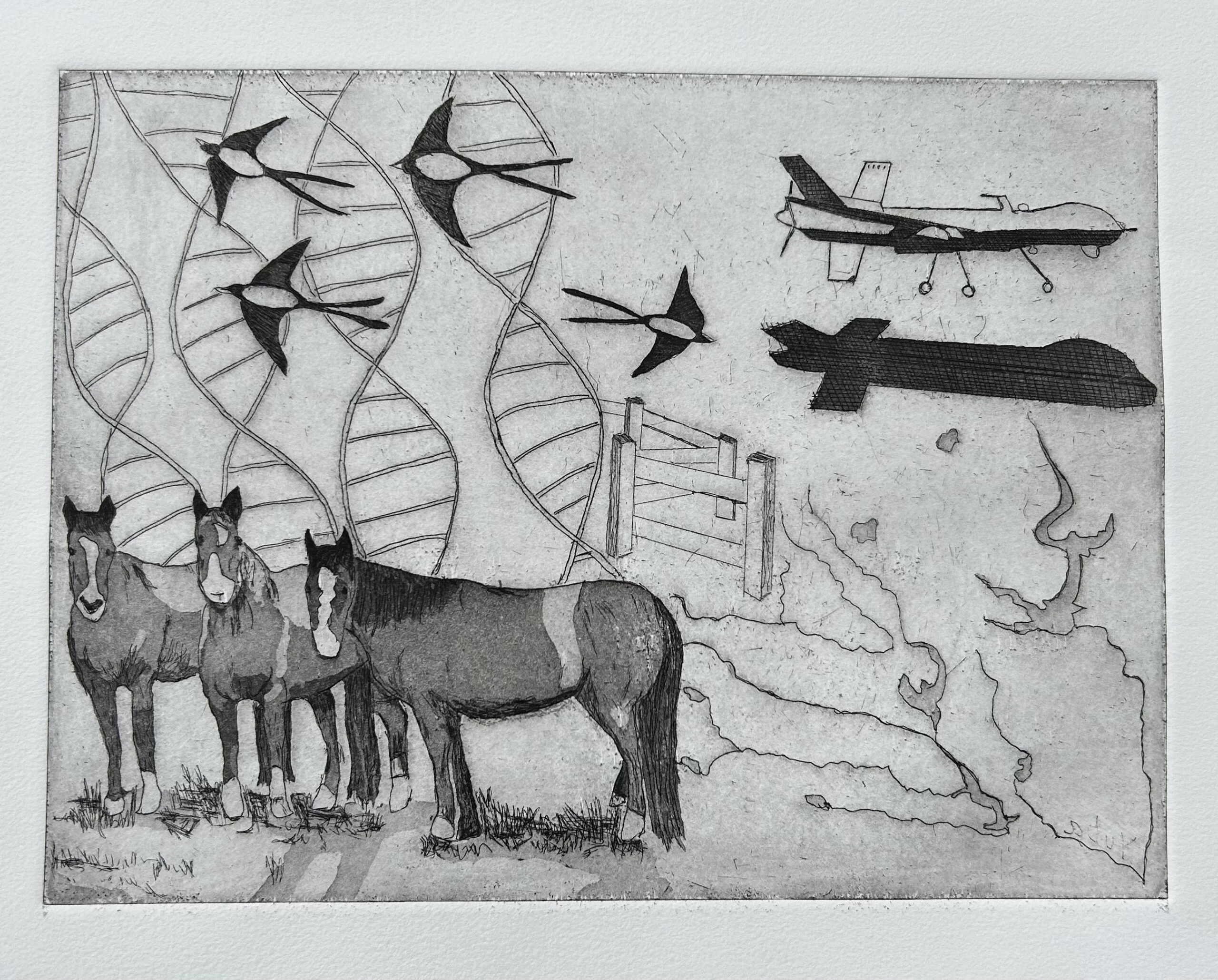
ARTIST STATEMENT The work was inspired by a trip through Yuba County near Beal Air Force Base. Beale is the home base for remote piloted aircraft, drones. Nearby Horses were munching grass, while presumably wintering over after a summer of rodeo performance. Later in the day while walking peacefully along the South fork of the Yuba River a squad of drones flew overhead, Producing an ominous response in this human. BIO Donna is a Southern California transplant and has spent nearly forty years in the San Francisco Bay area, raising a family and enjoying life. Although schooled as a scientist and working as a microbiologist for many years, Donna has always been an artist. She worked in jewelry fabrication, ceramics and metal casting before discovering printmaking in 2014. From that point on printmaking has been her passion. The entire procedure from imagining the image to carving the plate, inking the plate and printing the image all allows for the subtle variations that add to the mystery of the process that she so much enjoys. Donna’s artwork is generally figurative and focuses on special times with family and the people in her life that inspire her. Her artwork attempts to capture the joy of special moments frozen in time. She has studied with a number of printmakers taking workshops and classes at local community colleges. She has exhibited throughout California and beyond. She was awarded First Place in in Printmaking from Sheridan Art Prize, the Jurors award at Richmond Art Center and the faculty award for printmaking at DVC. She has a small studio with a 20in wide press in her home and prints at KALA when she has a larger special project in mind. Donna is a member of the California Society of Printmakers, the LA Printmakers and the Santa Barbara Printmakers. donnaprints101@gmail.com donnawbrown |
Egor Shokoladov
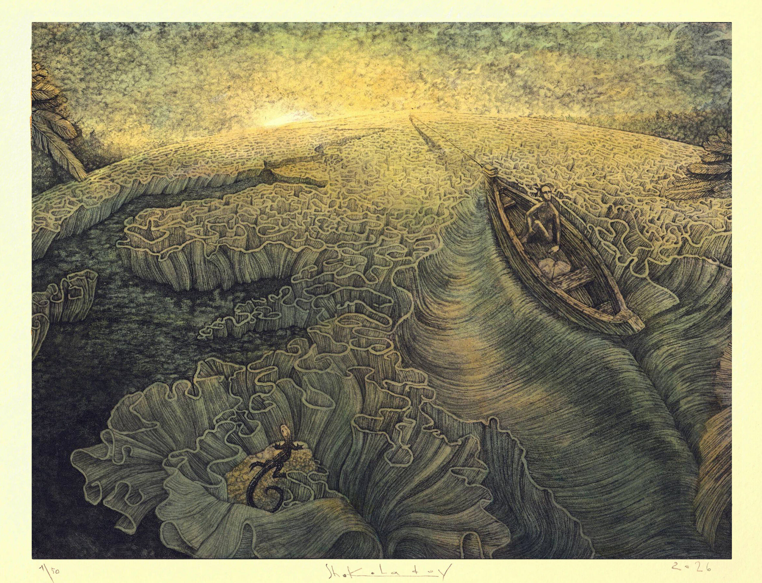
ARTIST STATEMENT My etchings are constructed through the internal logic of the scene. I am interested in the moment when a character or object fuses with its role and begins to take shape through what it does. I build each composition so that it unfolds gradually rather than revealing itself at once. It is important to me to preserve sincerity in the image, even when humor, absurdity, and inner nerve coexist within it. For me, details are what hold the world of the work together, sustaining its dimension and multi-layeredness. BIO Egor Shokoladov (b. 1990, Grodno, Belarus) is an artist based in Hillsboro, Oregon. He earned an MFA in Visual Arts from Yanka Kupala State University and works in graphic art and traditional printmaking, while also experimenting with mixed media and materials. His works are held in galleries, museums, and private collections across Europe, Asia, and the United States. Since moving to the U.S. in 2020, he has been represented by Northwind Arts Center and Davidson Galleries in WA, and has presented solo exhibitions at Peninsula College in Port Angeles, WA, and Low Fence Horse Sense Gallery in Port Townsend, WA. His work has also been shown in more than one hundred juried and group exhibitions and art fairs in the U.S. and internationally, and has been commissioned for public art projects in Washington and Oregon, including a mural in Hillsboro. His recognitions include multiple People’s Choice Awards and jury prizes in the U.S. and Germany. Shokoladov is a member of the California Society of Printmakers and the Society of American Graphic Artists. egor.shokoladov@gmail.com https://www.instagram.com/egor.shokoladov |
Eileen Parent
ARTIST STATEMENT My practice is inspired by patterns that I find in nature, in constructed environments, and the intuition to create a human mark. My work is generated from experiences and my responses to these environments. My drawings and prints are created through a direct process that teeters between focus and letting go. What materializes is an internal language that is personal and individual but reflective of the organic patterns around me. Such as the bark of trees, petals accumulated in the cracks of sidewalks, broken glass, and the reflection of sunlight on water. These marks are a documentation of time, of the phenomenon of nature, and a realization of my own presence. Making a mark records my hand and is evidence of my slow and repetitive method. The marks I make relate to the size of the span of my hand, making it individual to me. Some of my larger drawings are a response to the scale of my body and my reach. My hope is for the viewer to see my presence, the documentation of time spent and that the piece may be reflective of the larger patterns that create our world. BIO Eileen is an abstract artist working in the mediums of printmaking, painting, and drawing. She has earned a Bachelor of Arts in painting and drawing from UC Berkeley and a second Bachelor of Fine Arts in printmaking from Sonoma State University. She received her Master of Fine Arts degree from the California College of the Arts and is currently a lecturer in Art Studio at Sonoma State University, Napa Valley College, and Santa Rosa Junior College. Her artwork has been showcased in various professional exhibitions and shows, including the de Young Museum. In her spare time, she can be found working in her studio, curating exhibitions, volunteering at the Sonoma Community Center and teaching creative workshops. leenermonkey@gmail.com @eileen.parent.art |
Elizabeth Addison
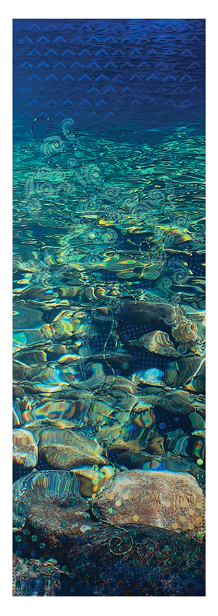
ARTIST STATEMENT Nii~-Li-, from my Flow & Root series, reflects my ongoing exploration of freshwater systems as living beings – dynamic, threatened, and enduring. This “scroll” recalls the experience of first entry into the Smith River (Nii~-Li-, Tolowa name) on my annual summer visit. The cold water both shocks and welcomes me. I tell Nii~-Li- about the intervening months, and she has much to say in return. My most meaningful conversations with Nii~-Li~ occur when I’m up to my neck in her riffles. Fine oscillations ripple, disrupt, and animate her surface. It’s a language, and I listen closely to the tension between calm and movement. Nii~-Li- incorporates original Smith River imagery from my most recent visit with monoprint, stencil, and collage elements on 100% cotton rag paper, displayed as a scroll. My phthalo-forward palette is intentional. Nii~-Li-’s jewel-like waters truly glow from emerald and phthalo turquoise to cobalt, revealing an undercurrent of wisdom, vitality, and presence. BIO Elizabeth Addison’s prints and dimensional mixed-media works honor California’s Smith River, exploring freshwater systems as living beings—dynamic, threatened, and enduring. She combines imagery from annual river visits with hybrid printmaking, fusing traditional and digital techniques. She constructs these works in layers. Kirigami elements bring dimensionality, revealing deeply hued substrates, and her phthalo-forward palette evokes the jewel tones of California’s last wild river. Addison co-founded The ROOTS International Art Project, is a member of the California Society of Printmakers, a WEAD member, a Kala Art Institute Artist in Residence, and served as Exhibitions Chair (2019-2025) and Professional Development Chair (2016-2019) for the Northern California Women’s Caucus for Art (NCWCA). eaddison329@gmail.com @eaddison329 |
Emily Kampa
ARTIST STATEMENT My practice is rooted in research, labor, and storytelling. For years my work explored California’s natural ecosystems: seaweed, fungi, lichen, coastal textures. In late 2024 I entered a new chapter, turning toward women’s health and reproductive healthcare. The subject changed, but the instinct didn’t: begin with research, sit with it, make something that invites others into an experience they may have never had, or one they’ve had and never seen acknowledged. My work has always been about shared experience and illuminating smaller yet still pertinent stories, and I hope it emanates the same familiarity, reflection, and release that creating it brought me. BIO Born and raised in Minneapolis, MN, Emily Kampa holds a BFA in Studio Art & Computer Science from Carleton College. She currently lives and works in San Francisco, CA. Constantly inspired by the quieter moments in life, Emily’s recent works have ranged from celebrating the flora and fauna of Northern California to exploring shared experiences within women’s health and reproductive healthcare. Emily draws on her own experiences when designing her prints, guided by curiosity and inspired to give voice to the stories that are meaningful to her. kampa.emily@gmail.com www.instagram.com/stressyandlemonzesty/ |
Erin Malone
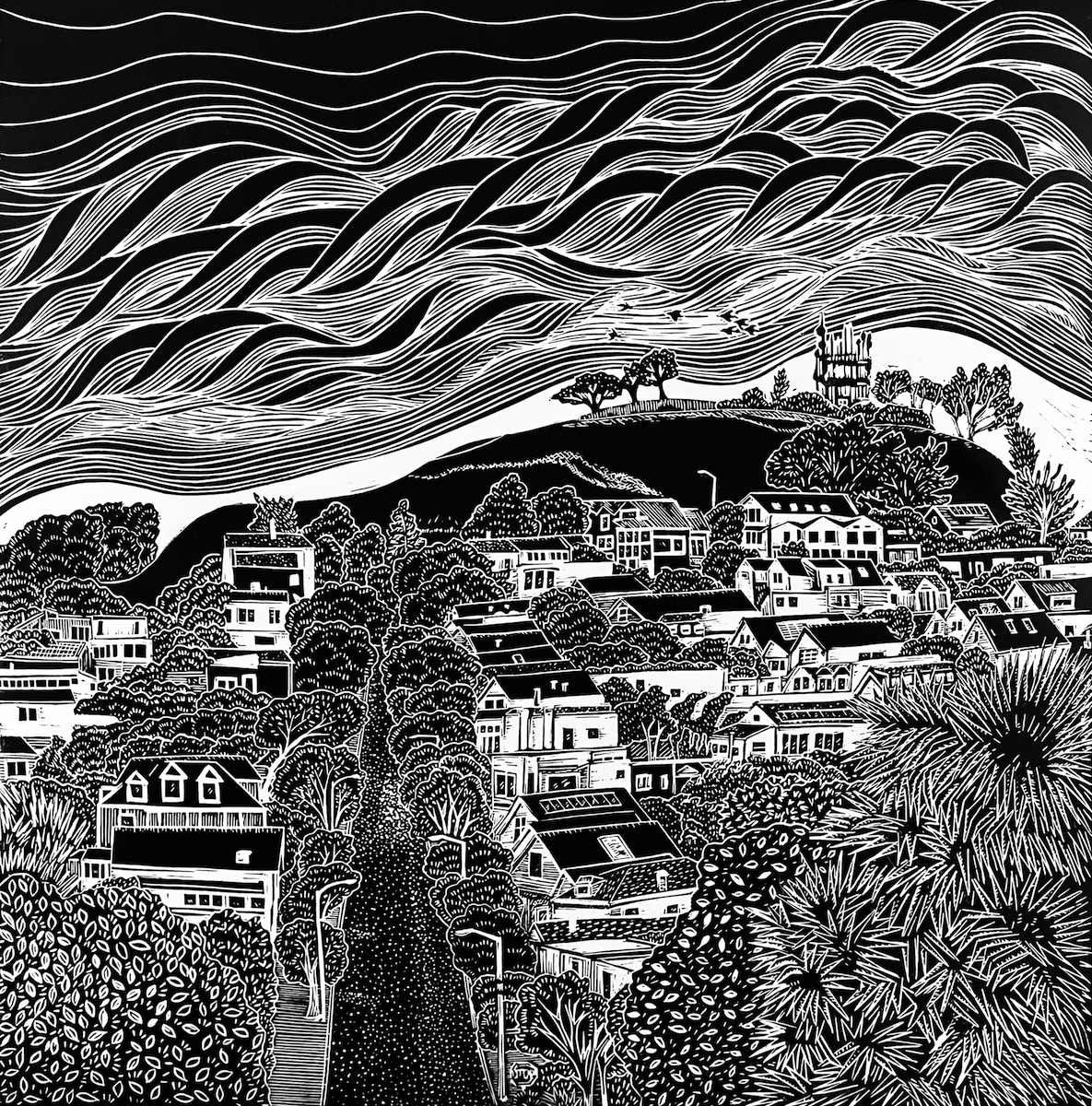
ARTIST STATEMENT I’ve long been enamored with my neighborhood both in and out of the fog. Multiple series of photographs and documenting my dog walks have transitioned into an ongoing series of relief prints capturing the essence of the city I love. I began my San Francisco series because I was drawn to the interplay of angles and textures across the roofs of my neighborhood (as seen from my balcony) and this subject appears in multiple photographs and blockprints. Interesting houses I pass everyday on my dogwalks are now part of the series, capturing the unique look of many of the streets in my neighborhood. The instantly identifiable hill that dominates Bernal Heights and the signature fog of San Francisco, lovingly nicknamed Karl the Fog, became the inspiration for my newer images with the fog playing a central role. Expanding beyond my neighborhood, the fog finds its way around many of the well-known landmarks of the city, creating a throughline in my work. BIO Erin Malone is an artist, author, design historian, educator and a former user experience designer. She is a professor at California College of the Arts and Chair of the BFA Interaction Design program. She is the author of the book “In Through the Side Door: Fifty Years of Women in Interaction Design” from MIT Press, which came out October 2024. She is co-author of both editions of the book Designing Social Interfaces from O’Reilly Media published in 2015 and 2009 and one of the essay authors in the book 97 Things Every UX Practitioner Should Know. She holds a BFA in Communication Design from East Carolina University School of Art and an MFA in Graphic Design from Rochester Institute of Technology. In her spare time she is a fine art photographer, printmaker, and letterpress printer. She turned to printmaking and book arts to create handmade books for her photography, but what started as a side effort to enhance the medium of photography, has taken over and she is primarily doing printmaking today. Specifically, linoleum blockprints. Whimsical cats started it all, fueled by the pandemic, an effort to create smiles and something positive. Her work still includes cats – there’s a new series of cats in bed – but her subjects have expanded to include birds, portraits of views of the Bernal Heights neighborhood and areas around San Francisco. She works with several kinds of presses, including a Vandercook proofing letterpress, a Takach etching press, a blockprinting hand press and her hands. All works are created on archival paper unless noted. She lives with a dog and 2 black cats who inspired the name of her printmaking studio – 8 Paw Press – located in San Francisco, California. erin@erinmalone.com @erin_8pawpress |
Eva Bernstein
ARTIST STATEMENT Though primarily a printmaker, I draw and paint as well. Each medium presents different challenges, both technically and conceptually. These challenges allow me to approach and express my vision in distinctive ways – related, yet different in scope. My monotype printmaking technique demands that a piece be fully realized within a single art-making session. Painting lets me develop a work over an extended period. Charcoal drawing asks me to examine a world without color. Whatever the medium, all my work is process driven – each piece evolves as I react to the mark that went before. Nothing is predetermined. My artwork is usually nonobjective, yet firmly rooted in personal experience. My longtime practice of figure drawing sometimes leads to unintentional references to the figure. My love of printmaking is based on a gut-level connection to the process. Perfecting printmaking’s technical aspects is interesting to me but more so is the demand printmaking makes upon me to let go of complete control over my artmaking. Ink on printing plates move under the enormous pressure of the printing press. The image is reversed. Layers of inking react with each other in unplanned and unexpected ways. As I pull a print there is always the moment when I hold my breath waiting to see how the print gods have worked their magic. Whether printmaking, painting or drawing, each session in the studio is an exploration of technique and imagery. For me, the magic of art-making continues unabated. BIO Born and raised in the NYC Metropolitan area, Eva Bernstein’s formative years were spent visiting art museums: MOMA, The Metropolitan, The Whitney. That early exposure sparked a life-long love of art. After receiving a B.A. from SUNY Stony Brook, Ms. Bernstein was accepted into Pratt Institute’s M.F.A. program in printmaking. Following her move to California’s Central Coast, Eva earned her living as a graphic designer while continuing her art education in classes and workshops at UC Santa Cruz and Monterey Peninsula College. While at MPC, Ms. Bernstein was a founding member and first president of the MPC Printmakers. Now a full-time artist Eva’s practice consists of printmaking and drawing. In 2010 Ms. Bernstein became a founding artist of DoonArt, the annual Bonny Doon Studio Tour. Eva is a member of the California Society of Printmakers. Her work is held in numerous private collections. ebdesign@cruzio.com |
Felicia Rice
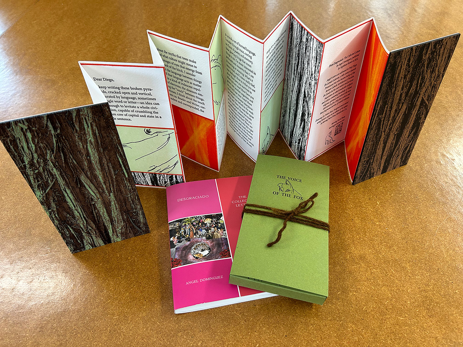
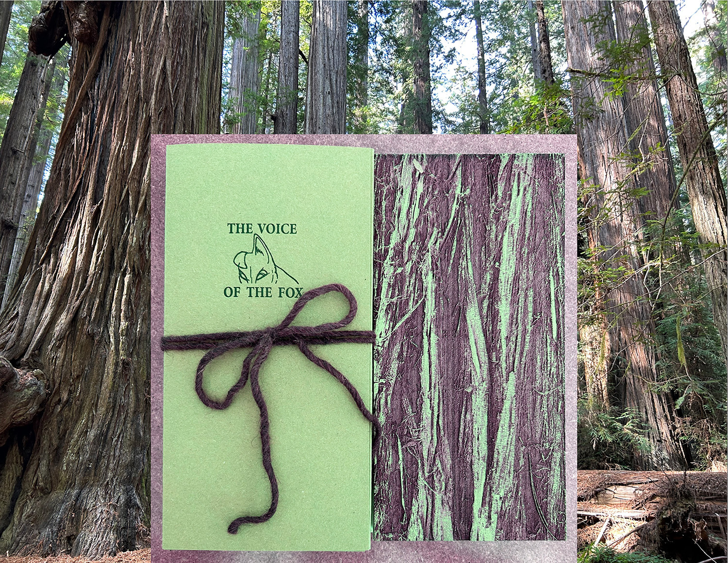
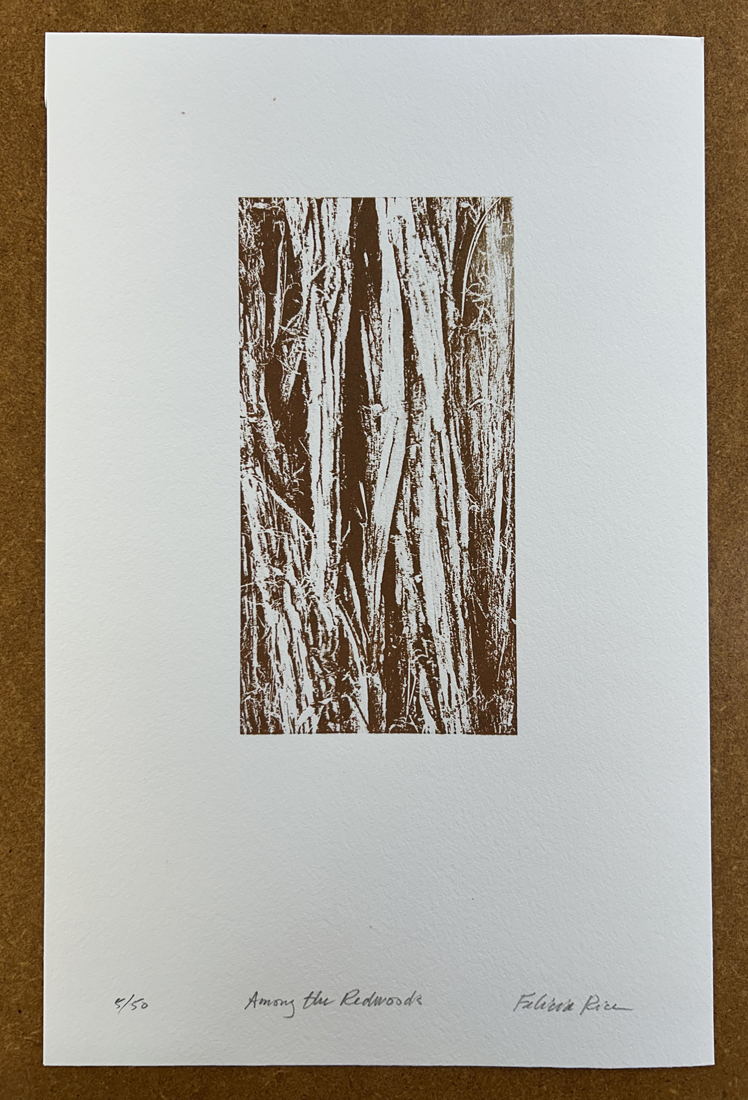
ARTIST STATEMENT THE VOICE OF THE FOX / Among the Redwoods is an intergenerational conversation, a collaboration across artists, archives, and acres of time. It reflects the enduring resilience of the natural world as well as the rebellious resistance to colonization, as it wrestles with the passage and scale of time itself. Conversations between Angel and Felicia began in 2018 with the “Latinx / Chicanx / Poetx” broadside series. Both collaborators live within the remnants of a vast forest of redwoods, now confined to a narrow strip along the Pacific coast from south of Santa Cruz to north of Mendocino, two communities under threat. This artists’ book is a letter that Felicia selected from Angel’s book, “Desgraciado (the collected letters),” and one that found new, revitalized life in this project. The poem is one of 100 epistolary poems in which Angel interrogates Diego de Landa, the 16th-century Spanish Franciscan friar who used book burning in an attempt to eradicate the Maya civilization. The book draws on the Dresden Codex, one of just four surviving Maya codices, for its accordion-fold structure, scale, proportions, and page design in which red outlines delineate sacred space. The wooden “redwood bark” book cover was laser-cut, and I added green “lichen” by hand in ink. The eponymous fox of my drawings makes its presence known now and again outside my studio, prompting clay studies of foxes, then pencil drawings of the clay figures, and finally prints in the book. Silent during the day, sometimes at night the fox releases a wild screams that call down the heavens. THE VOICE OF THE FOX seeks to imbue the reader with a cohesive forest-centered experience, beginning with mushroom-dyed yarn from the archives of Felicia’s mother, dye researcher Miriam C. Rice, that ties each book together and deepens the intergenerational conversation. The print, “Among the Redwoods,” captures the essence of redwood bark in brown ink made with polypore mushroom pigment. BIO Felicia Rice has collaborated with Chicana/o/x artists and writers under the Moving Parts Press imprint since 1989. Work from the Press has been included in exhibitions from Mexico City to Japan and New York. Her books are held in library and museum collections worldwide, and she has been the recipient of many awards and grants. Rice writes, “As a printer, my job is to confront complex issues and render my response to them in book form. As an artist, my job is to do so with profound integrity. As a publisher, my job is to make these issues public.” frice@movingpartspress.com instagram.com/movingpartspress/ |
flint hahn
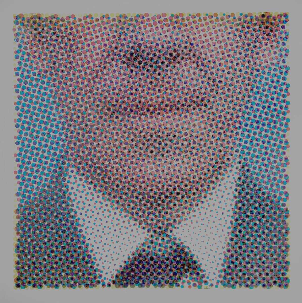
ARTIST STATEMENT There’s a phenomenon that affects my perception of the faces of people I know. This isn’t prosopagnosia (face blindness), but rather a gradual fading of facial details over time as I spend more time with individuals. I still recognize their features, but I rarely notice details like moles, freckles, scars, piercings, missing teeth, or even eye color. Instead, it’s like a blurred amalgamation of features. My mental image mapping relies on the overall macro topology (representational geometry) of their faces. I believe we create visual shortcuts for recognizing individuals. By doing so, we familiarize ourselves with the general overall makeup of someone’s appearance without the need to focus on details to identify friends and loved ones. This familiarity leads to a blurred recognition. Cognitive psychology of face recognition fascinates me because it explores how our brains pixelate our mental recollections of people we’re intimately familiar with. The four-color halftone dot has been used in print for years in various commercial settings, such as magazines, catalogs, and newsprint, to display images. As the halftone dot size increases, so does the loss of detail, resulting in a softer overall image. Up close, it appears as a jumble of colorful dots; it only becomes clear when you step back away. A single dot holds no significance; meaning only emerges when numerous dots are collectively combined. BIO Flint, a relief printmaker primarily working in linoleum, meticulously hand-carves over 100,000 dots to create halftone portraits that explore the blurred familiarity of individuals. By employing oversized dots with only four colors (cyan, magenta, yellow, and black), Flint achieves a greater richness of color values while simultaneously reducing the intimate facial details to their bare, discernible elements. Inspired by the portraiture of Chuck Close and Gerhard Richter, Flint’s halftone prints delve into the complexities of family and friendship. His work has been shown at the Smithsonian Institution museum in Washington, DC and the Cosmopolitan of Las Vegas. im@fh.io https://www.instagram.com/i.am.flint/ |
frances valesco
ARTIST STATEMENT My work responds directly to the environment, drawing inspiration from natural life forms I encounter in my surroundings or during my travels. This connection to the familiar and the natural world allows these visual marks to tell a story. My latest work explores inner voyages and the body as it is transformed by age and illness. BIO Frances Valesco has exhibited her work nationally and internationally in museums, galleries, and cultural centers. Her work is in the collections of the UC Berkeley Bancroft Library, the Library of Congress, Washington, DC; the Museum of Modern Art, NY; the New York City Public Library; the Fine Arts Museums of San Francisco, CA; and the Galeria Nacional San José, Costa Rica. She has received artist residency awards at various locations, such as the Guanlan Printmaking Base in Guanlan, China; ArtPrint Residence in Arenys de Munt, Spain; PLAYA Artist Fellowship in Summerlake, Oregon; Tyrone Guthrie Centre in Newbliss, Ireland; and La Romita in Terni, Italy. She has also taught at numerous institutions, including the Academy of Art University, City College of San Francisco, Kala Art Institute in Berkeley, the San Francisco Art Institute, San Francisco State University, and the University of California, Berkeley. fvalesco@gmail.com https://www.instagram.com/fvalesco1/ |
Frank Trueba
ARTIST STATEMENT Combing my interest in the traditional technique of mokuhanga with modern subject matter this piece marries the well known image of Hokusai’s The Great Wave of Kanagawa withthe image of a modern Santa Cruz surfer. While attempting to be accurate as to the general view of the wave, I have played with the print’s traditional colors. BIO A native New Yorker, but living on the West Coast for the last four decades (and over three decades in California) I have been something of a non-professional artist concentrating in printmaking and bookbinding. While I am experienced in a number of printmaking methods, such as silkscreening, intaglio and marbling, I have concentrated on mokuhanga since my retirement in 2017. While always interested in Japanese prints, I was smitten with the actual printing process since taking my first weekend mokuhanga workshop 25 years ago. I enjoy mixing the ancient printing technique with modern subject matter. I am founding member of the printmaking co-op Printmakers at the Tannery (PATT) in Santa Cruz, a member of the California Society of Printmakers (CSP) and been involved with the International Mokuhanga Conference (IMC) since 2017. My work can be found in the permanent collections of the Department of Graphic Arts, Spencer Museum of Art, University of Kansas (Lawrence, KS); the University of Kentucky Museum of Arts (Lexington, KY), the New York City Public Library Print Collection (New York, NY) and the Australian Print Collection of the Wagga Wagga Regional Art Gallery, (NSW, Australia). frank.trueba@yahoo.com |
Gail Jacobs
ARTIST STATEMENT I continue to make prints and exhibit. BIO BA -UCSB 1972 gailjacobs@earthlink.net |
Gisela Ramirez
ARTIST STATEMENT Gisela M. Ramirez’s work uses printmaking as a way to document the changing world around her. They highlight socioeconomic and environmental issues that marginalized communities face when they are violently and unfairly uprooted from the places they call home. She uses her privilege as a citizen of the United States of America to invoke imagery in her work of the oppression of her people and the horrors of colonization and its long-term effects on marginalized communities as well as a desire to belong in a world that dehumanizes them. She references current events, the political climate, and nature as a way to display human preservation and resilience. BIO Gisela M. Ramirez (she/they) is a Mexican-American multidisciplinary artist who explores themes of identity, memory, and place. She was born in Escondido, California and received her BA and BFA at California State University, Chico. At CSU Chico, she received the Janet Turner Print Memorial Scholarship and the Lt. Robert Merton Rawlins Merit Award. After graduating, she worked in ceramic production for businesses in Los Angeles. They currently teach classes and workshops at McGroarty Arts Center for ceramics and printmaking. ceramicprintmaker@gmail.com ceramicprintmaker |
Glen Rogers
ARTIST STATEMENT For over forty years, Glen’s artwork has been women centric and inspired by the Sacred Feminine. Her work depicts women in their strength as well as in their sensuality – women as life-givers who are grounded yet connected to the spiritual realm. For many years Glen has traveled around the world visiting sacred sites inspired by ancient goddess cultures. She focuses on women in their power and often depicts priestesses and goddesses such as Athena, Lilith, and Mary Magdalene. Through the monotype process, she shares HerStory – a revisionist history relating to matriarchal cultures with a definite feminist agenda. BIO Glen Rogers is an internationally exhibited painter/printmaker and public sculptor. She relocated from the San Francisco Bay Area to Mexico in 2000 and currently lives in San Miguel de Allende. Recent solo exhibitions include Museo de la Mujer, MX City and Casa Europa, Amarillo 78, and Tinta y Tiempo in San Miguel. Her work was included in Crossing Borders at Westbeth Gallery, New York, 2024, and in group shows in Belgium, Netherlands, and Argentina, Her solo show of large-scale monoprints was at Bienal International de Grabado, Lima, Peru, and Bellas Artes, Cusco, Peru. Her public sculpture include ‘Throne for a Goddess’ in St. Ruprecht/Raab, Austria and ‘Aleteo’ in San Miguel’s El Charco Botanical Gardens. She has over 25 public artworks in the San Francisco Bay Area. Glen has two published books, ‘Art & Sacred Sites: Connecting with Spirit of Place’; ‘Symbols of the Spirit: A Meditative Journey Through Art’ and oracle decks ‘Spirit Cards’ and ‘Sacred Feminine Wisdom’. Glen has a B.A. in Printmaking from University of Florida, MA from San Francisco State and MFA from San Jose State University. She teaches monoprint workshops and offers Art Vacations in Mexico: San Miguel de Allende, Oaxaca, Guanajuato, Mazatlán, as well as Peru, and most recently BeArtz in Southwest France. Grogarts@gmail.com glenrogersart |
Greg Borman
ARTIST STATEMENT The faces and bodies in my work allow me to delve into different aspects of myself. I explore my own psychology, and what I am thinking/feeling is made manifest in the images I create. Rather than laboring and analyzing, I summon immediate responses – going with instinct is key. I trust both my hand and heart in translating my subconscious into the imagery in my work. Drawing with altered Q-tips, rubber tools, brushes, and rags into ink rolled onto Plexiglas has helped to get me in touch with the process of making images, and I trust that years of exposure to and making of art will lead to a few successful prints on any given day. Instagram: https://www.instagram.com/borman_fine_art BIO Greg Borman began his creative path in Cincinnati, Ohio as an active member of the DIY punk scene. He wrote songs, played in several bands, and contributed writing to local zines. After receiving his BFA from the University of Cincinnati, Borman moved to the San Francisco Bay Area, where he has lived ever since. He received his MFA from San Francisco Art Institute. He also holds an MLIS (Master of Library and Information Science) from San Jose State University. Since 2019, Borman has focused on the exploration of printmaking, specifically monotypes, at studios in Berkeley and San Francisco. He has exhibited extensively in the San Francisco Bay Area and beyond. bormang2@gmail.com https://www.instagram.com/borman_fine_art |
Gustavo Mora Perez
ARTIST STATEMENT I make images that approach the subject of travel as a metaphor. I am inspired to recreate landscapes from my drawings with the visual and expressive qualities of woodcut. My work has literary and cinematic influences from which I build an image, using them like a window, built with scenes of urban environments, and with elements of everyday life such as automobiles and characters who wander paths of uncertainty. BIO Gustavo Mora Perez was born and raised in Mexico. He earned a bachelor’s degree in Studio Arts at the Instituto de Artes Visuales del Estado de Puebla, and a master’s degree in Visual Arts from the Facultad de Artes y Diseño at the National Autonomous University of Mexico. In 2025, he graduated as Specialist in Art History from the Instituto de Investigaciones Estéticas at the National Autonomous University of Mexico. His work is influenced by Expressionism and Mexican Graphic Arts as well as literary and cinematic works. He has participated in exhibits and art events in Mexico, Argentina, France, the United States, and elsewhere. His solo exhibits include Mito y concreto, at Casa de la Cultura Oaxaqueña, in Oaxaca, Mexico (2024), and Gustavo Mora Printmaker at Mission Gráfica at Mission Cultural Center in San Francisco, CA (2014). He has also participated in collective exhibits such as the XIV International Biennial of Engraving and New Images in Sarcelles, France (2009), and José Guadalupe Posada, Mexican History Museum in Monterrey, Mexico (2012). In 2009, he won honorary mention at the First Biennial of Mexican Contemporary Printmaking at the National Museum of the Stamp in Mexico City. He has been a member of the California Society of Printmakers since 2008, and he is member of Los Angeles Printmaking Society since 2025. gustavo.mora.perez@gmail.com @gustavo.mora.perez |
herlinde spahr
ARTIST STATEMENT In the early nineteen nineteen I produces a large body of work around the imagery of the duck/rabbit made famous by Ernst Gombrich. The image, which could be rad as either a duck or rabbit, became a stand-in for the bipolar condition, especially since the brain cannot see both extremes simultaneously. I scarred a piece of Formica with the levigator and grit, inked it as if it were a copper engraving and then printed the image on it from stone. I placed the print inside a rubber mold of an old litho stone and cast this in hydro stone — resulting in fact in a triple decoy since I finished the stone to resemble a real litho stone. Most of this body of work is very experimental and has not been shown.BIO Herlinde Spahr was born in Belgium and moved to California in 1977. Her work is included in major public collections: the Fine Arts Museums of San Francisco, the Oakland Museum, the Morrison Collection at UC Berkeley, the Royal Museum of Antwerp, the Prentenkabinet of Brussels, the Turner Print Museum at Chico, the Library of Congress and the Hanoi Fine Arts Permanent Collection, Los Angeles County Museum of Art Her work is featured in “The Best of Printmaking. An International collection” and in “60 Years of North American Prints. 1917-2000.” Spahr has published on the philosophy of printmaking and produced four books documenting her work. David Acton described Spahr’s work as follows:”Technical finesse, an open attitude to the creative process and deeply personal subject matter are typical of the works of Herlinde Spahr” in “Sixty Years of North American Printmaking.” The Monterey Museum of Art awarded Spahr with a one person exhibition in 2021: THE PRECIPICE WITHIN. herlindespahr@mac.com |
Holly Downing
ARTIST STATEMENT This image is a somewhat chaotic collage of endangered environments: coral reefs, wetlands, desert sand dunes, glacial ice floes, water, honey combs, rain forests. BIO Born in California, I studied art, (including art history, printmaking and painting) at the University of California, Santa Cruz and did graduate work in printmaking at the Royal College of Art, London, and the Goddard College Graduate Program in Europe. While living in London in the 1970s, I received a National Endowment for the Arts Fellowship to study the archaic printmaking technique of mezzotint. I had experimented with mezzotints but had some problems and no one seemed to know how to know more than I did. I eventually found an old British mezzotint reproductive engraver who passed on to me the techniques he had inherited from a long British tradition. That cemented my lifelong love of the technique, though as it is so laborious and often most beautiful in black and white, I continued to paint in color. In addition to an almost 30 year teaching career, I’ve had solo shows of paintings and mezzotints in London, Manila, Edinburgh, Seattle, Santa Rosa, Fresno, Santa Jose and San Francisco, Santa Clara Los Angeles, Berkeley, and San Jose, CA. And I’ve participated in group exhibitions and print biennales around the world. I have also benefited from numerous art residencies in the US and abroad. In addition to the NEA grant, I’ve been fortunate to receive grants from the British Arts Council, the Greenshields Foundation of Canada, the Phelan Awards Foundation for Printmaking and the Graham Foundation, Chicago. An elected member of the Royal Society of Painter-Printmakers, U.K., my work is in many public collections, including the Library of Congress; Achenbach Foundation, Fine Arts Museums, San Francisco; Stanford University Museum California; Portland Museum, Oregon; Victoria and Albert Museum, London; Ashmolean Museum, Oxford, UK; British Arts Council; Scottish National Gallery of Art; Hawaii State Art Museum, Hilo; Yale Rare Book Collection; Bibliotheque Nationale, Paris and Chi-ba Art Museum, Japan. Images of my work are included in The Mezzotint, History and Technique; by Carol Wax; Abrams; N.Y. 1990 and Schiffer 2023; Holly Downing, Twenty-five Years of Mezzotints 2001; Penumbrae: Holly Downing, Mezzotints and Paintings, Fresno Art Museum, California, 2010, among many other catalogues. hollydowning@comcast.net |
Israel Campos
ARTIST STATEMENT Israel Campos lives and works in South Central Los Angeles. He works with painting, print media, digital media, and artist books to explore how historical events are interconnected and reverberate into the present. He is influenced by street murals, Mesoamerican Art and oral folklore, reflecting his upbringing as a second-generation immigrant born and raised in South Central L.A. from parents born in rural Mexico. His bright palette, surreal environments, and representations of the human form draw from the legacy of pre-Columbian Art and examines the post-colonial legacy of the Americas. BIO Campos is Assistant Professor of Printmaking at Loyola Marymount University and is on the Board of Directors for the California Society of Printmakers. He also runs and operates Chayote Press, a printmaking studio based in the Pico Union neighborhood of Los Angeles. chayotepress@gmail.com israelcamposart |
Jami Taback
ARTIST STATEMENT Nonfiction refers to the reality we often try to push away, discard, or refuse to see. We cannot always handle what is difficult to hear or witness, yet the truth remains. It clings to us until it is acknowledged and worked through.
BIO Jami Taback is an interdisciplinary artist and thinker, whose work involves printmaking, book arts, and installation. Projects I am involved in explore all aspects of the climate crisis. Currently she is living and working in Hawley, Pennsylvania. Her work is represented in many public and private collections including The Bradbury Art Museum, Arkansas State University, an installation at Rowan University School for the Earth & Environment, Discovery Hall, N.J. George Mason University, Paper as Politic, and The Center for Earth & Environment at Nevada Museum of Art. This year, Jami’s work will travel to Taiwan for her first International Exhibition at the Live Forever Foundation, Taichung, Taiwan. The artist won a 4th Place Prize for her painting, Woman World at the Arad Biennale, Romania in 2004. She studied with and monitored the studios of Master Printmakers, Krishna Reddy at NYU and Ruth Leaf on L.I. The artist has been the recipient of a California for the Arts Covid-19 Relief Grant and from the Foundation for Contemporary Arts, NY, Puffin Foundation Ltd, and is represented by Annex Galleries, CA. Jami has attended residencies in Budapest, Hungary, and her work was acquired by the offices of the Director of the Health Services. She teaches printmaking processes to eager students and is committed to working in a non-toxic approach to the arts. She is Past President of the California Society of Printmakers. jamitaback@gmail.com jamitaback |
Janis O'Driscoll
ARTIST STATEMENT Janis creates photopolymer plates from her pen and ink abstract drawings. Chine collé, collage , and monotype are often used during the printing process. Her current work experiments with using dark non-representational marks to tell stories. BIO Janis O’Driscoll is a founding member of Printmakers at the Tannery, located in Santa Cruz, CA. Her work derives from her lifelong love of drawing and storytelling. Currently she serves on the editorial team of the CSP annual journal. She has work in the CSP Confluence book arts project and the Printed and Stitched traveling exhibit. rubyboggs@gmail.com www.instagram.com/irishrose46 |
Jerry Theobald
ARTIST STATEMENT This is a cut up etching glued to a black background, the trees were painted over the top with the cheese cloth stretched along the bottom. BIO I have been doing art all my life, I have done etching for 30 plus years, I have done stained glass, ceramics, jewelry, quilting for 15 years many paintings including watercolor and acrylic. I built my studio behind our home twenty years ago, I have been retired for 30 years but as an artist I am never retired. jerrytheobald@yahoo.com |
Jessica Dunne
ARTIST STATEMENT call myself a painter but I make monotypes and aquatints too. For the monotypes, I develop an image by dabbing etching ink onto a Mylar plate with my fingertips, subtracting the lights with cotton swabs. I then print from the Mylar onto a sheet of paper, and repeat the process over 50 times to create an image. The monotypes are really printed paintings: I make a single copy. The technique enables me to achieve a depth and subtlety of color that I have not found possible in any other medium. By painting what I see, I make discoveries. By paying attention to the details that record shifts in light, structures, and moods, I want to impart the sense of being located and included in a way that leaves an afterimage in the mind’s eye. BIO Dunne makes large urban landscape paintings and tiny spit-bite aquatints and drypoints. She received a Pollock-Krasner Foundation Grant, the James D. Phelan Art Award in Printmaking, and many artist-in-residency awards. She has had solo shows in museums and universities around the country, including the Frye Art Museum, the Flaten Art Museum, Saint Mary’s College Museum of Art, and the Fresno Art Museum. The Oakland Museum of California, the Fine Arts Museums of San Francisco, Stanford Special Collections, and the New York Public Library collect her work. In 2025, she had a solo exhibition at Santa Clara University’s Art and History Gallery and at Commonweal in Bolinas. She finished her newest artist book, “Horses, 10 Drypoint Prints,” in 2026. info@jessicadunne.com @jessicadunnepaint |
John Babcock
ARTIST STATEMENT There have always been some strange characters on the world stage, but lately I am overwhelmed. Last year, I began a series of “Singular Entities” in response to my thoughts about our present world situation. These sculptural paper “Entities” are not representative of humans in any way; they are just sheets of paper. However, as I build, hammer, and push the pigmented pulps into form, each “Entity” does take on a personality, sometimes predetermined and sometimes not. Many of the objects made by artists I admire have what I call presence, and I believe it comes from the artist’s manipulation and love of the material. I make a specially formulated paper pulp of my own manufacture to create paper for my layered and embossed sculptural forms. My work becomes a documentation of feeling, an emotional graphic response to the thick, multi-pigmented pulp. The resultant action of pushing the plate or matrix into the wet paper records the story and the energy of the process. BIO John works at his studio in the Santa Cruz Mountains in California. He embosses paper pulp to print works in poured, cast, inlaid, and collaged paper. They are produced using large stretched screens for pouring and resin surfaces for further manipulation and drying the wet paper. His work with paper began while working on an MFA in sculpture at the Institute of Experimental Printmaking in Santa Cruz, CA His work has been exhibited in more than thirty museums across Europe, the Americas, and China, including the Museum of Art and Design in New York and the Musée des Arts Décoratifs in Paris. He has lectured and led private and public workshops throughout the United States and has served as a visiting artist and instructor in India for the US Information Agency. Babcock’s work is held in numerous public and private collections throughout the United States. paperjohnbabcock@gmail.com |
Joseph Ferrer
ARTIST STATEMENT I am fascinated with binary, duality and computational. Paper sculptures are based on mathematical folds of circles to form triangles and shaped to form polygons. BIO JoSep Ferrer is a Filipinx artist. JoSep is influenced by San Francisco Textile Artists. His art reflects his own learning journey and experience as an information worker, a maker and immigrant. He has shown in Bedford Gallery and Triton Museum. He is a member of an art collective, Graphic Arts Workshop. pointyarrows@hotmail.com josep.art.prints |
Julie Cornett
ARTIST STATEMENT My artwork combines elements from the landscape and surroundings that tell a story about the experience of place. It is rooted in a Magical Realism aesthetic. I experiment with the colors associated with the high desert, but with a different, more personal and subjective take on color and light as expressive elements. My print designs draw from observed phenomena — desert landforms, animals, and desert flora — reimagining them with pictorial construction using bold palettes, clean lines, and the hand-carved texture of linocut printmaking. I consider my art practice as a kind of visual myth-making. I use whimsical juxtaposition — like a cactus blooming from a tortoise’s shell — to reframe the ordinary into the surreal. These playful, slightly off-kilter combinations point to the strangeness and wonder embedded in everyday life — and gesture toward the endless ways we might imagine ourselves transformed, reshaped, or reborn. BIO My hand-carved linocuts blend magical realism aesthetics with vivid psychedelic elements. I’ve been working solely with the linocut medium since 2008 and my work is deeply rooted in the high desert and Eastern Sierra, where I live and draw inspiration. My prints reflect a metaphysical connection to landforms; mountains, rocks, and desert creatures become symbols of both grounding and transcendence. Through bold colors, whimsical juxtapositions, and stylized natural forms, I explore the spiritual and surreal qualities of the Western landscape. The result is a body of work that feels at once timeless and trippy, earthy and electric. jucorn@yahoo.com @queencreosote |
Karen Thapa
ARTIST STATEMENT The reports of the Great Pacific Garbage Patch have been worrying me for some time. I often walk on the beach and collect pieces of trash and I used some of these in my monotype. I handpainted some of the plastics with watercolor. I then mounted the print on to a cardboard mailing tube and sealed it with cold wax. I attached a wooden cap and base. BIO Karen Baden Thapa was born in Los Angeles and currently lives in the SF Bay Area. Her artwork highlights the ocean, the intertidal zone and the animals that live there. She speaks French and loves art so she spend a year at the University of the Sorbonne in Paris studying art history. She came home to California and ended up at U.C. Berkeley where she got a B.A. in the Practice of Art . During this time period she discovered the joy of drawing on a litho stone. Eventually, she learned to etch on copper plates and began to print using several different methods including monotypes, monoprints, collographs and photopolymer etching. She is member of the California Society of Printmakers and the Lamorinda Arts Alliance. Education: 1979-80 Art History Studies, University of the Sorbonne, Paris, France 1983, Bachelor of Fine Arts, University of California, Berkeley Teachers & Mentors: Toru Sugita, Printmaker Robynn Smith, Printmaker & Painter Jim Melchert, Sculpture & Art Books Joan Brown, Painter Elmer Bischoff, Painter Associations California Society of Printmakers- Board Member Lamorinda Arts Alliance- Member and Curator. karenthapa@yahoo.com #karenbadenthapa |
Karen Gallagher-Iverson
ARTIST STATEMENT The “Wine Dark Tides” series takes a predictive look at the altered air of the next-world. Visually informed by the ominous air quality in past years – thick with harm yet mesmerizing to gaze upon. Highlighting endangered lands along the Pacific Ocean at risk to disappear with shifting costal ecology and rising sea levels. The color palette for these Point Reyes scenes have been impacted by the intensely colored light of the west coast Fire Seasons. All those glowing grays and wrongly placed hues along the costal tidal plains. Wild fires and the resulting haze filtered atmosphere offer a present-day perspective on the descriptions of the “Wine Dark Sea” in Ancient Greek literature. I now wonder if we’re fated for an era where the color blue may be obscured, replaced with deep red and yellow-green hues of a forgotten age. BIO Karen Gallagher Iverson is a San Francisco area artist exploring innovative conventions within the fields of traditional printmaking and drawing. With a focus on uniquely expressing the light and silhouettes of the Northern California landscape, Gallagher employs a variety of methods to visually abstract information and build rich, highly layered images. Gallagher has exhibited in numerous galleries and museums including the deYoung Museum, Turner Print Museum, Crocker Art Museum, Highpoint Center for Printmaking, Grace Hudson Museum, New Museum Los Gatos and Marin Museum of Contemporary Art. Features on her studio practice and work can most recently be seen in the vol7:4 issue of Catamaran Literary Reader and vol 30/31 of the Mid America Print Council Journal. Karen’s work is in the collections of the Bancroft Library, the Metropolitan Museum of Art, Stanford Health Care, The Nevada Museum of Art as well as other private and public collections. In 2018 she was selected to receive an Artist Parent Award at the Kala Art Institute and continues to maintain an artist residency at their Berkeley printmaking facilities. Additionally, Karen has taught in educational programs such as Kala, and the San Francisco Art Institute, where she received her MFA with the department fellowship. Karen brings decades of experience in the arts to her current work as a creative operations professional, with a background spanning fine art installation, gallery preparation, studio management, and project support for prominent artists, projects and galleries throughout the San Francisco Bay Area. Following years of leadership with the California Society of Printmakers, she continues her engagement with the field as an elected artist member of the California Society of Printmakers, Los Angeles Printmaking Society, Boston Printmakers, and Mid America Print Council. Today, Karen focuses much of her professional time on supporting creative entrepreneurs in their practices while continuing to make work in her home studio alongside her young family. karen@gallagheriverson.com https://www.instagram.com/karengallagheriverson/ |
Karen Towne
ARTIST STATEMENT The 2021 Dixie Fire, one of the largest in California history, burned over 70,000 acres in Lassen National Volcanic Park. I visited the park in 2022. I did a sketch from a photograph I took near the visitor’s center at the southern entrance. To create the woodcut, I first traced the sketch to transparent glassene paper so I could reverse the image before transferring it to the wood block. After I carved and handprinted the block with oil based relief ink, I hand colored parts of the print with watercolor. This print is one of several in a series of prints of Lassen. BIO Karen Towne grew up in southern California and moved to San Francisco in 1969. She has been a long time member of the California Society of Printmakers and the Graphic Arts Workshop, specializing in woodcuts of California landscapes. She studied art at Long Beach City College, art history at the University of Colorado, and printmaking at Fort Mason Art Center and Graphic Arts Workshop. She has shown her prints in numerous state and national group shows, and is included in the Library of Congress collection. She currently lives in Marin County, California. towne.karen@yahoo.com |
Katheine Baca-Bielinis
ARTIST STATEMENT I have long been captivated by the lithographic process, a passion that began during my college years. The ability to preserve the character of each hand-drawn mark, along with the knowledge that those marks will endure on the plate, creates a profound connection to generations of artisans who valued patience, discipline, and craftsmanship. Old-world architecture offers a parallel source of inspiration. Its weathered surfaces, ornate details, and enduring forms tell stories that span centuries, reflecting cultures that seamlessly fused function with beauty. In my prints, I seek to merge these two passions—preserving a sense of history while honoring the artistry inherent in these time-honored practices. Recent works move beyond the traditional two-dimensional surface, incorporating sculptural and textural elements to transform printed imagery into more dimensional forms. By cutting, layering, folding, and combining printed fragments, I explore the space between print and object, allowing the physical qualities of the work to become part of its narrative. BIO Katherine Baca-Bielinis (b. 1955 Hispanic, American) is a fine art printmaker living and working in the Rochester, New York area. A native of San Francisco, she earned her B.A. in Art from California State University, Long Beach, where she discovered her passion for printmaking and developed a concentration in lithography. She later received an M.S. in Art Education from the Rochester Institute of Technology and dedicated herself to a long career as a public school art educator. Since retiring in 2010, she has devoted herself to her studio practice, working primarily in lithography, etching, and silkscreen. Her practice incorporates non-toxic and alternative printmaking technologies, allowing her to maintain a home studio while continuing to explore the expressive possibilities of traditional and contemporary printmaking processes. Her imagery is often inspired by architecture, historic sites, and weathered surfaces encountered during her travels. She is particularly interested in the passage of time and the ways surfaces can reveal traces of history, craftsmanship, and human experience. Her work has been exhibited in local, regional, and national exhibitions. Katherine is a member of the California Society of Printmakers, Boston Printmakers. She served 13 years on the Board of Directors for The Print Club of Rochester, taking on a variety of roles including President (2019-2024). kcbaca55@gmail.com #kcbaca |
Katherine Warinner
ARTIST STATEMENT I am a printmaker/painter, and my practice has long been concerned with surface texture and non-traditional methods of printing. Technically, I investigate the sensual properties of ink on paper through a unique process of relief monotypes. My monotypes are a hybrid of painting, printmaking, digital imagery and photographic processes, reinventing traditional forms of printing with modern technology. I think of my work as organic abstraction and work with forms and structures found in nature, drawing inspiration from landscapes. For instance, in the Branches series, I investigate the transparency of light coming through foliage, leaves and branches, as did the Impressionists who capture light in a moment of time. The transparency of layers of ink and subtle texture of embossed paper combine to form a sensation that must be experienced in person. My goal is to create images that reach beyond the literal to a place of contemplation. A print can go too far and collapse or balance on the edge of beauty. That edge is what keeps me working. BIO Katherine Warinner is a San Francisco Bay Area artist working primarily with printmaking. Inspired by a love of design, the landscape and natural processes, she seeks to illuminate and elevate the timeless beauty of the natural world. She has been an artist-in-residence at Kala Art Institute in Berkeley and InCahoots Residency in Petaluma, CA, where she prints her large scale works on paper. Along with national gallery representation, her work is in private and corporate collections. Born in the Midwest where she attended college and graduate school receiving an BFA in Painting and an MA in Design, she has lived in Marin County, CA for over 30 years. kw@katherinewarinner.com @katherinewarinner |
Katherine Venturelli
ARTIST STATEMENT “My artmaking over the past 40 years has focused on archetypal and symbolic themes; ideas and mark making in translation. The physical world offers me complex relationships and rich metaphors which I thrive in exploration.” This image is inspired by some of my recent abstract sumi ink paintings which are both meditative and action oriented. Working intuitively, an integral part of my image making printmaking process is welcoming the accidents and surprises that may occur while utilizing a variety of copper plate etching methods. Experimentation, spontaneity and observing the evolutions of image transformations are reasons why I enjoy printmaking. My etchings are press printed on archival papers and created in my printmaking studios either in Fiddletown, CA or Santa Fe, N.M. BIO Katherine Venturelli is nationally recognized for creating unique artist books and fine prints produced from her Northern California printmaking studio. Her works are held in numerous museum and institutional collections including the Crocker Art Museum and the S.F. Palace Legion of Honor. Currently her new print series, “Circus of Fifths”, was exhibited at the Mondavi Arts Center, and will be a part of an expanded solo exhibit in Oct-Nov, 2027 at the Pence Gallery, Davis. Visit: https://www.mondaviarts.org/news/circus-of-fifths-exhibit/ Her artmaking over the past 40 years has mainly focused on archetypal and symbolic themes; ideas and mark making in translation. The printmaking medium offers her both experimentation and spontaneity which she has delightedly shared over the years as both artist and instructor. For more information please visit my website: katherineventurelli.com kventurelli47@gmail.com KatherineVenturelliArt |
Kathryn Page
ARTIST STATEMENT In 2025, I visited several tallgrass prairie preserves across the Midwest and Great Plains. I hiked through surviving remnants of what was once an immense, continent-wide “sea of grass”, now largely gone. I was struck by the scale of this vast historic ecosystem, both the endless fields above ground and the invisible, subterranean root networks that sustained them. The Big Bluestem installation is a meditation on that world and its loss and on the idea of rootedness, both for our society and for me personally. The imagery is grounded in organic abstraction with three imagined root systems layered one over another. The color palette – intense yellow, light green and red violet – takes its cue from the grasses themselves in late summer. The layers’ varied scales refer to the sense of limitless expansion a visitor feels as they wander through the grass. Each print is a trace monotype, or rather three monotypes, serially printed on one sheet of paper. Together, the 64 prints create a composition abstracted from photographs of a Big Bluestem specimen plant cultivated by researchers in Iowa. With this imagery I made the patterns used to create the trace monotypes. The printing was accomplished during a residency at the Kala Art Institute in Berkeley this past summer. Finally, I mounted the prints on 12×12 inch panels to preserve them and to emphasize the grid format. This is a nod to another ongoing concern of mine – the development of a visual language based in mapping and geography. This subject matter is inherently map-like, in my view. The rectilinear format and the sporadic sets of parallel ‘ghost’ lines, either vertical or horizontal, underscore that association. My practice overall centers around a search for pattern and continuity. Starting with imagery I encounter in the natural world, I strive to identify and investigate underlying patterns within a complex visual field. Through gestural mark making, repetition, layering, scale and color, the imagery is abstracted into an essential pattern. Eventually, the pattern overtakes the original source material and itself becomes the work’s content. BIO Kathryn Page was born in Keokuk, Iowa, a riverfront town located on bluffs above the Mississippi River. Her family moved frequently due to her father’s Air Force career. With a B.A. in Art History from Stanford and an M.L.S. from UC Berkeley, Kathryn worked in the world of libraries for over forty years. She began her art career in the 1990s, earning a Post-Baccalaureate Certification from UCB Extension in 2017. She enrolled in the MFA program in studio art at Sacramento State University in 2022 and graduated in 2024. Kathryn lives and works in San Francisco, California. Her work has been included in shows at UC Berkeley, Sacramento State, and several galleries in the Bay Area and Sacramento area. kathryn.page9@gmail.com @kathrynpageartsf |
Kelley Berg
ARTIST STATEMENT This print is from my recent solo show Q is for Love featuring sixteen queer artists and writers whose practices have informed, fortified, and animated my own. A few of them are alive today; all of them have managed to far outshine a stifling orthodoxy, and the world is richer for it. I chose portraiture as the means of exploring themes of inspiration, love, longing, loss, and perhaps most importantly, perseverance. Generally speaking, my work is based solidly on the drawn mark. Texture, accident, and imperfection are constant companions in my work because these also characterize my lived experience and are very dynamic teachers. BIO Kelley Berg is a painter and printmaker based in West Marin County, CA. She holds a B.A. in Anthropology from Western Carolina University and laid the groundwork for a thriving second life as an artist by first spending over twenty years in the corporate world of finance and philanthropy. Berg has been a resident of Kala Art Institute since 2023 and currently serves on its Board of Directors. She is also a member of the exhibition program of Gallery Route One in Point Reyes. She exhibits her work locally and nationally. kelleyberg@gmail.com @k_walker_berg |
Kelly Autum
ARTIST STATEMENT As an Asian American woman of mixed descent, I frequently find myself navigating questions of identity and belonging. As a child, I was fascinated by the stories, traditions, and superstitions shared by my family members. I was named Autumn after the season I was born, and I believe this has helped shape who I am. I was taught to notice ritual and meaning in recurring signs in nature at an early age. More and more, I find myself focused on how memory, family history, my cultural heritage, and my personal connection to the natural world influence the dialogue that drives my work. I am curiously drawn to pattern and mark-making. Lines become symbols of resilience and the interconnected relationships between people, place, and ancestry. Through visual storytelling, I aim to share my sensitive relationship to my community and my culture. Fragments of everyday life can become entry points into larger conversations about beauty, resilience, family, and attachments. BIO Kelly Autumn is an Asian American visual artist and multidisciplinary printmaker based in Sonoma County, California. Kelly is a passionate arts educator with a natural curiosity for combining traditional print methods with an experimental mixed-media approach. Kelly holds a BA from San Francisco State University and an AA degree in Studio Arts, with a Certificate of Achievement in Printmaking from Diablo Valley College. As a teaching artist, Kelly strives to cultivate an inclusive and equitable learning environment that is enjoyable and supportive to students of all ages. In 2024, Kelly was chosen as a North Bay emerging artist to receive a LA ASAMBLEA Pa’lante grant. She currently leads the Printmaking Department at the Sonoma Community Center and serves as the membership coordinator on the Board of Directors of the California Society of Printmakers. Her work is in private collections and has been featured in various publications and public exhibitions throughout the Bay Area. kellyautumnsperbeck@gmail.com @kellyautumn |
Kelsey Jones
ARTIST STATEMENT This print explores the spiritual interconnection between the feminine form and the landscape encountered through experiencing nature — the body and the land as symbiotic embodiments of life, one existing across eons, the other a mere blip within it. Moving through Northern California’s coastal terrain, experiencing nature becomes an act of ecofeminist communion, breath and body dissolving the boundary between self and earth. The monotype layer captures this intuitively — wet, gestural ink pooling like light through canopy, unrepeatable as any single encounter. Into that ground, drypoint lines etched on natural fiber paper trace the body’s more deliberate rhythm, their burr catching ink like scar tissue, recording contact between foot and earth, flesh and terrain. Over both, a screen-printed poem — written in fragments timed to breath — floats with flat precision above the saturated, atmospheric tones beneath, embodying the inner feeling stirred by these landscapes. Together, these layered processes are both reflection and call to action: a residue of liberation, communion, and coexistence between body and land — impossible to fully repeat, essential to keep honoring. See more intuitive and landscape imagery connected to this experience on Instagram @kjones_prints BIO Kelsey is a Bay Area high school art educator and printmaker, focusing on landscape and abstract imagery connected to transformative experiences of space, memories, and connections of the body to our natural world through varying forms of printmaking and mixed media work. She is especially drawn to process-based techniques that embrace discovery and imperfection such as monotype, dry point etching, and chine colle. jones.kelsey22@gmail.com Kjones_prints |
Kent Manske
ARTIST STATEMENT Inquiry and introspection into the nature of existence, human behavior, and knowledge systems drive my desire to create visual narratives — what I think of as serious play. At the center of this practice is something I’ve spent decades building: a visual language, a system of forms and symbols through which I access my own truths and express ideas unburdened by the interpretive weight of words. Finished works function as conscious maps, documenting the paths I’ve traveled and revealing a thought process. For four decades, socio-political issues have shaped my work — driven less by a desire to declare than to understand, to deconstruct, to find my footing in an unsettling world. In 2016, I began inventing imaginary organisms as a way to ease that weight and turn toward beauty and wonder. I continue to work in both conceptual directions and increasingly find them cross-fertilizing. Printmaking is integral to both the conceptual and physical development of my images. I am seduced by the act of layering ink to gradually evolve an image on paper. Working in series provides a structured framework to explore broad conceptual directions not easily conveyed in a single piece. While each work stands on its own, its meaning is often informed by others in the series. Being Aware 9 is from a series of eleven original prints, each incorporating a relief printed symbol from the artist book Fear (2002). Over two decades later, the issues addressed in Fear still exist. Journalist and author David Brooks wrote that “Democracy is conversation. It is compromise. It’s a series of very subtle and very challenging social skills across ideological differences.” As a citizen and cultural worker, I believe our 250-year-young experiment in democracy can work and set an example of how a just and free society operates. To succeed, it requires “We The People” to put in the hard work. Art has the ability to aid reflection on complex issues across a broad ideological spectrum of diverse citizens. The works in the Being Aware series aim to encourage deeper conversation about life, liberty, and the pursuit of happiness, of the people, by the people, for the people. Through revisiting these symbols, Being Aware invites us to see the world as layered, complex, and full of possibility, affirming the power of diverse perspectives to challenge divisive strategies, overcome ignorance, move beyond narrow fundamentalist viewpoints, and inspire curiosity and wonder. An open and honest conversation about what is unfolding here is not optional. Civilization demands it, particularly as artificial intelligence carries the power to aid in upending core human values that we should instead be working together to advance and secure. BIO Kent Manske creates images and symbols to inquire, process, manage, convey and assign meaning to ideas about human existence. He uses printmaking and book publishing processes to create one-of-a-kind and limited-edition works on paper. Manske has a BFA from the University of Wisconsin Eau Claire and an MFA from The School of the Art Institute of Chicago. He is a co-founder of PreNeo Press in Redwood City, California. His work can be found in public and private collections including the San Francisco Fine Arts Museums and the Oakland Museum of California. kent.manske@gmail.com |
Kevin Harris
ARTIST STATEMENT Presently I am screen-printing my watercolor paintings, and ink designs through a variety of digital and traditional processes. The tonal gradations of brush marks, and layers of overlapping color form a depth within the image, that I always find really satisfying. I love the puzzles created in printmaking, both in the setup, and in the wild resulting patterns. Planning where marks will fall together with colors that mix via transparent layers, is inspiring, and sometimes feels like a kind of natural element is being exposed, or emulated. Often craftsmanship is thought of classically, but my experience as an artist, and printmaker, (largely with screen-printing) feels more like a combination of overlapping ecosystems, rather than mastery of a singular technique. For me craftsmanship follows my ideas, and becomes polished only when the techniques are combined, and settled over time. In my past work, printing textile designs on fabric, my practice utilized many non-traditional materials, and techniques. My designs were planned, and repeated seamlessly through registration marks that spanned the length of long tables. My steam curing apparatus relied on a rice cooker, and my colors were made from thickened dye. I used a lot of tinfoil, and became a master at cutting intricate, and delicate shapes with a scalpel like blade. Mixing dye pigments became intuitive. I found a way to burn my screens from ink drawings on tracing paper. My process at the time felt fluid, and expansive, but wholly made up. I think that, that is part of craftsmanship. The circular motion of a living process, involving ideas, and materials; the human, and the earthly, in communication. BIO Kevin Harris is a Bay Area printmaker, textile designer, and watercolor artist. His contemporary artwork often combines mediums and techniques. The quality of overlapping color, the stories a textural shape can tell, the found elements in a landscape, and the landscape in a portrait, are themes Harris’ artwork explores. Kevin has sold work to galleries and museum stores nationally. Presently he curates and organizes exhibitions and projects for the California Society of Printmakers as Exhibitions Board co-chair. kharrisc252@gmail.com kharrisc252 |
Kim Anselmo
ARTIST STATEMENT For as long as I can remember, I have been both an artist and a passionate lover of animals and the natural world. Throughout my career, my primary subject has been my Salukis, a breed that has been an integral part of my life since my teenage years. I have long been inspired by their graceful form, elegance, and timeless beauty, using them as subjects for many of my prints, drawings, and paintings. My years of living with and exhibiting Salukis have given me an intimate understanding of their anatomy and expression, allowing me to portray them with both technical accuracy and a deep personal connection. Living alongside my dogs allows me the unique privilege of observing their personalities, movement, and quiet presence each day. Whether indoors or outdoors, I strive to portray them within their own environments, taking advantage of natural light to capture their character and the subtle beauty of each moment. In addition to canine portraiture, I enjoy creating landscapes and studies of botanical subjects, including flowers and other natural forms. My work is rooted in realism, whether I am working from life or from my own reference photographs. I am continually inspired by the interplay of light, form, color, and atmosphere, elements that remain central to my artistic practice. My artistic background includes printmaking, drawing, watercolor, and digital illustration. Across these diverse media, I seek to create work that reflects both a deep appreciation for the natural world and a lasting connection to the animals that have shaped my life and artistic vision. BIO Kim Morrison Anselmo is a printmaker and realist artist based in the San Francisco Bay Area, where she has lived and worked throughout her life. Her artistic journey began in high school, where she discovered printmaking, a medium that has remained central to her creative practice. She earned an Associate of Arts degree from Diablo Valley College begore receiving a Bachelor of Fine Arts with Distinction from the California College of Arts and Crafts (now California College of the Arts) in 1979. While there, she specialized in intaglio printmaking, studying hard ground, soft ground, and aquatint, and later continued her etching studies with Victoria Johnson at the Kala Art Institute. After a four-decade career in the restaurant industry, Anselmo retired in 2022 and returned to her artistic practice with renewed focus. She resumed printmaking studies at Diablo Valley College, expanding her expertise in woodblock, etching, and contemporary printmaking techniques under the instruction of Toru Sugita and Whitney Humphreys. As a returning student, this period resulted in a significant body of new work that reflects both her classical training and renewed creative exploration. Anselmo has received two Faculty Choice Awards at Diablo Valley College: one in watercolor and one in printmaking. Anselmo is also an active member of Arts Benicia and continues to develop her printmaking practice through ongoing study and exhibition opportunities. Her work is inspired by the natural world, particularly the elegant form of her Salukis, as well as landscapes and botanical subjects. Working across printmaking, drawing, watercolor, and digital illustration, she is dedicated to creating realist works that celebrate light, form, and the enduring beauty of nature. jamora2@comcast.net |
Kristina Nobleman
ARTIST STATEMENT I am continually intrigued by the printmaking process and its ability to transform my materials into evocative imagery. Experimenting with the diverse effects that traditionally textile-based techniques can achieve via printmaking has become a key aspect of my process in making large-scale monotype prints, collage, and sculptural paper pieces. By manipulating either the paper or the textiles that I use to print with methods such as stitch, shibori wrinkling, binding and folding before running it through the press, the line between textile and paper is blurred. The outcome is tactile, process-based and materially-driven work that hovers between two & three dimensional states of being. BIO Kristina Nobleman is a multidisciplinary artist who works with textiles, ink and paper. Improvisation is an important part of her practice and forms the basis for large-scale monotype prints, collage, and sculptural paper pieces exploring the aesthetic and sensory possibilities that fiber has to offer. Kristina studied liberal arts at Sarah Lawrence College, NY. She subsequently worked in New York as a fashion designer, and later held teaching and management positions at the Textile Arts Center, Manhattan before moving home to Northern California to establish an independent studio practice. Her work has been featured at the de Young Museum in San Francisco, di Rosa Center for Contemporary Art in Napa, and has been acquired by The Achenbach Foundation for Graphic Arts at the Fine Arts Museums of San Francisco. She also has pieces in the collections at The Ritz-Carlton Santa Barbara, Stanly Ranch Napa, The Fairmont Orchid Hawaii as well as private collections nationally. She is on the Board of Directors for the California Society of Printmakers in charge of portfolio review. kristinanobleman@gmail.com @kristinanobleman |
Laura Cantor
ARTIST STATEMENT Bicycle Jig is a reduction linoleum print. It features a closeup view of part of a bicycle in fancified colors and patterns. Mechanical parts have become a subject I return to often. Bicycle art – definitely part of my oeuvre. I named it a jig because of the movement of the colors and shapes. BIO Laura Cantor Artist Bio As an artist living in the Bronx, urban images are central to my artwork. I find the patterns of bridges, water towers, and elevated trains fascinating. Machinery has also been important in my art ever since I worked as a car inspector (subway train mechanic) for the N.Y.C. Transit Authority. Being a printmaker involves constant experiment and combination. I use collage, sewing and mixed media to add color and texture and visual interest. Currently I am working on a series that combines intaglio and relief printing. I received an undergraduate art degree in 2005 from Empire College (SUNY). In 2010 I graduated with an MFA in printmaking from Lehman College (CUNY). I have worked with two nonprofit printmaking groups: Bronx Printmakers and Studio889. Bronx printmakers put out several portfolios and exhibited at Hostos Community College and other venues. Through this group I had the chance to work briefly with Bob Blackburn in his studio. Studio889 taught children and adults printmaking in the Hunts Point neighborhood of the Bronx. Studio889 also did collaborative work with artists and we used the walls of our studio as a neighborhood gallery for printmaking. Currently I belong to SAGA (the Society of Graphic Artists), the Catharine Lorillard Wolfe Art Club, and several other artist organizations. lcbxartist@yahoo.com lcbxartist |
Lea Basile-Lazarus
ARTIST STATEMENT My work is a vibrant response to the world around me—reflecting on social justice, community, and the natural environment. I use contemporary printmaking and paper pulp painting to express these ideas, drawn to the physical and intuitive qualities of both processes. Often working on multiple images at once, I layer stencils, shapes, colors, and marks in a rhythmic, responsive flow. Each process is both mentally and physically demanding, transforming mark-making into a language of nuanced conversation, unspoken emotion, and quiet resistance. Colors may clash or converge, echoing the turbulence of the world I navigate—yet within that tension, moments of stillness and clarity emerge, offering space to pause and breathe. Paper, whether printed upon or formed from hand-shaped fibers, holds the memory of the natural world and human touch. I am drawn to its organic, unpretentious, and tactile qualities, often allowing the paper itself to become part of the story. BIO Lea Basile-Lazarus is an intuitive abstract printmaker and papermaker who has been an artist and educator for most of her life. Lea’s passion for printmaking grew in undergraduate school, at The College of New Jersey. She received her MFA with a concentration in Printmaking from the School of the Art Institute of Chicago. Lea has exhibited nationally and is featured in numerous collections. Over the past few years she has participated in one person shows or group exhibitions at the Robert C. Williams Museum of Papermaking in Atlanta, GA, Jeffrey Moose Gallery, Bainbridge Island, WA, Mavi Contemporary Gallery, Gig Harbor, WA, Alki Arts, Seattle, WA, CoCA, Seattle, WA, and Gallery 110, Seattle, WA. In 2026, Lea exhibited in national shows at Slip Stitch Gallery, WA, Sebastopol Center for the Arts, CA, Brand Library and Art Center, CA, and Remarque Print Workshop, NM. Lea moved to the Pacific Northwest almost 6 years ago, now living in West Seattle. She is an active member of the Seattle art community and is currently Co-Chair of the West Seattle Art Tour and is responsible for hanging exhibitions at the Women Painters of Washington Gallery in Columbia Towers, Seattle, WA. Most recently, Lea was awarded a residency at the Remarque Print Workshop. She is also a member of Seattle Print Arts, California Society of Printmakers, Women Painters of Washington, and CoCA, Seattle WA. leablazarus@gmail.com lblprint.com |
Leslie Lowinger
ARTIST STATEMENT Department stores are public spaces, rather we are shopping or not. BIO Leslie Lowinger was born in New Orleans grew up in Detroit. Her work has been shown various places including: the Janet Turner Print Museum, Inclusions Gallery, the Bronx Museum, Fashion Moda NYC, and the Detroit Institute of Arts. She is in the collection of the DIA Foundation and the Library of Congress. leslow@hotmail.com @leslielowinger |
Linda Lieberman
ARTIST STATEMENT “Big River Banks” depicts the banks of the Big River in Mendocino near its confluence with the Pacific Ocean. Forces of nature have constantly inspired my art, and this scene of mysterious dark woods bordering ever-changing marshes is typical of the grandeur of the environment that has always captivated me. Natural forms, plant material, and especially water, feature in almost all of my art as I strive to inform the viewer of my reverence for the wonders of nature and the necessity of preserving our ever-fragile environment. Representing a moment in time of a break-taking natural scene is at the heart of my artistic practice. I am represented by Annex Galleries (www.annexgalleries.com.) My website is: lindaliebermanart.com BIO Linda Lieberman, painter and printmaker, was born in California in 1945 but raised in Chicago, Illinois. By the age of ten years old, she was allowed to take the El by herself so that she could attend Saturday art classes at the School of the Art Institute of Chicago. Lieberman speaks of becoming friends with various masterpieces that she walked past on her route to the back of the Art Institute to her classroom. Lieberman moved to the San Francisco Bay Area in 1967 after earning a B.S. in Art Education from the University of Wisconsin, Madison. She traveled extensively, visiting legendary world sites and museums and eventually, in 1987, earned her M.A. from San Francisco State University. Lieberman had a thirty-year career teaching English as a second language at the College of Marin. Beginning her art career as a painter, Lieberman’s interest turned to printmaking after taking a workshop in 2007. She is equally facile in relief and etching. Her etchings combine various techniques including hard ground, soft ground, and drypoint. Using color, she employs three plates. Not having her own press, Lieberman has printed at Crown Point Press and extensively at the former City College of San Francisco (CCSF) classes at Fort Mason Center in San Francisco. After the pandemic lockdown, Lieberman concentrated on producing hand-pulled woodblock prints, either multiple plate or reduction prints. She also began creating collages of her state prints utilizing geometric shapes, repurposing material and transforming it into a completely different genre. lindalieberman6@gmail.com |
Liz Schiff
ARTIST STATEMENT My preferred media are watercolor and monotypes, sometimes combining the two. I am drawn to these two approaches due to the element of surprise inherent in both — encouraging me to pursue unexpected visual paths. For me, painting and printmaking are opportunities to discover alternate visual worlds — a chance to escape, explore and create. I find the act of painting and printmaking paradoxical: a juxtaposition of the joy of being engrossed in colors, shapes, and textures while at the same time having to puzzle through putting all the parts together into a compelling whole. I strive to combine evocative content and successful composition with flights of imagination. Over the past few years, rapid social changes and disturbing current events have seeped into my work, darkening my palette and the mood of many of my prints. “Overload” Is part of a series I’ve been working on called “Chorus Line.” In “Overload’” figures are bombarded with random bits of information demanding attention but bouncing off. The figures slump under the weight of this onslaught, unable to absorb any additional information. BIO Liz Schiff is a Bay Area watercolor artist, printmaker and instructor. Her work has been in multiple group and solo shows over the last twenty years. She has taught adult classes for over twenty-five years and currently teaches a variety of printmaking workshops at Kala Art Institute in Berkeley and at Sharon Art Studio in San Francisco. Liz holds an M.A. in Communication and a B.A. in French. Ensecrist@comcast.net |
Macy Chadwick
ARTIST STATEMENT In the news, icebergs are melting, global temperatures are rising, storms are getting more intense. For me, living on a rural property in Northern California, climate change has become more vivid: the landscape around me is parched for 6 months a year and the threat of wild fires looms ever closer. I purchase air purifiers and use an app to track the source of smoke plumes I see on the horizon. Every fall I eagerly await the first rain, then reckon with rising flood waters. In my artist book, Waiting for Rain, I bear witness to this cycle of beauty and devastation. In this large-scale installation, book pages from the making of Waiting for Rain extend up to the ceiling, looming and overwhelming the viewer. BIO Macy Chadwick received an MFA in Book Arts and Printmaking from The University of the Arts in Philadelphia and assisted book artist Julie Chen at Flying Fish Press in Berkeley for three years. After fifteen years of teaching at the Academy of Art University, San Francisco Art Institute, and San Francisco Center for the Book, Macy moved to Petaluma, California, where she is the founder and director of In Cahoots Residency. The residency provides housing and studio space to both emerging and professional artists with a focus on artists books, letterpress, printmaking, writing, and collaboration. Macy continues to create books and limited edition prints in her letterpress studio and her work is in prominent collections in the U.S. and abroad, including the Victoria and Albert Museum, Yale University Special Collections, and the Jack Ginsberg Collection in South Africa. incahootspress@gmail.com @in_cahoots_press |
Madison Garcia
ARTIST STATEMENT My work explores how desire, self image, and identity are shaped by the images we consume. Drawing from music, pop culture, and art history, I use familiar imagery to examine the relationship between public perception and private experience. I am interested in the way media creates expectations around identity, especially for queer people whose experiences are often simplified, distorted, or erased. Screenprinting is central to my practice, particularly my ongoing experimentation with the CMYK color separation process. Rather than following its conventional formula, I push each of the four colors through every possible layer combination, creating sixteen distinct prints from a single image. This process allows me to investigate color beyond its intended function, treating repetition and variation as ways to challenge a system designed to produce predictable results. I also work with cyanotype, painting, digital media, and mixed media, allowing each process to offer different possibilities for translating an image. I am drawn to vibrant color, surreal compositions, and the tension between spectacle and vulnerability. Celebrity culture often presents carefully constructed versions of people, shaping how we see ourselves and others. By distorting familiar imagery and disrupting what we expect to see, I challenge these polished representations and explore the complexity of identity beneath the surface. As a queer artist, I approach visibility as resilience. I want my work to make room for identities and experiences that have been pushed aside while encouraging viewers to question the images and expectations that shape their understanding of themselves and others. Instagram: @prints.by.madison.fiona
BIO Madison Garcia is a Mexican American interdisciplinary artist based in San Jose, California. She received her BFA in Pictorial Art from San José State University in 2026, building a practice rooted in printmaking, visual culture, and material experimentation. Garcia’s interest in art lies at the intersection of pop culture, personal identity, and art history. Influenced by the bold visual language of Pop Art and the work of women and queer artists, she draws inspiration from the imagery that surrounds everyday life, from music and celebrity culture to advertising and digital media. Her practice moves between traditional and contemporary processes, including screenprinting, cyanotype, painting, and mixed media. As a bisexual artist, Garcia is particularly interested in the visibility of queer identities and the ways personal experiences can be shaped by cultural expectations. Her work reflects an ongoing commitment to exploring identity through image making, using experimentation to challenge familiar ways of seeing and to make space for experiences that are often overlooked. madison.fg@gmail.com @prints.by.madison.fiona |
Margaret Murray
ARTIST STATEMENT My Glacial Melt series conveys the grandeur of mountains and glaciers — immense, timeless forms now shifting under the pressure of a rapidly-warming planet. The experimental techniques I use to create the copper plates result in spontaneous and often uncontrollable fissures, mimicking the fracturing of ice sheets, glacial calving, and melt. Cracks, texture, and tone depict transformation and erosion. The process of creating each plate becomes a metaphor for the ever-changing connection between ice and water, solid and liquid states, and the cascading changes happening in the Arctic. I hope the beauty and fragility of the landscapes I depict inspire viewers to care about these environments and to act against human-made climate change. More from this series can be seen at www.memprintmaker.com. BIO Margaret E. Murray is a printmaker and photographer living in San Francisco. Her name — Murray — is derived from the Moray region of Scotland and means “settlement by the sea.” It’s no wonder that she is drawn to coastlines, the edges of things, wherever land meets tidal water. Birds-eye views of landscapes and time spent near oceans, ice pack, and marshes inspire the colors, shapes, compositions, and textures of her work. Pressing ink into paper is a thrill hard-wired into her by the great-grandfather she never knew, a Scottish letterpress man. Murray holds a BA in semiotics from Brown University and a JD from the University of California Hastings College of the Law. She is an ongoing artist in residence at KALA Art Institute, has been awarded The Arctic Circle and In Cahoots Residencies, and exhibits her work nationally. margaret@memlawsf.com https://www.instagram.com/memprintmaker/ |
Margaret Niven
ARTIST STATEMENT Trees have been the primary subject of my work for many years. I am drawn to the patterns of their canopies and the shifting shadows they cast. They captivate me both visually and formally through line and shape, light and dark, color and texture. Trees embody a slower measure of time. Standing among them, I sense a scale of growth, endurance, and change that extends far beyond my own experience.
BIO As soon as I was old enough to venture out on my own, maybe twelve, I’d take the family dog and walk for hours in the open space preserve near our Oakland family home. About the same time, I began to make art. Both activities have remained at the center of my life. Walking and art have become integrated. I hike on local trails snapping photos of trees that I use as subjects for my prints. After earning my MFA from UC Berkeley in 1982, I moved to Santa Cruz where I have lived, walked and made art ever since. While I recently retired from teaching art at West Valley College and Monterey Peninsula College, I continue to give workshops both locally and abroad. In addition to my studio work, I currently serve as chair of the Santa Cruz County Arts Commission. I’m on the editorial committee of the CSP annual journal, The California Printmaker. My painting and printmaking studios are at the Tannery Arts Center in Santa Cruz California. nivenart@gmail.com margaret_niven |
Marian Harris
ARTIST STATEMENT My artwork explores themes of nature in the form of animals, lands, skies and waters, always looking for the spirit and joy within. I am especially enthralled with the beauty and grandeur of the natural creatures on our earth and in our oceans, their unassuming existence in their environment, their graceful fluidity, their subtle and changing colors and shapes, and wondering about their level of awareness. In my artistic exploration in printmaking, I also am fascinated with process, of making the images, the plates, and then the printing. This particular piece is made from a photo I took at the Monterey Bay Aquarium. I printed it with a Direct-to-Plate process onto a UV Sensitive Polymer plate using an Epson printer, processed it a UV exposure unit and then in water, turning it into an etching plate. Now the fun begins as I explore the best way to print the plate. The à la poupée method of applying different color inks to different areas, and the blending of the inks is highly technical, creative and absorbing. I am lost in the zone and find great pleasure printing this way. BIO BA in Studio Art, emphasis in printmaking, UCSB, and continued adding to my printmaking pallet of knowledge with classes, workshops and Open Studios, including Zea Mays inaugural Green Printmaking Certification Class, 2015. I am a member of the National Association of Women Artists (the N.A.W.A.), the Audubon Artists, Inc., the California Society of Printmakers, the Lamorinda Arts Alliance, the Southern Graphics Conference International, the Monotype Guild of New England (past), and the Printmakers of Cape Cod (past). I also participate with the Diablo Valley Printmakers, and the East Bay Women Printmakers. I show my work with these groups, and have won awards in juried shows throughout the United States. mharriswc@gmail.com https://www.instagram.com/marian_harris/ |
Mary V. Marsh
ARTIST STATEMENT My work explores the changing technologies of communication through a lens of personal experience and anxiety. Prints, artist’s books, and installations look at how information is delivered and perceived, and the intersection of experience and persuasion. I have become fascinated by the cell towers that are disguised as trees. I am trying to imagine our digital messages moving through the landscape by wire and electromagnetic waves. How many translations does it take to send a text message? At each step it must be converted; from letters and symbols, to electronic impulses in tiny copper wires, decoded by a cell tower, and then converted back to a radio signal to the receiver’s phone as a packet of data. Camouflaged to blend in, they exemplify our need for connection everywhere and satisfy our desire for infrastructure to be invisible. The earliest landscape photography in the 19th century was financed by industry to document progress and control of resources in the developing west. Photographers created albums and stereoview cards to sell, helping to create tourism and fueling industry’s expansion. Tourists want to visit famous sites and collect images to show their friends.
BIO Mary V. Marsh is an Oakland artist making prints, artist’s books, and installations exploring the changing technologies of communication through a personal lens. Projects are often based on questions or anxieties that are explored through the process of making the books. Researching ideas on how information is delivered, perceived, and accessed lead the choices of format, materials and printing methods; letterpress, hand-carved relief blocks, hand set type, hand sewn bindings, and intaglio. She has had solo shows at San Jose Museum of Art, San Francisco Arts Commission at Grove Street, Berkeley Art Center, SFPL Skylight Gallery, and Mercury 20. She makes artist’s books and prints as Quite Contrary Press, including collaborative works with her husband Tony Bellaver. Quite Contrary Press shows at the CODEX Book Fair, and is in the collections of SFMOMA Library, The Bancroft Library, Harvard Fine Arts Library, Yale University Art Library and many others. Public collections include Berkeley Civic Art Collection, and the City of Hayward. She received an MFA from the San Francisco Art Institute in 1992, a Fellowship Award from Kala Art Institute in 2018, and was a 2022 Small Plates artist at San Francisco Center for the Book. An active member of book arts and printmaking organizations, she is a current officer for Colophon Club. quitecontrarypress@gmail.com @quitecontrarypress |
Maryly Snow
ARTIST STATEMENT My “Beautiful Bad” series is based on early atomic bomb tests in the Pacific Ocean, Nevada. These bomb tests were horrific in so many ways. The resulting mushroom clouds were awesome in their scale as well as their horribleness, hence the “Beautiful Bad” series name. “Ivy Mike” was the code name for the Nov. 1, 1952 detonation over Elugelab Island over the Enewetak Atoll in the Pacific Ocean. BIO Maryly Snow is a retired visual collections librarian from the University of California, Berkeley. She studied sociology and psychology at UCB, earned her Masters of LIbrary Science from UCB, and retired after 30 years as the 35mm slide librarian at UCB’s Architecture Visual Resources Library, College of Environmental Design. She has been known to the Internal Revenue Service as an “artist/librarian” since 1979. She was accepted into CSP in 1990, has served on the CSP Board of Directors in several capacities over the decades, and is currently a Legacy (or Lifetime) Member. Currently Maryly is a member of two book clubs and as a beekeeper in the Alameda County Beekeepers Association. maryly@snowstudios.com https://www.instagram.com/marylysnow/ |
Michele Ramirez
ARTIST STATEMENT I am a painter and printmaker interested in the stillness of people, places, and things. My landscapes and interiors are inspired by geometric structures and planes, by both the relatively empty spaces set beneath vast skies and the people who inhabit them. The highways and roads slicing through these rural places divide and order space into elemental forms of drawing and painting. These lines and structures bear the weight of my compositions, while line ties them to emotion. The story is left to the viewer. BIO Michele Ramirez is a painter, printmaker, and proud Californian. She grew up amid the fields of the San Joaquin Valley where crop rotations regularly presented different shapes and textures, and each season brought new colors in sections and rows. She currently lives in Oakland with her family, three cats, and two dogs. m.micheleramirez@gmail.com https://www.instagram.com/mmicheleramirez/ |
Michele Petherick
ARTIST STATEMENT Recently, my work has been very focused on birds. Coming from a background in scientific illustration, I have discovered that printmaking methods are the ideal progression of my illustrative work. The delicacies of bird anatomy translate beautifully through the deeply tactile processes of carving and etching. Birds exist in a state of impermanence, and I am driven by a desire to make a fleeting moment permanent, through the steady deliberation of print work. I prefer to work directly from specimens or live observation, exploring themes of life vs stillness, animation and decay, love and heartbreak. The night heron depicted in this piece, is, in part, a message of love for my present home, Oakland, where these birds are an iconic symbol. But there is a dual narrative, a mirrored vantage, a personal yearning to follow a new pathway. BIO Michele Petherick is a Northern California based artist whose work bridges a foundation in the study of scientific illustration at UC Santa Cruz, with an ongoing practice within Oakland’s Laney College printmaking community. Michele’s print work focuses heavily on ornithological imagery- by means of linocut, woodblock, intaglio, and lithography. Her work is currently on display at the SFO Museum’s “Shared Impressions” exhibition. Recently, Michele has further developed her live-subject observation skills through participation in the SWLA John Busby Seabird Drawing Course in Scotland, UK. michelepetherick@hotmail.com @thisspaceforcorrespondence |
Michele Ferandell
ARTIST STATEMENT I was inspired by Juan Gris’ cubist paintings from 1914-1916, in which he achieved a shallow space that was different from Picasso and Braque’s completely flat-spaced Cubist works. My work generally uses a similarly shallow space. As for technique, I cut small blocks from wood or paper-board, print the images, and move them around on light-fast colored papers that I have made by printing light-fast inks on Sekisu paper. When everything fits, it is glued together. BIO A Bay Area artist for more than six decades, Michele Ferandell is inspired by the structure of the natural world. She studied at the University of Arizona (BFA printmaking) and the Cleveland Institute of Art. Through her teachers, she was influenced by the richness of printmaking and the formalism of the Bauhaus; her painting teacher at Cleveland was well-known Op artist, Julian Stanczak. Michele Ferandell lives and works in Sonoma, California. mferandell@yahoo.com |
Mollie Doctrow
ARTIST STATEMENT Slogging through swamps, wading through weeds and getting off the beaten path, Doctrow sketches native habitats and makes environmental woodcuts. These printed woodcuts are portraits of plants and plant communities, some endemic, rare and endangered. This art reflects Doctrow’s captivation with diverse habitats from swampy jungles to the Mojave desert. A dominant theme is the drama of the moment, a personal interaction with a particular place. “Through this artwork I connect to the natural world and hope to bring attention to these fragile environments.” Her recent work has focused on Central and South Florida and Southern California. The work is influenced by the Western landscape art tradition, representing natural forms accurately and expressively, as well as Oriental art. Working mostly in black and white, Doctrow explores complex forms and aims to simplify the composition. Her artistic goal is to achieve a balance between black and white areas, carved and uncarved areas of the woodcut block, positive and negative. She begins with field sketches of natural places, transfers them to woodblocks and then completes the final image with carving. “The carving demands spontaneity, letting go, and following the movement or feeling for the form.” The carved marks become visual shorthand – a way of simplifying complex images, expressing rhythm, texture, form and space. The carved blocks are printed on Japanese kozo paper, each print hand-pulled in the artist’s studio using an etching press. Her studio is located in Camarillo, CA. For more information about Mollie, visit: www.doctrow.com or Insta at mollie.doctrow BIO Doctrow is Curator Emerita at the South Florida State College Museum of Florida Art & Culture in Avon Park, Florida. Her work has been featured in many solo and group exhibitions, and she has received several grants and awards. She has lectured widely and conducts workshops on woodcut art. Doctrow has held art residencies at Big Cypress National Preserve, Everglades National Park, Archbold Biological Station, Petrified Forest National Park, and Mojave National Preserve. Doctrow was the artist-in-residence at Joshua Tree National Park, May 2026. These residencies provide access to remote and pristine areas inspiring much of her recent work. March 2026, a public art project depicting metal plaques of historical and botanical sites of the Camarillo area, was installed in Central Plaza, Camarillo CA. The plaques were cast from 10 woodcut prints, hand-carved and printed in her studio. mdoctrow@gmail.com https://www.instagram.com/mollie.doctrow/ |
Monica Wiesblott
ARTIST STATEMENT My work is a reflection of my dreams in various states of consciousness. I create images that appear as though my camera has accompanied me into my dreamscapes; I translate those images into small editions of intimate works. The creation of purposely small works encourage a personal and private interaction from leaning in and discovering the quiet image and its unspoken experiences. My methods of image making are varied, but always involve a journey and expression of the path taken. “She didn’t expect to be here” is an image of a path not expected, one that leads to places she never thought she’d have to walk; and the calm and heartbreak of when that moment is realized. Inspired by my newly required caregiving of my parents. BIO Born in Los Angeles, by the age of seven she was handed a 110 camera and so began the journey into image-making. Monica has studied studio art and art history in Europe and Asia and completed a “round the world trip” beginning in Nepal. Ms. Wiesblott currently exhibits her photography and printmaking both in the US and internationally. When she is not making art, you will find her breaking HOA rules by planting wildflowers, feeding the local birds, tending to her photographers garden where she sources plants for her alternative photo processes and growing vegetables in her local community garden. Monica currently lives in Southern California with her husband and 3 spoiled cats. mwiesblott@gmail.com @monicawiesblott |
Nanette Wylde
ARTIST STATEMENT With “Only Connect” I am thinking about the seemingly current state of disconnection in contemporary culture and how the arts bring us together in heart, mind, and body. The interior pages are printed on translucent kozo, allowing the imagery to connect through the paper.
BIO Nanette Wylde is an interdisciplinary artist, writer and cultural worker making environmental, socially reflective, and language-based works using a variety of hybrid media. Her artist books, prints, and electronic works are included in significant international collections. Wylde’s interests include: language, personality, difference, beliefs, systems, ideas, movement, reflection, identity, perceptions, structures, stories, socialization, definitions, context, memory, experience, the natural world, change, and residue. nwylde@preneo.org |
noah breuer
ARTIST STATEMENT This repeating pattern was created last year for a site-specific installation, entitled “Return” at the Český Krumlov Synagogue in the Czech Republic. That synagogue, which was comprehensively restored in 2012, was the pre-war religious home of several members of the Breuer family. Noah used American Sign Language to embed the word “Return” as well as its Czech, Hebrew and German translations Návrat, Lashuv and Zurück throughout these works. BIO Noah Breuer is an American artist and Assistant Professor of Print Media at the University at Buffalo, SUNY. His practice occupies the intersection of traditional printmaking and 21st-century digital technology, utilizing this hybrid approach to examine themes of family identity, labor, and the Jewish diaspora. Breuer’s current research focuses on the cultural legacy of early-20th-century Jewish-owned textile printing companies in Czech Bohemia. Through what he describes as a “reclamation project,” Breuer investigates his own family’s lost industrial history, resurrecting and reinterpreting archival designs to explore the tension between ancestral memory and contemporary artistic ownership. noahbreuer@gmail.com https://www.instagram.com/noahbreuer/?hl=en |
Patricia Theobald Payne
ARTIST STATEMENT Mother Nature’s Meditation shows the great lady in a moment of grounded balance upon a floating lotus blossom. She is in tune with the beauty of all creation, an idealistic image and a worthy goal. BIO My ongoing creative career continues independently with influence from history, literature, travel, and the emotional life of a mother, and grandmother. With a curious mind, too much repetition creates boredom, so my artistic work continuously evolves to provide new challenges for me. I am always striving to honor the beauty I see in simple things or ideas , so that others may feel a connection. I trust the creative instinct within, combined with a strong work ethic to provide direction for my work. I am a busy, joyful artist who works because I am driven to. patricia.payne@prodigy.net |
Peter Baczek
ARTIST STATEMENT Urban Landscapes have long been central to my vision. Rather than depict cityscapes literally, I interpret them through a more distilled and intentional lens. Architectural structures become compositional elements – defining areas of color, light, and shadow that evoke mood and atmosphere. By expanding my use of texture, shadow, and illumination, each piece gains greater depth and nuance, allowing the work to more fully embody the vision I set out to capture. BIO Peter Baczek received his BA in Art with a concentration in Printmaking from San Jose State University in 1970. Over the years he has been included in national and international print competitions, receiving numerous awards. He has participated in many group shows in galleries and museums, including the Berkeley Art Center, Triton Museum, Tokyo Art Museum, Cooper-Hewitt Museum, Philadelphia Museum of Art, Tucson Museum of Art, the California Palace of the Legion of Honor, and the deYoung Museum. He is in several permanent collections, including the Brooklyn and Tucson Museum of Art, California Palace of the Legion of Honor, The Turner Print Museum, and the Library of Congress. He is a member of the California Society of Printmakers, and The Boston Printmakers, the Los Angeles Printmaking Society, and the Society of American Graphic Artists. pbaczek@earthlink.net @peterbaczek19 |
Quinn Keck
ARTIST STATEMENT An irrational number is a never ending, never repeating decimal. An imaginary number exists and creates a complex system that explains observed phenomena. (1) Equations are symbolic representations of concepts, abiding metaphors, (2) ideas, dreams, (3) and thoughts. It can be tempting to imagine our skulls to be like the walls of the gallery – blank canvases to house our autonomous creations. (4) Like the gallery wall and Plato’s cave, our minds and bodies have contexts that determine possible interpretations of shadows on the wall, obscuring which questions are “unreasonable” to ask. (5) But let’s peel back a few layers? After all, knowledge is a collective pursuit. (1) A detailed full proof here: “Answers and Explanations — Do “Imaginary Numbers” Really Exist?” by Philip Spencer www.math.toronto.edu/mathnet/answers/imaginary.html. And for some other helpful explanations: https://www.reddit.com/r/askmath/comments/z4qxsk/can_anyone_explain_what_imaginary_number_are_what/ BIO Quinn Keck (they/them) is a multidisciplinary book artist who investigates concepts in sociology, physics, technology and philosophy. Working across printmaking, artists books, and installation, their work discusses memory, perception and grief through questioning the manifestation of systems. Their work has been collected by and shown with the Bainbridge Island Museum of Art, the Codex Foundation, Triton Museum of Art, UC Irving Libraries, the Richmond Art Center, and Highpoint Center for Printmaking. They have been an instructor and printmaker in residence at Women’s Studio Workshop, Kala Art Institute, and Zea Mays Printmaking. keck.quinn@gmail.com https://www.instagram.com/quinn.r.keck/ |
Robert Brokl
ARTIST STATEMENT This image is an abstracted version of the trails and hills at Sibley Regional Park in the East Bay Hills, where we walk Beauregard the Jack Russell all seasons and weather. I’ve also painted and drawn the landscape. I carve and print multiple blocks, hand-rub on Japanese printmaking paper, using water-based inks. BIO I received my MFA from UC-Berkeley in 1982, my teachers included famed Bay Area Figurative artists Elmer Bischoff and Joan Brown, and noted abstractionists including Jay DeFeo. My work concerns my life, pets, art, travel. Inspired by German Expressionism and Japanese prints, I took up woodblock printing, besides etching. Visiting lecturer at UC-Davis and SF State. Artist-in-residence at the de Young Museum in 2006. Recent solo exhibitions: Monterey Museum of Art, 2024, Piedmont Center for the Arts, 2022. Included in “recent acquisitions” exhibits in 1987 and 1989 at the Achenbach Foundation, San Francisco Fine Arts Museums, and in survey exhibitions of Bay Area/ California printmaking at the Hearst Art Gallery, Moraga, 2009; Palo Alto Cultural Center,1992, and Lang Art Gallery, Scripps College, Claremont, Ca., 1987. I was awarded a Gottlieb Foundation Grant in 2006, and exhibited with the SFMOMA Artists Gallery, Ft. Mason, 1981-2021. I have written art and book reviews for Bay Area/Northern California publications such as Square Cylinder and the Bay Area Reporter since 2020, and won awards from the California News Publishers Association in 2024 for Wonner/Brown and Sargent and Spain reviews. My topics have ranged from the renowned, like David Hockney and photographers Wolfgang Tillmans and George Platt Lynes to well-known Northern California artists Paul Wonner and William Brown, and such under-recognized artists as etcher Augusta Rathbone and painter Richard Caldwell Brewer. Public collections include the Library of Congress, Washington, D.C.; Achenbach Foundation for the Graphic Arts, Fine Arts Museums of San Francisco, Ca.; The Oakland Museum of California, Oakland, Ca.; Manetti Shrem Museum of Art, University of California, Davis, Ca.; Rhode Island School of Design Art Museum, Providence, RI; Bates College Museum of Art, Lewiston, Maine; Stockton Art Commission, Stockton, Ca. broklcrofts@sonic.net
|
Robert Simons
ARTIST STATEMENT This piece represents two child skeletons suddenly recognizing their shared similarities. Between them is a landscape which they observe together and below is a field of cavorting toy mice representing the happiness of childhood. This is a four panel altarpiece format made from zinc plates and hand colored with gouache, watercolor, markers and mixed media. BIO I studied printmaking at CCAC (now CCA) and received my MFA in 1972. Following that I did post graduate study at The Croydon College of Art in England. Following a short stint as a fine art printer at a San Francisco gallery I began an academic career which lasted over forty five years and culminated with being granted professor emeritus status by Holy Names University in Oakland in 2023. During my teaching years I offered classes in intaglio, silkscreen, darkroom photography, design and color and several art history subjects including art history survey, modern and contemporary art, post-modern art and art and religion of Asia. robertsimons925@gmail.com |
Robert Raines
ARTIST STATEMENT In my artistic practice, I weave together the intricate threads of geometric patterns, the tactile richness of visible textures, and the rhythmic dance of parallel and converging lines. I find inspiration from their angular collisions—a reminder that even chaos adheres to hidden rules. Organic textures breathe life into my imagery. The gnarled bark of ancient trees, the delicate veins of leaves, and the weathered contours of stone—they tell stories of resilience and adaptation. I also celebrate what humans have created—rough-hewn edges of city walls, polished surfaces of skyscrapers, and hidden corridors of conduit that make our society function. Through my art, I invite viewers to pause, trace the lines, feel the textures, and recognize the interconnectedness of our world. BIO Robert Raines is a photographer, printmaker and documentary filmmaker living in the San Francisco Bay Area. Born and raised in New York City, Robert developed and printed his first analog photograph at age 12. Using a photography-based approach for his printmaking work, Robert’s imagery tends toward the bold and graphic, with vibrant colors and strong contrast, a nod to his background in marketing and advertising. Robert graduated from Harvard and the University of Chicago. After a career in business, he studied printmaking with Toru Sugita at Diablo Valley College (DVC). His work is in private collections and in the permanent collection at DVC, where he volunteers as a teaching assistant. Website: rraines.com raines@eleda.com robertraines |
Robin Rome
ARTIST STATEMENT “Toggling” between several printmaking modalities, etching and intaglio always reels me back in. Making things of many materials includes sewing, and my sewing machine is a dear possession of mine. I honor it by drawing it and immortalizing it in a “tirage variable”. BIO As a member of Graphic Arts Workshop in San Francisco I am blessed with the opportunity to be with a community of printmakers who inspire, advise, and teach me. And hopefully vice-versa, from my perspective. Making things, of many sorts, is exalted with the techniques of printmaking–there is always a problem to solve. Always a bunch of materials involved. My career as an art teacher for k-12 students involves me in the above-mentioned activities greatly. As a visual anthropologist social critique wends its way into my images, yet figuration and still life speak most naturally in my drawing and prints. robinrrome@gmail.com robinrrome |
Robynn Smith
ARTIST STATEMENT Through pilgrimage to places of historical and psychological impact, I have collected a vast library of photographic images that I use to travel between the present and the past, connecting the dots of humanity’s magnificent opportunities and repeated mistakes. Contrasting images are used to create detailed comparisons of the wretched and the sublime, light and dark, nature and technology. Lines blur and connections are made. Profoundly spiritual observations are presented alongside the moral bankruptcy of war. My work explores these ideas in a wide variety of media, through physical processes as well as through the use of specific imagery. The images combine with process to form the content. Through the processes of layered transfer and printmaking techniques, works reveal moments of beauty and horror. Embedded photographic processes help to focus and sharpen the impact of the imagery, A surprising visual language is created, one that reaches places of tender familiarity, shocking trauma, submerged memory and subconscious reality. BIO Robynn Smith received her BFA from Rhode Island School of Design and her MFA from San Jose State University. Robynn grew up in New York and for the past 50 years, has made Santa Cruz, California her home. She is an internationally exhibiting painter and printmaker, Professor Emerita, Monterey Peninsula College and the Founder of the annual international event, Print Day in May Notable solo exhibitions include Monterey Museum of Art, Triton Museum of Art and Santa Cruz Museum of Art and History. She has been represented in juried and invitational group shows on 5 continents. Recent residency fellowships include L’AiR Arts Paris, Islensk Grafik Iceland, The Church Sag Harbor in New York and Zea Mays Printmaking in Massachusetts. robynn@cruzio.com blue_mouse_studios |
Rose Steiner
ARTIST STATEMENT “Seeing” is a Monoprint printed twice. Then manipulated by cutting it up, reprinting and collaging. It could be a self portrait or a portrait of a stranger. It is about complexity and seeing. It is about understanding, her eyes speak. BIO Rose Wulff Steiner is a Marin County based artist, working in printmaking and painting. Rose Wulff Steiner was born in Hamburg Germany, she moved to Canada when she was 12 years old and to California when she was 16 years old. Growing up in 3 Countries and going to 10 different High Schools, art was Rose’s main constant. Rose studied art at San Francisco State and was most influenced by Robert Bechtel, Richard McLean and John Ihle. She spent all her free time in the Art department.
rosewsteiner@gmail.com rosewulffsteinerartist |
Ross Sheehan
ARTIST STATEMENT My paintings and works on paper combine real and surreal situations discovered while investigating geographies and landforms that exude certain types of mysterious energies. The topias that I explore by walking and observation contain real layers of truth and natural histories in the strata. These layers also hold the spirits, the voices, and an otherworldliness that is sensed but not immediately seen. I summon the marvelous from the landscape… pulling it out from the ground below. I merge imagery of found places with my own memories, visions, dreams, and experiences of déjà vu. I want my work to seem inviting and familiar, but also unnerving and questionable. To be believable and unbelievable at the same time. BIO Ross Sheehan (b.1978) is an artist and educator investigating psychogeography, heterotopian environments, and relations between real and surreal places. He is primarily focused on painting, drawing, printmaking, and other mixed media techniques to create uncanny dreamscapes. He has exhibited at venues such as CURA Contemporary in Morgan Hill, CA, Diablo Valley College Art Gallery in Pleasant Hill, CA, Epperson Gallery in Crockett, CA, Piedmont Center for the Arts, Burlington City Arts, VT, Local Project in Queens NY, SOMArts Cultural Center in San Francisco, Art Ark Gallery in San Jose, Bennington Museum in Vermont, and International Print Center New York. He received his BFA from Syracuse University, and his MFA from Vermont College of Fine Arts. Sheehan is a member of the California Society of Printmakers. He founded the School of Psychogeographic Arts in 2021 and his work has been exhibited and collected internationally. Ross lives and works in Aptos, California. risheehan@icloud.com https://www.instagram.com/liminalgrounds/ |
Roxanne Sexauer
ARTIST STATEMENT Website: roxannesexauer.com A “QuickTime” film of this print being made is available on my website. Drawing directly on my woodblocks before carving, with the inclusion of frottaged elements, solidifies my hand in the work. BIO Ever the “shoe made for the city,” Roxanne Sexauer was born in the Bronx, New York, in an era when fathers knew best, and mothers sighed at the inevitability of a life lived through sons. Her own father was born in Santa Barbara, CA, and had a formal education that ended in grade six. Her mother, born in New York City, traded her decidedly Eastern European name for the moniker “Ann Parker” to better assimilate into mainstream American culture. Sexauer has BFA and MFA degrees in Printmaking, studying first with Mauricio Lasansky at the University of Iowa and later at the State University of NY at Purchase, with Antonio Frasconi. Since that time, she has been awarded residencies in the US at Palenville Interarts, NY; The Hambidge Center for the Creative Arts and Sciences, Rabun Gap, GA; Dorland Mountain in Temecula, CA ; Lily Press Residency, Rockville, MD; Tamarind Institute, Albuquerque, NM; “Summer Arts,” Humboldt University, Arcata, CA; The Plains Museum of Art, Fargo, ND. International residencies include: Black Church Printmaking Studio, Dublin, Ireland; Skaftfell Residency, Seydisfjordur, Iceland; Beisinghoff Printmaking Residency, Diemelstadt-Rhoden, Germany. woodcuts@twc.com hand.printer |
Rozanne Hermelyn Di Silvestro
ARTIST STATEMENT Strong, powerful, and feminine, holding your gaze with a sense of understanding of things that we could never dare to express. I see a woman standing strong, without even standing, challenging and reshaping expectations that are long-established in our culture. My mother accepted security at a cost. I insisted on freedom of choice. Women today are embracing nothing less than total acceptance of who they are, body and mind. BIO Rozanne Hermelyn Di Silvestro is a visual artist whose practice spans painting and printmaking. She studied art and design at UCLA and the Art Center College of Design before founding her own award-winning design firm in San Francisco. After more than two decades in design, Rozanne shifted her focus to fully embrace her voice as a fine artist. Her work has been exhibited at the Triton Museum of Art, Marin Museum of Contemporary Art, Museum of Sonoma County, Janet Turner Print Museum, The Art Complex Museum, and the Museum of Los Gatos. Her pieces are also held in the permanent collections of the Harvard Art Museum and the Library of Congress. In addition to her exhibitions, Rozanne’s work has been featured in Reed Magazine, California’s oldest literary journal, and The California Printmaker journal. art@hermelyn.com https://www.instagram.com/rhermelyndisilvestro/ |
Sachin Pannuri
ARTIST STATEMENT This is made using two colors on two copper plates both etched and aquatinted. I have varied interests and so my work is not limited to one subject although the human figure is central. For this image, I worked with a model to capture movement in time and space making a watercolor painting for each stop during the movement. These paintings were then combined and three of the images were made on plate and four on the other with an offset in height. Colors were tested for each plate and the final version was made in an edition of 17. It speaks about the temporal nature of life. BIO Sachin was born in India, where he spent the first twenty years of his life and earned a bachelor’s degree in chemical engineering. He later moved to the United States and completed a PhD in Chemical Engineering at The Pennsylvania State University. While building a successful career as a chemical engineer, he continued to nurture his lifelong passion for fine art, studying at the Yard School of Art at the Montclair Art Museum (NJ) and at The Art Students League of New York. He was elected to the Society of American Graphic Artists (SAGA) in 2023 and currently serves as the Recording Secretary. Sachin was selected for the 2026 artist showcase by the Print Club of New York. Sachin was the recipient of the 2025 Kuniyoshi Award from The Art Students League and was an artist in residence at the Kala Art Institute in 2026. His prints have earned multiple honors, including the red dot (Best in Show) at the Art Students League Student Salon in 2022, 2023, and 2025, as well as an honorable mention in 2024. He received an honorable mention at the Awagami International Mini Print Exhibition (Japan). His work has received the Robert Conover Memorial Award at the 2023 SAGA Annual Members Show, second prize at the 2024 Mini Gems Print Show (SAGA), and second prize at the 2022 Salmagundi Club Juried Print Show.
nehaqt@aol.com |
Sam Freeman
ARTIST STATEMENT When printmaking, I often lean upon background in photography as a guide for much of my work, and so my subjects are often the things and places around me. I aim to create work honoring things which inspire me, especially California flora and fauna, my pets, and my community. In this case, one of the crows that visits me at work every day. I trade cat food in exchange for their company. You can see more of my work on instagram: @album_art.jpg BIO Sam Freeman (they/them) is a queer multidisciplinary artist based in Oakland, CA. Sam has studied a variety of media including photography, glassblowing, welding, and printmaking. Some of their work is currently on display in the show Shared Impressions: Printmaking from Laney College at the SFO Museum samuelalexanderfreeman@gmail.com instagram.com/album_art.jpg |
Sandra Beard
ARTIST STATEMENT Sandra Beard BIO Studies have included a BFA from the University Of Ottawa, Canada, and an MFA from San Jose State, California, as well as additional studies with master printer, J. Zirker and workshop residencies. Artwork has been on exhibit both locally and internationally. Currently a member of the Los Angeles Printmaking, Boston Printmakers, and the California Society of Printmakers. sandra@sandrabeardart.com |
Sandra Penney
ARTIST STATEMENT Jenny Kansas is part of my latest series, Her in the Here, a collection of relief and reduction linocuts and woodcuts that honor influential women in my life. Rather than literal likenesses, these works use shape and environment to capture the essence of their subjects. By reducing form to its essentials, the collection “iconizes” these women, bridging the gap between personal tribute and universal storytelling. This specific work is a unique monoprint variation pulled from the Jenny Kansas, Baby Bunging, and Shy Sky matrix. Seeking to experiment with alternative inking techniques, I flooded the plate with a mineral spirit wash to break up the ink before blotting it with shop towels to create the sky. BIO For the last ten years, printmaking has been at the heart of my creative life. I’m drawn to the medium because it’s both structured and meditative. In reduction and relief, monoprint, and monotype work, each carve, brayer roll, and layer of ink leaves a visible trace that cannot be erased. Whether I’m carving intentionally or working more spontaneously, every print becomes a way for me to explore how inner and outer worlds meet. My practice unfolds in two main pathways. My reduction and relief prints focus on the natural world, narrative, place, and memory. I often start with my own photos or drawings, using them as anchors while I build color and detail through careful carving and responsive inking. I often work in variable editions—where each print has a different color pathway—inviting viewers into rich, atmospheric landscapes shaped by both observation and emotion. My monotypes and monoprints, on the other hand, are much more experimental. I work with organic materials, masks, stencils, and hand‑brushed inks to explore mood, color, and texture. Meditation and dream recording play a role in this part of my practice, along with inspiration from artists like Remedios Varo and Dorothea Tanning. I bring Surrealist techniques into the print studio, using pressure, plastic wrap, organic shapes, and mineral‑spirit washes to create unexpected marks and forms. Together, these approaches let me move between structure and intuition. Printmaking, for me, is both a disciplined craft and a way to explore the subconscious. My goal is to create prints that draw viewers into layered visual environments—spaces where technique, emotion, and imagination come together. I teach printmaking at the Kirkland Arts Center in Kirkland, WA. penney.printmaker@gmail.com @s.e.penney |
Sandy Walker
ARTIST STATEMENT What inspired me to become a printmaker was the desire to make multiples. While in the MFA program in painting at Columbia I had studied etching with Tony Harrison (also the teacher of Kathan Brown in England) and woodcut with Seong Moy. I had made a few woodblock prints in the first fifteen years after I left school but it was only in the early 1980s that making prints became an important part of my artistic life. In the last 50 years I have produced more than 135 woodblock prints. Cicero Books has recently published “Sandy Walker, The Woodblock Prints, 1967-2023 Catalogue Raisonné by Darlene Michitsch. BIO Sandy Walker is an American painter and printmaker based in Oakland, California, whose work has been included in major museum collections, including the Whitney Museum of American Art, MoMA, The Metropolitan Museum of Art (NYC), the Achenbach Collection (SF), The Cleveland Museum of Art, and the Smithsonian American Art Museum among others. Working across decades, his paintings and prints reflect an ongoing commitment to abstraction and the possibilities of image-making. Recently, the American University Museum (DC), mounted a comprehensive exhibit of his monumental woodblock prints. sandywalkerart@gmail.com https://www.instagram.com/sandywalkerstudio/ |
Sarah Klein
ARTIST STATEMENT I use handmade glass lenses to create cyanotypes. Exploring glass as a medium has deepened my interest in material processes and transformation. I use stenciled silkscreens to create designs on the lenses by sifting powdered glass through the screen. The glass is kiln fired and gradually built up through the addition of successive layers of powdered glass. Once completed, the lenses are places onto light-sensitive paper and exposed to the sun. My work has long focused on themes of loss, separation and remembrance. The botanical imagery in these pieces originates from my own garden as well as the garden of a departed friend. The elegiac treatment becomes a vessel for memory, capturing a gesture, a specific plant, a peculiar quality of light, or a fleeting instance of time. The resulting images hold traces of both presence and absence. Through the interplay of glass, light, botanical forms and time, the work reflects on grief and how memory preserves traces of what is no longer present. To learn more please visit sarahklein.com and @the_sarah_klein BIO Sarah Klein is a San Francisco-based visual artist. Informed by a decade of working in stop-motion animation, she expands on the language of movement within print-based works. Klein earned her MFA from Mills College in Oakland. Her work has been presented at the Exploratorium, Mill Valley Film Festival, Southern Exposure, and Telematic in the San Francisco Bay Area; Anthology Film Archives, and Transmitter Gallery in New York; Museum of Contemporary Art in Zagreb, Festival Tweetakt in Utrecht, and General Public in Berlin. She has been awarded residencies at Djerassi Resident Artist Program, M.H. de Young Museum, Jentel Artist Residency, and the Ucross Foundation. She has received awards from Kala Art Institute, Headlands Center for the Arts, Trust For Mutual Understanding, and Zellerbach Family Foundation. Most recently she worked in partnership with the Jim Campbell Studio to create a site- specific animation for the top of the Salesforce Tower. thesarahklein@yahoo.com the_sarah_klein |
Sarah Smelser
ARTIST STATEMENT Though I employ the language of abstraction, I consider myself a landscape artist. I acknowledge that my focus is more often on the ‘scape’ rather than the ‘land.’ A scape is usually considered a view or scene, but there is a dictionary definition that ties the word ‘scape’ to the word ‘escape.’ As a travel junkie whose imagery is fed by impressions and memories of place, I feel more like an ‘escape artist’ than an artist of any other kind. Escaping, traveling, and walking…these are what do it for me. While navigating a labyrinth of trails in Skopelos, Greece; sliding through muddy footpaths in County Mayo, Ireland; pacing the streets of Chicago; exploring residential neighborhoods in San Francisco’s Bay Area; climbing the sun scorched hills of Santa Cruz, CA; and hiking in New Mexico’s Sandia Mountains, I have used a camera and observation to collect images of organic forms, hard-edged shapes, plotted boundaries, and patterns fundamental to the natural and human-made world. While walking, I think about how landscapes are organized: how plots, fields, land masses, and bodies of water might appear from above and fit together. I imagine a map and wander inside one, looking for what is native, imported, edible, or toxic, and making note of transitions such as gravel-to-rock, curb-to-road, and public-to-private. These shifts can be felt and heard underfoot; they can dictate one’s mood, movement, and attire. The resulting images are orderly and deliberate, yet within them there is a marked difference and conversation – or perhaps even a struggle – between that which is living, fabricated, uncontrollable, and in control. BIO Sarah Smelser received her BA from University of California Santa Cruz, and her MA and MFA from the University of Iowa. She is a professor in the Wonsook Kim School of Art at Illinois State University in Normal, IL. Because her work revolves around travel and, specifically, walking, Sarah has done a number of artists residencies at Vermont Studio Center; Franz Masereel Center, Artica Bilbao, Kala Art Institute, Jentel Artist Residency, Skopelos Foundation for the Arts, Anchor Graphics, Ballinglen Arts Foundation, Tamarind Institute, Remarque Print Workshop, and the Contemporary Print Media Research Center at University of California Santa Cruz. Smelser exhibits her work nationally and internationally. It has been included in invitational and juried shows, and been shown at numerous art fairs including Art Frankfurt, Estampa Madrid, the Affordable Art Fair in New York, Art Miami, Red Dot Art Fair in New York and Miami, Art Santa Fe, Art Chicago, EDITION Chicago, Boston Print Fair, Baltimore Contemporary Print Fair, Editions/Artists’ Book Fair, and the Los Angeles Art Show. Smelser has had solo exhibitions in venues such as Bridgewater/Lustberg & Blumenfeld in New York City, Kathryn Markel Fine Arts in New York City, Urban Institute for Contemporary Art in Grand Rapids, and the LUX Center for the Arts in Lincoln, NE. ssmelse@ilstu.edu @sarahsmelserprints |
Sayuka Bloodstone
ARTIST STATEMENT Hecate, the goddess, stands at a nighttime crossroads. In one hand, she holds a torch that lights the way; in another, she grips the knife of atonement, and a third hand clutches a serpent, symbolizing hidden wisdom and the power of magic. Finally, a key is held to open the gates to the underworld. Bathed in moonlight, Hecate guides the lost and reveals the secrets of death and rebirth to those chosen. Those who meet her must face their own destiny. This artwork was chosen at the 93rd the Japan Print Association Exhibition at Tokyo, Japan.
BIO Sayuka Bloodstone is a Japanese printmaker based in Tokyo, Japan. She holds a master’s degree in life sciences and previously worked as a clinical pharmacist in Japan. After beginning in Japanese manga-style illustration, she shifted toward contemporary art following her participation in JAPAN MIX: New Manga, Contemporary Japanese Graphics and More in California in 2006. She began copperplate printmaking in 2008 and has since developed a distinctive figurative practice combining finely detailed etching with the visual language of her earlier work. Recent honors include an Honorary Mention at Miniprint Kazanlak, Bulgaria (2026), the Mircea Ionescu-Quintus Prize at the 16th International Biennial of Contemporary Engraving “Iosif Iser,” Romania (2025), and an Excellence Award at Novel Miniaturism 2025 in Tokyo. Her work has been exhibited at Bankside Gallery, La Luz de Jesus Gallery, The Hive Gallery and Studios, Verum Ultimum Gallery, and the Orange County Center for Contemporary Art, and selected for Mini Print LA, the Mini Print International of Cadaqués, and other international exhibitions. Her work is held in public collections including the Castle Museum in Malbork, Poland; the “Ion Ionescu-Quintus” Prahova County Art Museum, Romania; and the Printmaking Archive of Ankara University, Türkiye. sayuka.bloodstone@gmail.com https://www.instagram.com/sayuka/ |
Shari DeBoer
ARTIST STATEMENT In my artwork I seek beauty in the minutiae of everyday life and wonders of the natural world. I explore the notion that as we navigate through everyday life and the physical world, within ourselves there is an abundance of wonder, curiosity and growth waiting to be discovered and embraced. “Deep Time” explores elements of nature that have inhabited the earth long before us humans. The raindrops that replenish us are also the shape of our tears, shed for the current precarious state of our planet. BIO Shari Arai DeBoer is a visual artist working in printmaking, watercolor and book arts. After working as an architect, Shari shifted her focus to visual art. In her art practice she examines wonders of the natural world, the minutiae of everyday life, and her own family stories in the context of larger issues. She resides in El Sobrante, California and is active in local organizations that use art to build community. shariadeboer@gmail.com |
stephanie mullaly
ARTIST STATEMENT ART has always been a significant aspect of my life. Having explored various styles and mediums of expression, I continues to return to painting, printmaking and drawing my primary creative outlet. My work has always been rooted in the study of the natural world and I create images that reflect seasonal changes in mood and tone. As a colorist I paint and print in the style promoted by the Impressionist movement and often utilize a central focal point and a relatively flat picture plane to convey a sense of quiet and calm. This print reflects the Autumn colors in a night sky creating a sense of mystery and anticipation of change.BIO Stephanie Gieralt Mullaly Works Signed: S. Gieralt Email: stephmullaly@Gmail.com Residing in San Francisco, California, I have a studio on the upper floor of her Victorian home in the Excelsior district. This residence is shared with my woodworker and artist husband in addition to their two cats. After completing my education and becoming a Registered Nurse, I traveled extensively across Europe and North Africa. Utilizing this opportunity to enroll in art classes and immerse myself in the works of renowned artists within international collections. Website: Gieralt-Mullaly.com stephmullaly@gmail.com Gieraltmullaly |
Stephanie Martin
ARTIST STATEMENT For the past fifteen years I have been dedicated to portraying some of the ephemeral treasures of California, especially our birds and plants. With each sketch, I learn something new about my subject; time slows down, and I can become lost in wonder. Etching is a perfect medium for me. It allows me to create delicate lines, use the aquatint process to make fine tonal areas that almost look like watercolor, and make striking marks and textures. It is a long and vexing process, involving copper, acid, scribing and burnishing tools, a press, powdered rosin, heat, ink, and paper. Not all etchings cross the finish line. I figure that if it were easy, it wouldn’t be worth doing. ‘ “Oh, you’re painting your dog,” a friend once exclaimed in surprise as she walked into Hockney’s studio to find a painting of his dachshund Stanley on the easel.
BIO Stephanie Zeiler Martin is a Santa Cruz printmaker enthralled by the natural world. Plants and birds are persistent images, and her work pays homage to their diversity and fascinating design. Stephanie studied natural history as an undergraduate, and after a long career in education began taking art classes. She draws plants and birds in botanical gardens, natural history museums and in the wild, and then winnows her sketchbook images, transforming the most arresting ones onto the printing matrix –a copper plate- using traditional etching techniques. Her work is known for its fine aquatint technique, the mercurial process in which tonal areas are added to the image by etching fine textures into the plate.
martins4@cruzio.com www.instagram.com/stephaniemartinart |
susan howe
ARTIST STATEMENT While looking into a fire one day I was reminded of the time I spent under the volcano on the Big Island of Hawaii. This woodcut print was achieved with several carved block done in the reduction method. BIO Susan Leone Howe is primarily a printmaker with a degree in painting from San Jose State University. Prints and paintings have been collected in the U.S., Korea, Japan and England. “Red Fields” is in The Library of Congress Collection, Washington D.C. sh.2021.csp@gmail.com |
Susan Silvester
ARTIST STATEMENT My work explores our connection to nature and the reminder that wild spaces require respect and a healthy distance. “A Delicate Boundary” started as a black-and-white design, but I wanted to push my skills and see how far I could take the image in full color. The process became a complex puzzle: I carved fthree separate linoleum blocks for six different colors, used a rainbow roll to blend ink gradients, applied local colors directly to specific areas on a single block using à la poupée dabs, and finished with a keyline block of soft charcoal. You can view more of my work on my website at www.susansilvester.com and follow my studio updates on Instagram – @susanjsilvester BIO Susan Silvester is a Northern California visual artist holding an MA in Painting from California State University, Sacramento. With a rich professional background that includes commercial modelmaking, fine art fabrication, and collegiate-level teaching, her studio practice spans printmaking, painting, and sculpture. Her award-winning and exhibited work, including multi-block linocuts and mixed-media print series, reflects a deep commitment to technical craftsmanship, traditional print methods, and narrative exploration. susan.silvester@gmail.com @susanjsilvester |
Susan Tibbon
ARTIST STATEMENT An annual Valentine’s Day Exhibit always fosters amusing takes on flirtation. BIO Born in New York City, and growing up in San Francisco, Susan Tibbon demonstrated a proclivity for drawing from a very early age. As a teenager, she was awarded a scholarship to attend the Rhode Island School of Design and Brown University. She received her B.F.A. from the San Francisco Art Institute and holds a teaching credential from San Francisco State University. Ms. Tibbon’s work is represented in the Library of Congress and in the permanent collection at the University of California at Santa Cruz, as well as numerous private collections. She and her works have been featured in publications including California Society of Printmakers One Hundred Years, Edible East Bay, Harper’s Bazaar, Essence, The San Francisco Chronicle, The San Francisco Examiner, and Computer Artist Magazine. She has been featured on national and local television shows and a number of evening news features. She has also created images for advertising and collateral pieces in the U.S. and Europe.
susantibbonart@Gmail.com |
Susan Trubow
ARTIST STATEMENT Overtime thematic ideas reappear in my artwork. Ideas that I reflect on, pondering very basic questions about the human condition. I attempt to make sense of the progress of living my life and the effect other lives have on mine and mine on theirs. Not only consciously but subconsciously. There is connectivity humans have to each other over the continuum of time. Sentient beings over centuries of human existence handling the nonsensical powers that drive human emotion and actions viscerally. BIO Susan Trubow lives in San Mateo, she grew up in San Francisco and attended San Francisco State University graduating with an Elementary Teaching Credential in 1972. Always interested in art, Susan joined the Peninsula Serigraphers under the tutelage of Anne Kendall Foote who was a great influence in her becoming a professional artist. Her work has been exhibited world wide including Japan and Great Britian and is part of private and corporate collections including the Bank of America, and Peoria University. Susan attended the California School of Arts to enrich her skills and graduated with a BFA in 1989. Susan has taught art to childern in public and private schools on the Peninsula. She works out of her studio in San Mateo California teaching private lessons and creating her art. susantrubow@comcast.net |
susan wolf
ARTIST STATEMENT SAMPLERS, a body of work begun was in 2024 in response to topics and headlines in the media feed. Each piece has a partner. SHOCK GLOVES is partnered with ROBOT DOG. MORALLY INARTICULATE s partnered with BAD FAITH. A monotype, collograph curtain leaves its imprint, setting the stage for TITLES, cross stitched in all caps. Currently a set of 14 pages. An important component of cultural care is curiosity. Understanding is nurtured by slow reflective gestures; piercing the page, pulling the thread, adding another XXX. BIO Susan Wolf has been experimenting with form and exhibiting her work in the Bay Area since 2005. swolfprojects@gmail.com @objectplace |
suSana Terrell
ARTIST STATEMENT My work is currently transitioning from traditional “pure” processes to experimentation with hybrid processes. In thinking about the ways in which I could have other elements collaborate with my mighty oak matrix, I intuitively envisioned color, line, and geometry in juxtaposition. I recently rediscovered my love for the work of William Wiley and then variations of some of his motifs found their way into my print. Wiley’s retrospective, titled “What’s It All Mean”, demonstrated his own penchant for using the imagery of other artists from various periods in history. Ultimately, this print became both an homage to Wiley and an embodiment of a question I often ask myself, in my own creative process. BIO Susana (Sana) Terrell studied with Patricia Tobacco Forrester at California College of the Arts and with Zarina Hashmi and Kay Metz at University of California, Santa Cruz, after receiving her BA from Principia College and MA in Humanities from San Francisco State University. Sana became a Lecturer in Art from 1993-2023 and developed a passion for re-contextualizing art historical elements into personal and political expression as a visual dialogue. As an example, her series of water motifs grew from an interest in Japanese art and field aesthetics. Her prints range from abstractions of the observed to anthropomorphic, invented narratives based on Punchinello in Commedia dell’arte. The piece in this show references some of the darker elements in those works. Sana prints both in her own studio and at the UCSC Print studio. Her work is held in public and private collections, including the Janet Turner Print Collection and the Smithsonian. ssn.terrell@gmail.com sanaterrell.art |
Teralyn Brown
ARTIST STATEMENT Teralyn Brown’s work uses primarily etching and photo-based techniques, focusing on the time-based nature of the processes and their ability to describe change and permanence. Her work surrounds found objects and the collective engagement of friends, family, and acquaintances in the search for candid subject matter in daily life Brown’s most recent collection of etchings centers around discarded wooden chairs found in overgrown fields and roadsides. Arranged in fractals and tangled in foliage, she understands these chairs to be in a shared suspension between growth and decay. Skeletal in their wooden forms, the chairs embody human vulnerability to nature’s cycles. You can follow her process on Instagram @tertomato. BIO Teralyn Brown is a printmaking artist born and based in the South Bay Area. Brown graduated from the University of California, Santa Cruz with a BA in Studio Art and received an MFA in Printmaking from the University of Wisconsin-Madison. She is currently a lecturer in printmaking at the University of California, Santa Cruz. teralyn.brown@gmail.com @tertomato |
Toru Sugita
ARTIST STATEMENT I feel moved when sunlight touches an object in the afternoon and visualize the space around me. I walk out and wander around to observe shapes of shadows. I realize that shadows make spaces visible. I find myself in the spaces enjoying architecture delineated by sunlight. Buildings and their shadows are layered and blended together, create momentary beauty of colors and shapes. These scenes are temporary, and will change or disappear in the next moment. They are very precious because their occurrence is the unique combination of a place, sunlight, and the precise moment I happen upon the scene – like an eclipse. I spontaneously use photography to capture visual information. What results are like quick sketches. The camera documents specific moments of ever changing shapes and spaces. Although capturing the moment is quick, when I create works of art, I choose time-consuming autographical method in transferring information from the photograph. During the process of depicting information, I become involved deeply and identify myself as a part of the space. I note that nothing is permanent and everything is constantly changing: light, cityscape, and myself. I choose printmaking as my primary medium. The printmaking process is reminiscent of the relationship between light and shadow. Etching and aquatint help me express my interest in light and shadow by using their rich tones of black and white. The graphic nature of black and white leads me to lines and shapes found in architectural elements. Once I eliminated color from my work, I found myself drawn to the exploration of space itself. My work became about the physicality of three dimensional space. Recently, I have been exploring the possibilities of achromatic world with Japanese watercolor woodcut prints. BIO Born and raised in Japan, traveled extensively throughout Latin America and the Middle East, eventually becoming involved in the Bay Area community as an artist and an art educator. Toru received a MFA in printmaking from San Francisco State University. He illustrated the award-winning book, “Floating Lanterns and Golden Shrines.” His prints can be found in public collections including the Achenbach Foundation of Graphic Arts in the Fine Art Museum of San Francisco. In 2006 Toru moved to Grand Junction, Colorado, where he focused on teaching and multimedia collaborative works. In 2009 he returned to the Bay Area as a faculty member at Diablo Valley College, Pleasant Hill, where he is in charge of the printmaking programs. Lives in Albany, California. toppi@torusugita.net torusugita |
Trishelle Jeffery
ARTIST STATEMENT My artwork is an act of journaling. I am interested in documenting the reality I know, using my own experience with specific and accurate details to reach toward a common understanding with people who have a life that may differ from mine. My work often takes the form of autobiographical comics. I use the formal mechanics of comic books in my work to appeal to my sense of memory, arranging moments in order in a way they can be seen all at once. This format also allows my art to feel accessible. I use self portraiture to create a narrative that is relatable, funny, and often poignant. BIO Trishelle Jeffery is a printmaker and cartoonist who grew up in the west desert of Utah. She started her education at Snow College, where she began to find interest in autobiography and printmaking. Then she finished her BFA at the University of Utah, followed by an MFA from Wichita State University. After receiving her own education she went on to contribute to the arts education of others, teaching at the University of Utah and Weber State University. She also taught workshops at SaltGrass Press and assisted with Frogman’s Print Workshops on several occasions. Trishelle now works as an Instructional Support Technician at Fresno State University. Trishelle’s work has been in exhibitions throughout the United States, including California Trishelle at Arts Visalia, Space Maker at the Utah Museum of Fine Arts, Three Hour Window at Lucky Cat Gallery in L.A., and the Monterey Biennial. She has also enjoyed being featured at the Utah Museum of Contemporary Art on multiple occasions, including a solo exhibit.
EMAIL trishelle_jeffery@yahoo.com INSTAGRAM trishellejeffery |
Vera Fainshtein
ARTIST STATEMENT This mixed-media artwork (24 × 38 inches) combines monotype, chine-collé, rope, cardboard, acrylic markers, and wax rubbings to celebrate the rich industrial history of San Francisco’s Dogpatch neighborhood. During the 1800s and early 1900s, Dogpatch was a center of industry and innovation, home to thriving shipbuilding operations, the Bowie Switch Company, and the Tubbs Cordage Company, renowned for manufacturing rope for the maritime industry. The layered materials reference the neighborhood’s industrial textures and history, while the rope and cardboard evoke its manufacturing heritage. Today, Dogpatch is undergoing another transformation as technology companies and new developments reshape the area. This artwork reflects the neighborhood’s ongoing evolution, honoring its working-class roots while acknowledging its continuing reinvention. BIO Vera Fainshtein is a contemporary artist and designer based in the San Francisco Bay Area. She received her BA in Design from UCLA and her MFA in Digital Media Art from the CADRE Laboratory at San Jose State University. Her work ranges from prints to paintings and large-scale video installations and has extensively exhibited in the United States and abroad. Some of the venues where she exhibited her work recently include the Triton Museum of Art, the Museum of Northern California Art, the Sebastopol Art Center, and many others. Fainshtein is a full-time professor at College of San Mateo, where she teaches graphic design. To learn more about her work, please visit: https://www.instagram.com/verafanya/ vrfainshtein911@gmail.com https://www.instagram.com/verafanya/ |
Vicki Nakamura
ARTIST STATEMENT I received my BFA in painting from the San Francisco Art Institute and then spent 26 years away from my art making. Printmaking has provided the bridge back to my creative self. Learning the technical aspects of various printmaking methods has provided a way to practice art making without my being completely frustrated by skills gone very rusty. At the same time, printmaking requires drawing or making marks, mixing of colors, use of values, design and composition, all skills I needed to regain. Plus, imagery and subject matter are needed. Photographing places, people, shapes, and colors has been a constant throughout my life, and my photographic images now serve as inspiration for the prints I make. I am drawn to representational images and narrative, as well as the symbolism that objects carry. While I feel comfortable with narrative, I also love the freedom of pure shape and gesture. I find beauty in both the city and the natural world. Both appear in my work. I have enjoyed the layering of imagery in printmaking, where representational images and abstract forms can be combined in the same print, resulting in complexity and mystery. BIO Vicki Nakamura received her BFA in painting from the San Francisco Art Institute. After a career away from artmaking, she took a printmaking class at Monterey Peninsula College. Since then, she has been continuously engaged in printmaking classes and workshops, pursuing printmaking as the bridge back to her creative self. Photographing places, nature, people, shapes, colors has been a constant throughout her life, and these photographic images now serve as inspiration for the prints she makes. EMAIL vicki.nakamura@gmail.com |
Weyman Lew
ARTIST STATEMENT What interests me most is another human being. I return to the figure time and again, drawing in line, simple and spare. I have long admired the art and thought of the Chinese seventeenth-century painter and poet Daoji, whose linear technique and theory of i-hua, or single-stroke painting, greatly influenced the development of Chinese painting and calligraphy, and whose wandering life as a mendicant monk in search of the Dao kindled my own wanderlust. There is this abiding passion to travel, to look, to see what is there. I recall my drawing studies with Jay deFeo, which were about many things, but mostly about looking, about seeing, about a sense of wonder. Like Alice. There is much of Matisse I like: the fluid line, the vibrant color, the languid odalisques, the interiors with windows and doors that invite to other spaces. If my imagery could open a window to a fresh view of peoples and places in our world, if my imagery could spark a kindred spirit, I would be honored. Weyman Lew December 1990. BIO Weyman Lew was born in San Francico Chinatown in 1935. His earliest drawings were made with chalk on the pavement of Hangah Alley. He received a degree at the University of California, Berkeley, and studied at the San Francisco Art Institute with Jay DeFeo. His figurative drawings and etchings have been exhibited in over forty solo exhibitions in North and South America, Europe, Australia, and Asia, including the M. H. de Young Memorial Museum, San Francisco; the Instituto de Arte Contemporaneo, Lima, Peru; the Santa Barbara Museum; the Art Gallery of Greater Victoria, Canada; the Chinese Culture Center, San Francisco; the International Art Exhibition Center, Beijing, China. His artworks in public collections include the Achenbach Foundation for Graphic Arts at the San Francisco Fine Arts Museums, the Berkeley Art Museum, the Brooklyn Museum, the Oakland Museum, the San Francisco Museum of Modern Art, the Tokyo Municipal Museum, the Honolulu Museum of Art, the Library of Congress, Chinese Artists Association, Beijing, China, the Santa Barbara Museum, the Instituto de Arte Contemporaneo, Lima, Peru. EMAIL wmlew@att.net |
Yeung Ha
ARTIST STATEMENT My work often has the imprints of my wide travels. I visited my native country, S. Korea, during the fall of 2025. I was in awe of so many things: Spending many special moments at my Aunt’s beautiful traditional home with a private tea ceremony especially arranged by my aunt., meeting and renewing my old school friends, some after over 60 years! But most of all, visiting Surok Mountains and hiking to the Dragon Water Falls through spectacular fall foliages were inspiring and memorable! BIO Yeung Ha was born in Kwang-ju, S. Korea. She received her MA and MFA in printmaking and graphics from the University of Wisconsin-Madison. Her prints and mixed media works have been exhibited nationally and internationally, including Korea, China, Ireland, England, France, New Zealand, and Israel. In 2009 and 2011 she was invited to participate in Qijiang International Prints Exhibition and Festival in Qijiang, China. Yeung was a founding member of Paper Gem Printmakers, a group of nine printmakers in the San Francisco South Bay area, and has taught at the University of Wisconsin- Madison, Austin Peay State University, Clarksville, TN, San Jose Museum of Art School, and the Community School of Music and Arts in Mountain View, CA. She was selected for inclusion in the Encyclopedia of Asian American Artists: Artists of the American Mosaic. EMAIL yeungha7@gmail.com |
Yuji Hiratsuka
ARTIST STATEMENT Although my artwork is mainly considered representational, I focus more on metaphorical aspects than on realistic physical evidence. The human body, along with other elements such as garments, fruit, vegetables, furniture, and birds, has been my focus. The images bear a slight resemblance to traditional Japanese Ukiyo-e prints, but also express contemporary aspects of the Western Hemisphere.There are small transitions in my work from time to time, and my interest is always in the unpredictable texture printed from the etched surface of the copper plate. My prints explore the complex relationships among paper, ink, and etched plates to describe my thoughts, as well as the relationships between figures and space to express other human experiences. I always investigate the maximum potential available to me as a printmaker. The enigmatic figures I draw are reflections of human conditions such as wryness, satire, whimsy, irony, paradox, or the mismatches that often occur in people’s daily lives. My figures also employ a state of motion, suggesting an actor/actress who narrates a story in a play. The images in my intaglio prints in this exhibit are little figurines in action. They are cheerful, joyous, and restless. They are all happy people. BIO I was born in Osaka, Japan.I have a B.S. in Art Education from Tokyo Gakugei University, and degrees in printmaking from New Mexico State University (MA) and Indiana University (MFA). I have been teaching printmaking and drawing since 1987 and until my retirement in 2022 served as a Professor of printmaking at Oregon State University, Corvallis, OR.
EMAIL hiratsuy@proaxis.com INSTAGRAM hiratsuy |